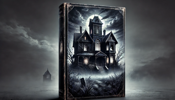
They say you shouldn’t judge a book by its cover—but let’s be honest, we all do it, especially when it comes to romance novels. Picture this: you’re strolling down a bookstore aisle, and amidst hundreds of titles, one book catches your eye. Is it the sweeping brush of pinks and purples? The elegant font hinting at a love story full of passion and longing. Or maybe it’s the almost-kissing couple that makes you think, this one’s going to be a page-turner.
A well-designed book cover is like love at first sight—it hooks you instantly. The right combination of colors, fonts, and imagery doesn’t just sell books; it creates an irresistible promise of emotional connection and happily-ever-afters. Whether you’re an author or a cover designer, mastering this art can mean the difference between readers and publishers swiping left or right on your book in a crowded marketplace.
Choosing Colors that Evoke Emotion
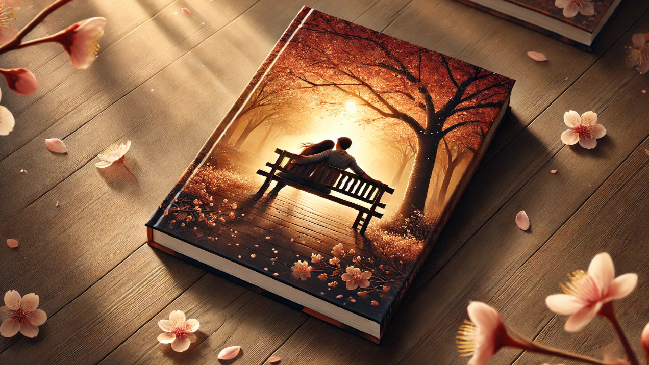
Colors have a way of whispering to our emotions before we even realize it—especially in romance book covers. When done right, the perfect palette can set the stage for the love story that lies within. Think of soft pinks, passionate reds, or calming blues. These aren’t just pretty shades; they carry meaning. Pink often brings to mind ideas of sweetness and innocence, perfect for a feel-good rom-com. Deep reds scream intensity and passion, ideal for a steamy romance that promises plenty of fireworks. Then there’s the cool blues, often used for more reflective, bittersweet love stories.
But it’s not just about throwing in some pretty colors and calling it a day. The combination of shades can make or break the cover’s vibe. Too much brightness and your slow-burn romance might be mistaken for a beach read. Not enough contrast, and that fiery passion could look more like a casual fling. The key is choosing colors that evoke the right emotions for the story you’re telling and that grab the attention of people in your target audience, whether they’re browsing online or in a bookstore.
And let’s not forget about color psychology—yes, it’s a thing. Studies have shown that certain colors can influence a reader’s perception before they even start reading. For instance, yellows and oranges might bring a touch of optimism and hope to a second-chance love story, while darker tones like maroons and purples suggest mystery or even danger in a romance full of secrets. When you use colors thoughtfully, you’re already halfway to creating a cover that will have readers swooning before they turn the first page.
The Role of Fonts: Romance in Typography
You might not think about fonts much, but trust me—when it comes to romance book cover design, typography is like the icing on the cake. Just as a whisper can evoke romance, fonts can convey elegance, passion, or mystery. The right font can instantly communicate the type of love story you’re offering, whether it’s a whirlwind romance or a slow-burning love affair.
Serif fonts, with their classic, timeless look, are a popular choice for romance novels. They exude sophistication, making them perfect for historical romances where grand estates and ballroom dances are the norm. If you’re writing something more contemporary, maybe a breezy rom-com, or a playful, handwritten-style font could give off the fun, happy, lighthearted vibe you’re aiming for. Meanwhile, bold, sans-serif fonts can offer a modern and chic feel, perfect for stories with strong, independent characters.
But it’s not just about picking any romantic-looking font—you need to think about legibility too. It’s great if your cover is all swoops and curls, but if readers have to squint to figure out things in the title, you’ve already lost them. Size matters here (pun intended), as does spacing. A well-chosen font can balance beauty and readability, giving readers a glimpse of the love story while ensuring they know exactly what book they’re picking up.
And then there’s the style. Italics can add a touch of elegance or emphasize a moment of passion. Script fonts can feel personal, almost like a love letter in type form. But tread carefully—too much flourish and your readers might confuse your romance novel with a wedding invitation. It’s all about finding that sweet spot, where the typography enhances the story without overpowering details on the cover.
Your Publishing Journey Awaits – Start NowImagery: Bringing Characters and Love Stories to Life
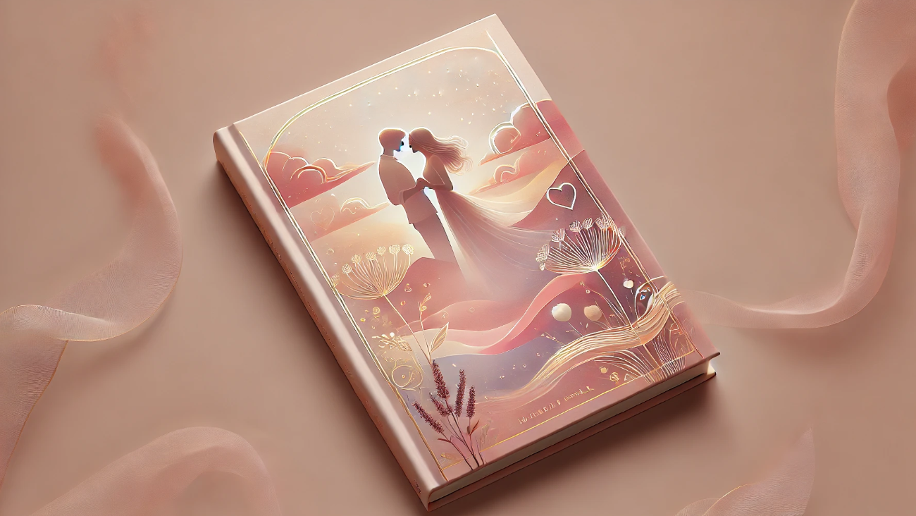
When it comes to romantic book covers, imagery is where the magic happens. It’s the visual hook that brings the love story to life and sets the mood for what readers can expect. Whether it’s a couple locked in a tender embrace, a windswept beach at sunset, or something more symbolic like a single rose, the imagery you choose speaks volumes about the genre and type of romance within the pages.
The trick here is subtlety. Romance covers often feature characters, but you don’t have to give away the entire story. Sometimes just a glance between two characters or a hand brushing against another’s can create just the right amount of tension and intrigue. You want readers to imagine the love story unfolding, not to lay it all out for them. That’s part of the fun—a cover that teases the idea of romance but leaves enough mystery to draw readers in.
For more abstract or symbolic imagery, think about what elements define your story. If your romance is set in the countryside, perhaps a misty field or a cozy cottage conveys the intimate, dreamy atmosphere. For a passionate, modern romance, sleek cityscapes or luxurious interiors can hint at the high stakes and emotional intensity of the story. Imagery like flowers, rings, or meaningful objects can also symbolize themes like commitment, longing, or love’s journey.
It’s also important to keep in mind the genre’s trends. A swoon-worthy couple on the cover is often a go-to for romance novels, but there are plenty of alternatives. From illustrated covers with minimalist charm to more artistic alternative takes on love, the key is choosing imagery that resonates with your story’s tone while still standing out on the shelves. After all, the right image isn’t just decoration—it’s an invitation into a world of romance, one that readers will be eager to dive into.

Balancing the Elements: Creating Harmony Between Colors, Fonts, and Imagery
Designing a romance book cover is like crafting a love story itself—it’s all about balance and harmony. The colors, fonts, and imagery must work together to create a cohesive, eye-catching cover that draws readers in and communicates the essence of your story. When these elements are thoughtfully combined, the result is a cover that not only looks beautiful but also tells a story all on its own.
Let’s start with color. A dreamy pink or warm gold might give off romantic vibes, but the colors must complement the fonts and imagery. Too many bright or clashing colors could make your heartfelt romance look like a loud, busy poster. Pairing soft pastels with elegant fonts and designs, for example, can create a timeless, serene feel, while a bolder, more dramatic color palette works well with striking imagery for a passionate love story. The goal is to ensure the colors enhance the imagery and typography without overpowering them.
Next, consider the relationship between fonts and imagery. A delicate, flowing script font may be perfect for a sweet, tender romance, but it could get lost if your imagery is too busy or detailed. Similarly, a modern sans-serif font might work well with a minimalist image but could look out of place on a cover with a traditional or vintage vibe. Balance is key—each element should enhance the other rather than compete for attention.
Then there’s the layout. Whether you’re featuring some artwork of a couple gazing into each other’s eyes or a symbolic object like a rose or ring, the placement of these images matters. If your imagery takes center stage, opt for fonts that complement without distracting. On the other hand, if the typography is the focal point, make sure the imagery supports it rather than fights for attention. Think of the elements like dance partners—they should move together in harmony, guiding the reader’s eye across the cover.
Ultimately, the harmony you find between colors, fonts, and imagery is what creates a cover that feels inviting and professional. It tells readers, at a glance, what kind of love story they’re about to experience, whether it’s sweet, passionate, or heart-wrenching. The right balance can turn a good cover into one that leaps off the shelf (or screen) and into the hearts of your readers.
Creating a Romantic Book Cover That Sells
At the end of the day, your book cover is one of the most powerful marketing and sales tools you have. A beautifully designed romantic cover doesn’t just attract attention; it sets the stage for the love story inside, giving readers a glimpse of the emotions and journey that await them. The right combination of colors, fonts, and imagery is more than just an aesthetic choice—it’s a strategic one, designed to resonate with your target audience and invite them into your world.
Whether you’re crafting the cover yourself or working with a professional designer, remember that each element plays a role in telling your story. From the emotions evoked by the color palette to focus, the tone set by the typography, and the intrigue sparked by the imagery, every choice should reflect the heart of your romance. When done right, your cover will not only stand out on the shelves (or screens) but will also create a lasting impression that lingers long after the final page is turned.
A romantic book cover is more than just a pretty face—it’s an invitation to fall in love, again and again, with every turn of the page.
At Spines, we’re here to help you craft covers that captivate and stories that shine. Whether you’re an author seeking professional design services or looking for expert tips to elevate your book’s appeal, Spines has the tools and resources to make your publishing journey seamless and successful. Start your journey today and create a love story your readers will never forget.
Your Publishing Journey Awaits – Start Now