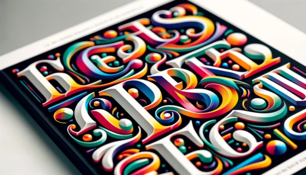
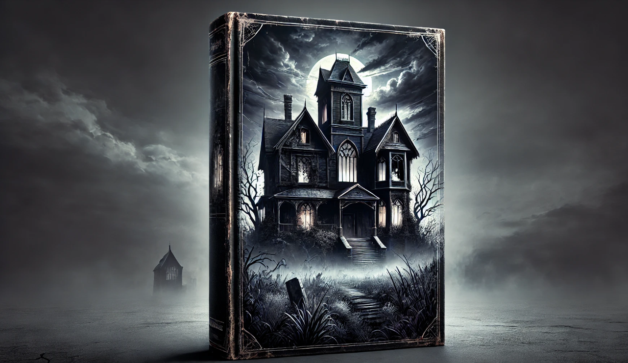
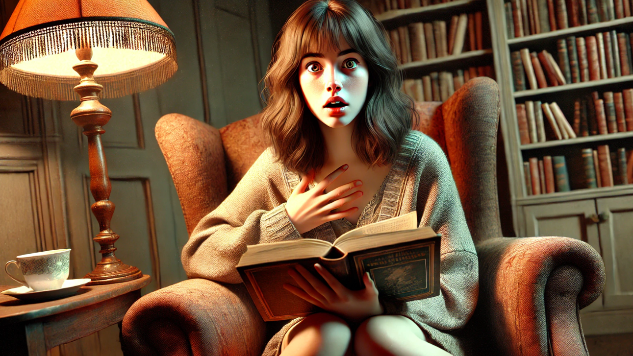
Ever picked up a horror book, glanced at the cover, and felt a chill run down your spine? That’s no accident. A good horror book cover doesn’t just sit quietly on the shelf—it lurks, it haunts, it dares you to pick it up, all while whispering, “You sure you want to do this?” Crafting that eerie, spine-tingling, eerie atmosphere in horror book cover design is an art form, and it’s what separates a horror book that gets devoured in one night from one that gathers dust.
Your Publishing Journey Awaits – Start NowDesigning a cover for a horror book is more than just slapping on some dark colors and creepy fonts. It’s about creating a visual promise of the terror, suspense, and thrills lurking inside. If you want to lure readers into your dark, twisted world (and let’s be honest, who doesn’t?), you’ll need to master the art of the eerie cover design. Stick around, and I’ll show you how to make your horror book cover send shivers down readers’ spines—before they even crack open the first page.
Setting the Mood: Why Atmosphere Is Key to Horror Book Cover Design
In horror, the atmosphere is everything. It’s the sense of dread, mystery, and suspense that wraps around the reader, even before they’ve turned the first page. A well-designed book cover can create this eerie atmosphere instantly, hinting at the terror within and compelling readers to take a closer look. Studies show that 60% of readers judge a book by its cover, with many stating that the mood conveyed by the cover is what initially draws them in.
Take, for example, some of the most iconic horror covers in publishing history. Stephen King’s books often feature dark, ominous visuals that hint at the lurking horrors in his stories. Covers like The Shining and It don’t rely on showing gory images or monstrous figures; instead, they use subtle imagery—like a misty, haunted hotel or a single, ominous balloon—to create a sense of foreboding. These covers tap into the power of the atmosphere, suggesting a dark, sinister world without revealing too much.
For designers, it’s all about creating that same effect. Think of your cover as the doorway to a haunted house—it should be intriguing and unsettling enough to make readers want to step inside, even if they’re not entirely sure what’s waiting for them. By mastering the art of creating an eerie atmosphere on the cover, you set the tone for the entire reading experience.
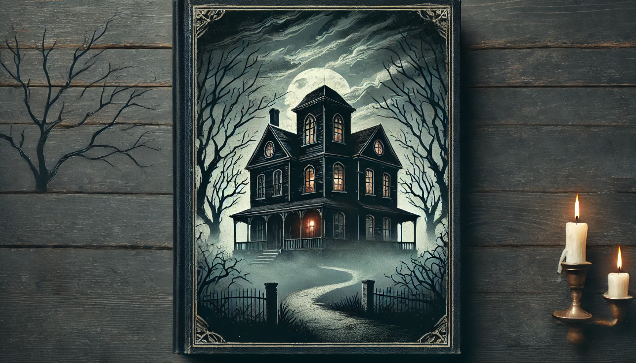
Choosing the Right Color Palette: Dark, Mysterious, and Unsettling
Color plays a massive role in how we perceive emotions, and your horror book cover is no exception. The right color palette can evoke fear, suspense, and unease, setting the tone before a reader even picks up the book. Studies on color psychology show that certain shades trigger specific emotions—deep blues and blacks, for example, are often linked to mystery and the unknown, while dark reds can evoke feelings of danger and urgency. According to a study published in Color Research & Application, dark colors like black and deep blue are associated with perceptions of mystery and fear, while red triggers a heightened sense of alertness and anxiety, making it a powerful choice for horror themes.
Think about classic horror covers like Dracula or The Haunting of Hill House. You’ll notice a pattern: muted, dark tones dominate, with splashes of bold color used sparingly to create contrast. This isn’t just a design choice; it’s a technique to draw the eye to specific elements, like the title or a sinister image while maintaining an overall sense of dread.
When you’re working on your design, try experimenting with dark blues, greens, and purples to create a cold, eerie vibe, while a hint of red can suggest danger or violence lurking just beneath the surface. The key is to find a balance—too many dark colors can overwhelm the design, while a sudden, stark contrast can make a single element pop, grabbing the reader’s attention. When done right, your color palette doesn’t just set the mood; it practically whispers, “Something is waiting for you here… are you brave enough to find out?”
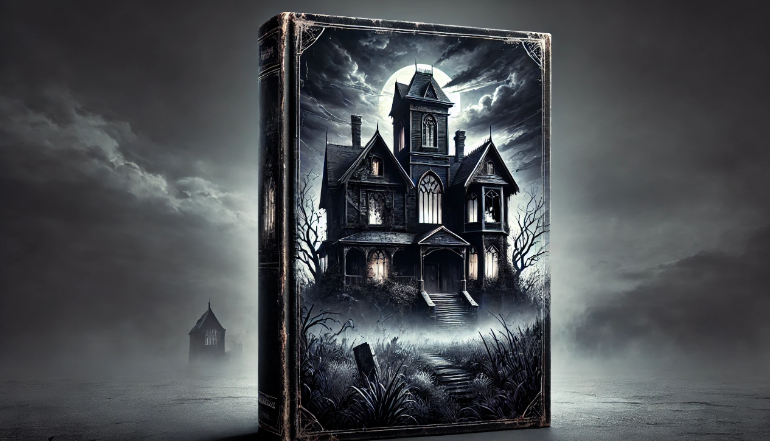
Imagery That Sends Shivers: Creepy Elements and Subtle Hints
When you’re designing a horror book cover, remember that sometimes what you don’t see is scarier than what you do. The right imagery can create a sense of unease and mystery, drawing readers in by hinting at the horrors lurking within the pages. It’s all about suggesting terror without showing it outright, letting the reader’s imagination fill in the dark, twisted gaps.
Think about the cover of Bird Box by Josh Malerman. Instead of featuring a monstrous figure, it shows a pair of blindfolded eyes against a dark background. That subtle but chilling image plays on the theme of fear of the unknown, inviting readers to find out why the character can’t—or won’t—look. Similarly, The Silence of the Lambs uses a close-up of a woman’s face with a death’s-head moth over her mouth. It’s a simple but eerie image that hints at the dark, psychological elements of the story without giving too much away.
How To Create An Eerie Atmosphere…
To create this kind of atmosphere, try using subtle, unsettling imagery—shadows, foggy landscapes, or barely visible figures lurking in the darkness of the background. Sometimes, it’s the smallest detail that makes a cover memorable, like a distorted hand reaching out or a glimpse of something hiding behind a curtain. These elements can build suspense, making readers feel like they’re catching a glimpse of something they shouldn’t see.
Symbolism is another powerful tool for horror covers. Skulls, ravens, and dark forests are common motifs that immediately give off a sense of foreboding. The trick is to use these elements sparingly and strategically, so they suggest rather than reveal. When done right, your cover becomes a visual puzzle—one that readers are eager to solve by diving into the story.
Typography That Enhances the Horror
Typography might not be the first thing you think of when designing a horror book cover, but it’s a crucial element that can make or break the eerie atmosphere you’re trying to create. The right font adds layers of tension, hinting at the mood of the story and drawing readers in before they even read the title. Studies on visual perception have shown that certain fonts can evoke strong emotional responses, with jagged or distorted styles often linked to feelings of unease or discomfort.
Your Publishing Journey Awaits – Start NowTake Stephen King’s Pet Sematary cover, for example. The bold, distressed font used for the title immediately sets a grim, unsettling tone, reflecting the dark and twisted nature of the story. Similarly, The Exorcist cover features a minimalist, sharp-edged font that feels cold and unnerving, reinforcing the book’s chilling themes. Those font choices aren’t accidental—they’re carefully selected to match and enhance the overall mood of the cover.
Tips For Picking Typography…
When you’re picking typography for your horror cover, think about fonts that convey a sense of tension, like cracked, jagged, or worn-out styles. Try to avoid overly decorative fonts that might dilute the dark, eerie vibe you’re aiming for. Placement is key, too—large, bold fonts can create a sense of urgency, while smaller, spaced-out letters can add a feeling of isolation or suspense.
Your goal should be to make the typography feel like an extension of the story. If your plot involves supernatural elements, a slightly distorted or ghostly font could be the perfect fit. For psychological horror tales, a minimalist, almost clinical typeface can amplify the unsettling mood. By matching the typography with the overall tone, you make sure every element on the cover works together to draw readers into the dark and creepy world you’ve created.
Using Subtlety to Create Tension and Intrigue
When you’re designing a horror book cover, remember: sometimes less is more. Subtlety can be far more effective than graphic, in-your-face scary imagery, creating that delicious sense of tension that pulls readers in. The trick is to hint at the horror without showing it outright, letting their imagination run wild as they wonder what terrifying secrets the book might hold.
Think about the cover of The Silence of the Lambs. Instead of showing blood or violence, it uses a simple, unsettling image: a close-up of a face with a death’s-head moth over the mouth. That moth isn’t just a random choice—it’s a symbol with eerie implications, representing silence and death. This subtle, symbolic choice instantly sets a creepy, psychological tone without overwhelming you. Similarly, Cormac McCarthy’s The Road has a bleak, desolate landscape that hints at the dark journey within.
When you want to create that kind of subtle tension, think small. A cracked mirror, a half-open door, or a barely visible hand reaching out from the shadows can all evoke a sense of mystery and fear. The key is to suggest that something is wrong—without fully revealing what it is. This approach can be even more chilling than showing a monster because it engages your reader’s curiosity, making them want to know what’s hiding in the dark.
Another way to build intrigue is by adding hidden details that only become apparent after a second glance. Maybe there’s a shadow that doesn’t quite belong, or a figure lurking just out of sight. These subtle touches can create a haunting atmosphere that lingers, making readers want to dive into the story to uncover the truth.
Mastering the art of subtlety will help you create horror covers that are not just eye-catching, but genuinely haunting—ones that make readers pause, look closer, and shiver a little before finally turning the page.
Bringing Your Horror Cover to Life
Designing a horror book cover is all about setting the mood—one that whispers of the terror lurking within and draws readers in with a sense of eerie curiosity. From picking the perfect dark, unsettling colors to using subtle, creepy imagery, every detail should work together to create a book cover that sends shivers down your spine. When you master the typography, backgrounds, and those subtle, haunting touches, you’re not just creating a cover—you’re crafting an experience that stays with readers long after they’ve finished the book.
The goal? To create an atmosphere of suspense, fear, and intrigue that makes people think, “I need to know what’s inside.” So, don’t be afraid to experiment, mix different ideas and elements, and leave a little to the imagination—after all, it’s what we don’t see that often scares us the most.
Pro Tip: When you’re done designing, step back and ask yourself: “If I saw this on a shelf, would it make me curious? Would the idea of it make me feel just a little uneasy?” If the answer is yes, you’ve nailed it.
Using the Spines Cover Design Tool for Eerie, Eye-Catching Covers
Looking to create a chilling, professional cover for your horror book? At Spines, our cover design tool, known as the ‘magic cover designer,’ makes it easy to craft a visually stunning cover that captures the eerie atmosphere you’re aiming for. The tool combines AI technology with customizable options, allowing you to experiment with color palettes, typography, and imagery that fit the tone of your book. You can choose from a variety of templates or create your design from scratch, ensuring your cover stands out on the shelf and sends shivers down readers’ spines.
With Spines, even first-time authors can easily design covers that are polished, professional, and hauntingly beautiful. Ready to bring your vision to life? Give the Spines cover design tool a try, and see how easy it is to craft a cover that captures the essence and style of your horror story. Sign up for free to discover more.
Iconic Horror Book Covers to Check Out
If you’re looking for inspiration, here are a few examples of classic horror book covers that masterfully use color and subtle imagery to create an eerie atmosphere:
- The Shining by Stephen King – Features a misty, haunted hotel that hints at the story’s chilling isolation without showing any explicit horror.
- It by Stephen King – The single, ominous red balloon on the cover suggests a lurking danger, using simplicity to evoke dread.
- Bird Box by Josh Malerman – A pair of blindfolded eyes against a dark background, hinting at fear of the unknown.
- Dracula by Bram Stoker – Often designed with dark, gothic elements, using reds and blacks to create a sense of mystery and danger.
- The Haunting of Hill House by Shirley Jackson – A shadowy mansion shrouded in mist, perfectly setting the scene for the ghostly story inside.
These covers show how a clever combination of use of colors and subtle, eerie visuals can pull readers in, hinting at the horrors within without giving too much away.
Your Publishing Journey Awaits – Start Now