
A Book cover gets a ridiculously short time to make a good first impression and most of the times this goes wrong are completely avoidable, not some matter of personal taste, but actual , specific errors that keep reappearing on amateur looking covers.
Knowing the actual ins and outs of the design process, and knowing exactly what types of mistakes are going to immediately kill a cover before even the title is looked at is way more important than any one trendy style.
A cover is like a handshake and an elevator pitch all rolled into one, it’s the first signal that a reader gets about what the book is going to be like, it tells them the genre, the tone, and even the level of quality, and it’s all before they read a single word of the actual book.
And to do that takes a proper process, not just one moment of brilliance, and that means avoiding a very short list of well documented things that self published covers get badly wrong all the time.
The Design Process, Step by Step
Here are some of the most important aspects to have in mind within the design process:
Brainstorming and concept
Before any imagery gets chosen, this stage is about understanding the book’s core themes, target audience, and tone.
If working with a designer, this is where mood boards and reference images get exchanged, setting the direction before any actual design work begins.
Building a genre reference set
This step gets skipped constantly, and it shouldn’t. Pull 10 to 20 bestselling or visually strong covers from the exact subgenre the book belongs in, cozy mystery, dark romance, epic fantasy, whatever applies, and look for what repeats: color palettes, font styles, layout patterns, emotional tone.
If a design doesn’t share a strong majority of those visual cues, it risks confusing a shopper about what kind of book they’re even looking at, even if the design itself is objectively attractive.
Sketching and mock-ups
Turning the concept into a rough visual, whether hand-sketched or a quick digital layout, tests whether an idea actually works before real time gets invested in a polished version.
Selecting imagery and typography
Choosing between custom illustration, an author’s own photography, or stock imagery depends heavily on genre. Illustration techniques tend to resonate more in fantasy and children’s books specifically, while stock photography remains a practical, cost-effective choice as long as it’s selected carefully enough to avoid feeling generic.
Typography should reflect genre as directly as imagery does, sharp, angular type for a thriller, flowing script for a romance, and choosing the right font matters as much for readability as it does for mood.
Finalizing layout
Title, author name, imagery, and any additional text need a placement that’s balanced and guides the eye in a clear order, typically title first, then image, then author name, or some deliberate variation of that hierarchy.
Review and revision
The near-final design gets tested against the original brief and refined based on feedback, ideally from more than just the author’s own eye.
Outside readers or a small focus group catch things a creator who has stared at the same design for weeks genuinely cannot.
Protecting the finished cover
Once a design is approved, copyright protection for the cover art is worth handling before publication rather than after, particularly for custom illustration or typography an author has paid a designer to create.
This step gets skipped constantly, usually because it feels administrative rather than creative, but it’s the difference between having real legal recourse if the artwork gets used without permission later and having none at all.
The Fatal Mistakes That Sink a Cover
This is the part most cover design advice skips, and it’s the part that actually determines whether a technically competent cover succeeds or quietly fails.
Each of these is a specific, fixable error, not a matter of taste.
Overloading the cover with plot
The instinct to cram in every major story element, the hero’s sword, the sidekick, the wizard, the airship in the background, produces a jumbled collage that reads as fan art rather than a commercially viable cover.
A cover’s job isn’t to summarize the plot, it’s to signal genre and tone clearly enough that the right reader recognizes it as their kind of book. Stick to one dominant focal point.
Ignoring genre visual conventions entirely
Skipping the reference-set step from above and designing purely on instinct risks producing a cover that confuses shoppers about basic genre, is this a horror novel or literary fiction. Genre cohesion isn’t a creative limitation, it’s the fastest way to signal “this book is for you” to the specific reader browsing for it.
Text that’s illegible at thumbnail size
The overwhelming majority of a cover’s first impressions now happen at roughly 200 by 300 pixels, not full resolution.
A title needs to occupy something like 40 to 50 percent of the cover’s visible space to survive that shrink, with thick, bold letterforms rather than thin, delicate ones that disappear entirely once scaled down. If a title can’t be read after squinting at a small thumbnail, it’s too small, full stop.
Low-resolution or stretched imagery
Enlarging an image past its native resolution, or changing its aspect ratio without accounting for the distortion, produces a cover that reads as unmistakably amateur even at a glance.
This is a purely technical error, not a stylistic one, and it’s one of the fastest ways to signal a self-published book wasn’t taken seriously in production.
Weak or chaotic composition
Elements placed without a clear hierarchy, competing focal points, imagery and text fighting for the same visual space, produce a cover that feels unsettled even to a viewer who couldn’t articulate exactly why.
A single dominant element, supported rather than crowded by everything else, almost always reads better than a composition trying to do too much at once.

Designing for Ebooks vs. Print
A cover built only with a full-size print jacket in mind often fails the moment it’s shrunk down to a digital thumbnail, and the reverse is just as true, a cover optimized purely for small-screen legibility can feel thin or underdesigned once it’s printed at full size on a physical shelf.
Ebook covers need to prioritize thumbnail legibility above almost everything else, since that’s the primary way most readers will ever encounter it, and getting the exact ebook cover dimensions right for each platform avoids the cropping and distortion issues that plague covers designed to a single generic size.
Print covers carry additional technical requirements entirely absent from digital design: spine width calculated from page count and paper stock, bleed settings, and CMYK color conversion, since colors that look correct in RGB on a screen can shift unexpectedly once sent to a printer.
DIY vs. Hiring a Designer
A DIY cover, built in a tool like Canva or Adobe Express, can work for a low-budget first attempt, but the mistakes above are exactly where DIY covers tend to fail most visibly, plot overload, weak resolution, poor genre signaling.
A professional book cover designer brings both design skill and a working knowledge of these exact failure points, along with genre-specific market awareness that’s hard to develop without seeing dozens of comparable covers succeed or fail in the same category.
Essential Tips for Creating a Great Book Cover
Crafting an effective book cover is a delicate balance between artistic expression and strategic design. While the front cover often grabs the initial attention, the overall design, including the spine and back cover, plays a crucial role in the book’s appeal. Here are some essential tips for creating a great book cover:
Effective Use of Text Boxes and Spine Text
- Text Boxes: The placement of text boxes for the title, author’s name, and any other textual information should be strategic. Ensure that these elements do not clash with the imagery but rather complement it. The font choice and color should enhance readability and attract attention without overpowering the overall design.
- Spine Text: For print books, the spine is an often overlooked but vital space. The text on the spine should be legible and well-aligned. Remember, in many bookstores, the spine is the first and only part of your book that a reader might see. The title and author’s name should fit comfortably, with the font size adjusted according to the spine’s width.
Significance of High-Quality Design for Front and Back Covers
- Front Cover: This is the most visible part of the book and should be striking and relevant to the book’s content. The imagery and typography should work together to create an inviting and intriguing front.
- Back Cover: The back cover is equally important, especially for print copies. It typically contains a blurb that should be concise and engaging, an author bio, an ISBN, and sometimes reviews or endorsements. The layout should be clean, and the text should be easily readable. The design should maintain the style and color scheme of the front cover for consistency.
Incorporating Feedback
- Potential Readers or Focus Groups: One of the most valuable steps in designing a book cover is gathering feedback from potential readers or focus groups. Their insights can provide invaluable perspectives on how the cover is perceived. Does it convey the right genre? Is it appealing? Does it stand out? Such feedback can be crucial in making final adjustments that significantly enhance the cover’s effectiveness.
Creating a great book cover is a nuanced art that involves careful consideration of every element, from typography to layout, and a keen understanding of the target audience. By paying attention to these tips and incorporating feedback, authors and designers can create compelling covers that capture the essence of the book and draw readers in.
AI in Book Cover Design
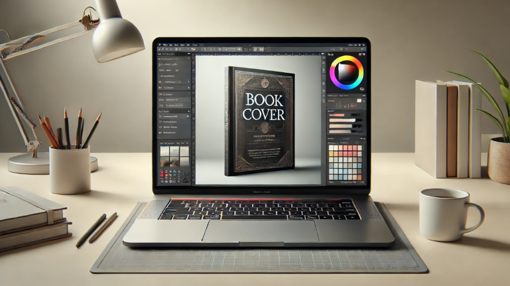
In today’s rapidly evolving technological landscape, Artificial Intelligence (AI) has emerged as a transformative force, revolutionizing the way we approach cover design. AI-powered tools have unlocked a world of creative possibilities, effortlessly generating a myriad of design options that capture the essence of a book with remarkable precision. Platforms like Spines, who offer self-publishing services, exemplify this innovative approach, offering authors the opportunity to harness the power of AI to craft covers that not only captivate but also effectively convey the essence of their literary creations.
AI’s ability to analyze vast amounts of data and identify trends is invaluable in understanding which visual elements resonate most with readers across different genres. It can suggest color schemes, layouts, and imagery likely to appeal to a specific audience, drawing on successful past designs. This technology assists in creating initial concepts, and quickly generating varied designs based on the book’s genre, target audience, and themes. These can then be refined by human designers, blending AI efficiency with creative human insight.
Moreover, AI streamlines the design process by efficiently sorting through stock images and automating aspects like image resizing and layout adjustments. However, despite these advancements, the human element in cover art remains crucial. AI aids in design but doesn’t replace the nuanced understanding of a skilled human designer. As AI evolves, its role in complementing human creativity in book cover design is becoming increasingly significant, marking a new era in how we visually present literary works.
Spines stands as a shining example of innovation in the publishing industry, harnessing the potential of AI to revolutionize the way books are published and presented. This innovative AI-powered publishing platform offers a comprehensive suite of services, guiding authors through the intricacies of getting their works published with unparalleled ease.
Comparing AI and Traditional Cover Design
AI cover design offers distinct advantages over traditional methods, primarily in efficiency and data-driven precision. Unlike the time-intensive nature of traditional design, AI can rapidly generate multiple concepts, drawing from extensive data on market trends and reader preferences.
This leads to designs that are not only created faster but are also tailored to appeal more effectively to specific target audiences. AI’s ability to analyze and implement current design trends can result in covers that are more aligned with contemporary reader expectations.
While traditional design relies on individual expertise and intuition, AI brings a level of analytical insight and speed that can significantly enhance the cover creation process, making it a valuable tool in the evolving landscape of book publishing.
The significance of a well-designed book cover in determining a book’s success cannot be overstated. It’s the first point of engagement with potential readers and plays a crucial role in conveying the essence of the content within.
The advent of AI in book cover design has revolutionized this domain, offering sophisticated, data-driven solutions that enhance both the efficiency and appeal of cover designs. The blend of AI advancements with the creativity of professional designers proves most effective.
Authors are encouraged to invest in this synergy of technology and professional expertise to ensure their book covers make a lasting and impactful first impression.
Make the Most Out of Your Book Cover
A great book cover isn’t the product of a single flash of creative inspiration, it’s the product of a real process followed carefully and a short, specific list of well-documented mistakes avoided deliberately.
Genre cohesion, thumbnail legibility, resolution, and composition aren’t matters of personal taste, they’re the technical and strategic foundation a cover needs before style even enters the conversation.
FAQ: How to Design a Book Cover
Q: What is the most common book cover design mistake?
Overloading the cover with too much plot, trying to represent every major story element instead of a single, clear focal point. This produces a cluttered composition that reads as amateur rather than commercially viable, regardless of how skilled the individual illustration or photography is.
Q: How do I make sure my book cover looks good as a thumbnail?
Test the design at roughly 200 by 300 pixels before finalizing it. The title should occupy close to 40 to 50 percent of the visible cover space, using bold, thick letterforms rather than thin or delicate fonts that disappear at small sizes.
Q: Should I design my own book cover or hire a professional?
It depends on the budget and the specific risks involved. DIY tools can produce a workable cover for a tight budget, but the most common failure points, plot overload, poor resolution, weak genre signaling, are exactly where DIY covers tend to fall short. A professional designer brings both technical skill and genre-specific market awareness that’s difficult to develop without extensive comparative experience.
Q: What’s the difference between designing a cover for print versus an ebook?
Ebook covers need to prioritize legibility at thumbnail size above nearly everything else. Print covers carry additional technical requirements, spine width based on page count and paper stock, bleed settings, and CMYK color conversion, that don’t apply to a purely digital cover.
Q: How do I know if my cover matches my book’s genre?
Build a reference set of 10 to 20 bestselling or visually strong covers in the exact same subgenre and compare recurring color palettes, fonts, and layout patterns against the design in progress. If the design doesn’t share a strong majority of those visual cues, it risks confusing readers about what kind of book it actually is.