
A book cover works when a stranger can tell what kind of story it is before they read a single word of the description. That is the entire job. Signal genre, tone, and quality in the half second before a thumb keeps scrolling or a hand puts the book back on the shelf. Every choice that follows, color, typeface, image, hierarchy, exists to protect that half second.
Most cover advice treats design as decoration. Treat it instead as a negotiation with a stranger’s attention span, one that has to be won in a size smaller than a postage stamp on most retail sites today. This guide breaks down the specific decisions that win that negotiation, the mistakes that lose it, and where a professional designer, a DIY tool, or an AI generator each earn their place in the process.
Fundamentals of Book Cover Design
A book cover is built from three working parts: color, typography, and imagery, and each one has a single job to do rather than a general aesthetic mandate. Color sets the emotional register before the eye reads anything else. Typography carries the genre signal even when the image is stripped away, which is exactly what happens when a cover shrinks to a 40 pixel thumbnail. Imagery earns the second look once the first two have already done their work.
Color
A palette should telegraph mood at a glance, and how color choices shape a reader’s emotional read goes deeper into why warm and cool palettes trigger such different reactions before a reader even registers the title. The real risk is picking a color that contradicts the genre’s existing visual shorthand, which trains a reader’s eye to distrust the cover in the same glance that was supposed to earn their trust.
Typography
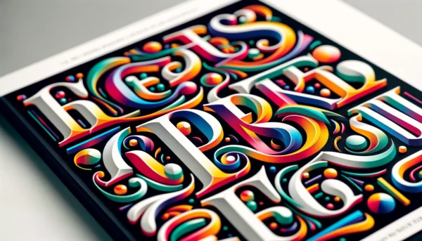
The title font is doing genre work whether the designer intends it to or not. A script font on a thriller reads as a mismatch before a reader consciously registers why. Bold, condensed sans serif fonts read as commercial and fast paced. Serif fonts with generous spacing read as literary and slower.
Imagery
An image only helps if it survives being shrunk to the size of a fingernail. A photograph with fine detail, a wide horizon, or a busy composition disappears at thumbnail size. A single strong silhouette or a tightly cropped object usually survives.
Balancing Visual Elements and White Space
White space is the tool that tells a reader’s eye where to look first, doing that work quietly enough that most readers never notice it happening. A cover crowded with competing elements forces the eye to work, and readers do not work for a cover, they move on. A cover with too little happening on it can read as unfinished or amateur, especially in genres where readers expect a certain density of visual information, like fantasy or romance.
The fix is a clear visual hierarchy: one dominant element, one secondary element, and everything else subordinate to those two. Title and author name should never compete with the image for the same visual weight. One of them has to lead.
The Parts of a Book Cover
A book cover has three parts, and the front cover, spine, and back cover work as separate components, each judged by a different reader at a different moment. The front cover has to work in under a second, from across a room or inside a thumbnail grid. The spine has to work from three feet away on a crowded shelf, which means it needs a legible title and author name and almost nothing else. The back cover has more time, usually five to fifteen seconds of an already-interested reader, and it earns that trust with a blurb, a short bio, and one or two credible endorsements rather than a wall of text.
Digital-only formats collapse this into just the front cover, which raises its stakes rather than lowering them. Every job the spine and back cover would have shared gets pushed onto a single thumbnail image.
Understanding Your Book and Target Audience
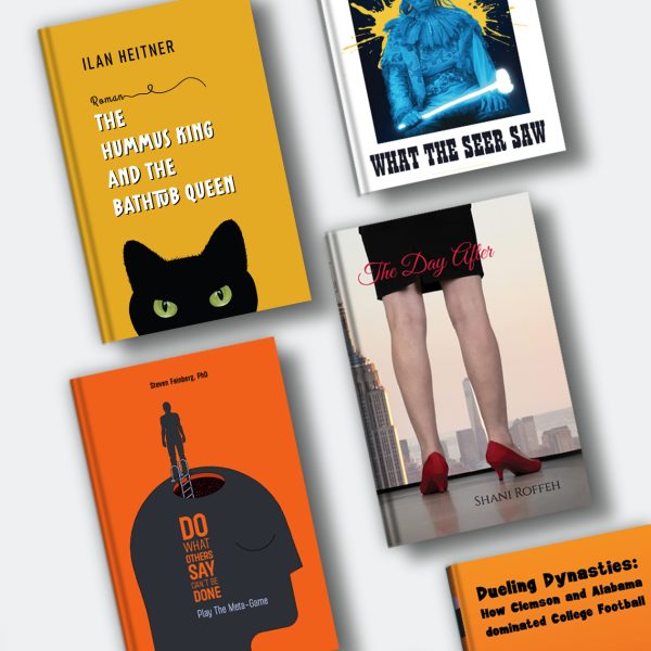
Every genre carries an existing visual contract with its readers, and breaking it without intention reads as a mistake rather than a choice. A romance reader expects warmth and intimacy signaled before they read the blurb. A thriller reader expects tension signaled through color and framing. Match that contract first, then look for the specific detail that makes this particular story worth noticing inside a genre that already has thousands of covers doing the same basic job.
The starting question worth asking is “what shelf is this book competing on, and what does that shelf already train readers to expect,” rather than “what does my book look like.”
Professional Book Cover Designer
A professional designer earns their fee by knowing what a given genre’s top sellers have in common right now, not five years ago, and by producing print-ready files that meet the technical specs a print-on-demand platform actually requires. That second part is easy to underestimate. Bleed, trim, spine width calculated against final page count, these are the details that turn a beautiful file into a rejected upload.
Before approaching a designer, gather three to five reference covers that represent the tone of the book rather than its plot, and spend a little time vetting a designer before committing to a project so the reference conversation actually goes somewhere. A designer working from “make it look like this” references moves faster and more accurately than one working from a verbal description alone. Once in progress, useful feedback names the specific reaction, something like “the title is competing with the image and the eye doesn’t know where to land first,” rather than a general impression.
DIY: Designing Your Own Book Cover
DIY cover design works when the genre has a strong, well-established visual pattern a template can approximate convincingly, which is really a question of weighing DIY against hiring a professional for this specific book rather than covers in general. Tools like Canva and Adobe Express lower the floor: even a first attempt will be legible and reasonably composed. They also lower the ceiling, because thousands of other authors are pulling from the same template library, and a trained eye can usually spot a templated cover in a genre where covers are closely scrutinized, like literary fiction.
Adobe Photoshop and InDesign remove that ceiling but raise the floor considerably. They demand real skill to avoid producing something worse than a good template.
Using AI in Book Cover Design
AI cover generators are fast, cheap, and reliably competent at producing something that looks like a cover, which is a lower bar than producing something that looks like your cover. Most AI-generated covers are technically clean, so the real failure mode is genre camouflage: because the model was trained on the existing top sellers in a genre, its default output tends to converge on the visual average of that genre rather than a distinctive variation of it. That’s useful for testing directions fast and useless for the one cover that actually needs to stand out on a shelf full of its own visual training data.
AI earns its place in three specific tasks: generating quick concept variations before committing to a direction, upscaling or cleaning a low-resolution image, and testing how a layout reads at thumbnail size before paying a human designer to finalize it. It earns less trust for the final image itself, particularly for text and hands, which remain the two things these models still render inconsistently.
The Impact of Digital and Print Formats
A cover designed only for print will usually fail as a thumbnail, because the two formats are judged from opposite distances. Print covers are handled up close, so texture, embossing, and fine detail all register. Digital covers are seen first at 150 pixels wide in a search results grid, where fine detail simply vanishes and only bold shape and high contrast survive.
The practical rule: design for the thumbnail first, then confirm it holds up at full size and in print, starting with getting the exact dimensions right for Kindle and other e-readers so nothing gets cropped or distorted on upload. A cover that fails at 40 pixels loses far more sales opportunities than one that isn’t quite as striking in hand.
Incorporating Graphic Elements and Typography
The title needs to be legible at thumbnail size before it needs to be beautiful at full size, because most readers meet the cover as a thumbnail first. That single constraint should drive font choice more than any other factor: bold weight, generous letter spacing, and high contrast against the background.
Genre expectations still apply underneath that constraint, and matching a typeface to genre and readability is worth getting right before a single design decision is made. Script fonts read as romance. Bold sans serif reads as thriller or commercial fiction. Serif with wide tracking reads as literary or historical. Hierarchy should be unambiguous: title first, author name second, any additional text a distant third that never competes for the eye’s first stop.
Genre-Specific Cover Design Tips
Genre determines what a reader expects to see before they’ve read a single word of the blurb, and violating that expectation without a clear reason reads as confusion rather than originality.
- Romance signals warmth through saturated, inviting color and often a script or elegant serif typeface.
- Thriller and mystery signal danger through desaturated or high-contrast color and bold, stark typography.
- Science fiction and fantasy signal scale through wide compositions, unusual color grading, and typography that echoes the world’s internal logic.
- Non-fiction and self-help signal authority through clean minimalism and confident, oversized typography rather than illustration.
The way to stand out inside a genre convention is to keep the expected signal and change one specific detail: an unexpected color inside the genre’s usual palette, or a font weight slightly outside what the genre typically uses. Breaking every convention at once just reads as the wrong genre.
Common Book Cover Design Mistakes
The single most common mistake is designing a cover that only works at full size and fails completely as a thumbnail, since that is the size most readers will actually encounter first. A close second is a title that competes with the image for the same visual weight, so the eye doesn’t know where to land and gives up in under a second.
A few others worth naming directly:
Mismatched genre signals. A cover that looks literary on a commercial thriller, or vice versa, actively repels the readers most likely to buy the book. Too much text on the front. Taglines, award mentions, and series numbering all belong on the back cover or a smaller secondary position, not competing with the title. Low-resolution or stretched images. This reads as unprofessional faster than almost any other single flaw, and it’s one of the easiest to catch before a file goes to print. Ignoring the spine. Authors design a beautiful front cover and forget the spine entirely, which is the only part of the book visible in most physical retail and library settings.
Finalizing the Design: Feedback and Revision
Useful feedback names a specific reaction: “the eye doesn’t know where to look first” gives a designer something to act on in a way a general impression never does. Gather feedback from two different sources deliberately. Target readers will tell you honestly whether the cover reads as the right genre, which is exactly the reasoning behind testing a cover with real readers before launch rather than relying on the author’s own eye alone. Industry professionals, editors, other authors, will tell you whether it competes with what’s currently succeeding on that shelf.
A reader having to be told what genre the book is after looking at the cover signals a full rebuild. A cover where the composition already works and only the color or font needs adjustment just needs an iteration.
Marketing Considerations and the Book Cover
A book cover is the only piece of marketing that reaches every single potential reader, in a bookstore, a search results page, or a social feed, before anything else about the book does. It has to close the sale on genre and tone in under a second, and it has to keep working at whatever size the platform happens to render it: a three-inch thumbnail, a shelf spine from across a room, or a full-size print in hand.
That’s why cover decisions belong in the same conversation as marketing decisions, not a separate one that happens after the manuscript is finished. A cover that works everywhere it’s seen is doing more selling than most of the marketing that follows it.
FAQ: Book Cover Design Tips
Q: What are the most important book cover design tips for self-published authors?
Design for thumbnail size first, keep the title legible at 40 pixels wide, and match the visual signals your specific genre already trains readers to expect before trying to stand out from them. Most self-published covers fail on the first of these three, not the third.
Q: What are the parts of a book cover?
A book cover has three parts: the front cover, which has to work in under a second; the spine, which needs a legible title and author name from across a room; and the back cover, which has more time to earn trust through a blurb, bio, and endorsements.
Q: What is the biggest mistake authors make with a book cover?
The most common mistake is designing a cover that only looks finished at full size and falls apart as a thumbnail, since a thumbnail is how most readers will actually encounter it first.
Q: How much does it cost to hire a professional book cover designer?
Professional book cover design typically ranges from a few hundred dollars for a template-based design to several thousand for a fully custom illustrated cover, with the difference usually reflecting original artwork versus stock imagery and photo composites.
Q: Can AI design a book cover that actually sells?
AI can generate a clean, competent-looking cover quickly, but it tends to default toward the visual average of a genre because it was trained on that genre’s existing bestsellers, which makes it useful for early concept testing and less reliable for a final, distinctive cover.
Q: What makes a book cover work as a thumbnail?
A thumbnail-ready cover uses one dominant shape or color block, high contrast between title and background, and a bold typeface, since fine detail and subtle color variation both disappear at that size.