

Most books fail to hold a reader past the first page for a reason that has nothing to do with the writing. The type on the page is doing more work than most authors realize, and the wrong choice makes even a strong sentence feel like effort.
Fonts for books are almost always set to old style serif fonts, such as Garamond, Caslon, or Adobe Garamond, because that family of type was cut specifically to keep the eye moving across long passages without fatigue. Everything after that, size, spacing, genre, cover typography, is refinement built into the rest of your book layout.
At Spines, we format manuscripts across every genre, and the font questions authors ask rarely come down to taste. They come down to authors not realizing that most of the decision has already been made for them by centuries of print history.
What a Font Actually Is
A font is a single style and size of a typeface, such as 12 point Garamond Regular. A typeface is the overall design of the letters, the shape family a font belongs to, such as Garamond, Times New Roman, or Helvetica. A font family is the full set of related fonts within one typeface, including its regular, bold, italic, and light versions.
The confusion between these three terms shows up constantly in manuscript submissions. Authors ask to change “the font” when they mean the typeface, and ask to change “the font family” when they actually want one weight adjusted. The distinction matters in production because a book that mixes typefaces inconsistently reads as unpolished even when each individual font looks fine on its own.
What Font Are Books Written In?
Books are written in a serif font for body text, almost always from the old style or transitional family, such as Garamond, Caslon, Baskerville, or Georgia. Sans serif fonts like Helvetica and Futura appear in books too, but almost never in the body text; they are reserved for headings, chapter titles, and covers.
This split exists because serif fonts were built for print and long reading sessions. The small strokes at the ends of each letter create a visual line that guides the eye from one letter to the next across a full page of text. Sans serif fonts read cleanly in short bursts, which is why they dominate screens, headlines, and signage, but lose that guiding effect once a paragraph runs past a few lines.
The Best Serif Fonts for Books (Body Text)
Garamond is the font most professional book designers reach for first, because its lowercase letters were drawn for readability at small sizes rather than for visual impact. Below are the serif fonts we see requested most often when formatting manuscripts at Spines, ranked roughly by frequency.
- Garamond — the standard choice for literary fiction and memoir. Low contrast between thick and thin strokes keeps the page calm across hundreds of pages.
- Adobe Caslon Pro — slightly warmer and more traditional than Garamond, favored for historical fiction and nonfiction with a classic tone.
- Times New Roman — built for newsprint columns rather than books, still common because it is universally available, though most designers treat it as a placeholder rather than a final choice.
- Baskerville — a transitional serif with sharper contrast than Garamond, giving literary fiction a more formal, structured feel.
- Georgia — designed for screens, works well for ebooks and any book formatted for digital first reading.
- Bembo — an older style serif with a slightly narrower letterform, common in poetry and literary nonfiction where page density matters.
Unless there is a specific reason to deviate, Garamond or Adobe Caslon Pro will serve most novels and memoirs well. Neither choice draws attention to itself, which is the entire job of a body text font
The Best Sans Serif Fonts for Books (Headings and Covers)
Sans serif fonts almost never appear in book body text, but they do most of the work on chapter headings, running heads, and covers. Clean, low detail letterforms read well at a glance, useful for a heading, but a strain across a full paragraph.
- Futura — geometric and sharp, common on nonfiction and design forward covers.
- Helvetica — the default choice for headings when nothing about the book calls for a specific personality.
- Avenir — softer than Futura, frequently used for memoir and self help chapter titles.
- Century Gothic — rounded and friendly, a common pick for children’s book text and titles.
- Gill Sans — humanist rather than geometric, giving headings a warmer, less corporate feel.
One pattern worth naming: children’s books are the one category where sans serif fonts regularly appear in body text, because simpler letterforms are easier for early readers to distinguish, especially at larger point sizes.
What Font Size Should You Use for a Book?
Book body text is almost always set between 10 and 12 point, with 11 point the most common choice for a standard 5.5 by 8.5 inch trade paperback. Larger trim sizes can support slightly bigger type, while smaller trim sizes, like mass market paperbacks, often drop to 9 or 10 point to control page count.
Headings and chapter titles typically run 14 to 18 point, large enough to signal a break without overwhelming the page. Line spacing, or leading, usually sits at 120 to 145 percent of the font size: tighter for genre fiction where page count matters, looser for literary fiction and nonfiction where extra room supports slower reading.
Getting this wrong shows up fast. Type set too small forces readers to strain, and type set too large makes a finished book feel padded, as if it is stretching a shorter manuscript to hit a page count.
Choosing a Font by Genre
Genre sets real constraints on font choice because readers carry expectations into a book before reading a single word. A whimsical typeface on a legal thriller undercuts the tone before chapter one starts, the same way a stark, corporate sans serif on a picture book would feel cold.
- Literary and general fiction: Garamond or Baskerville
- Nonfiction and education: Georgia for body text, Helvetica or Avenir for headings
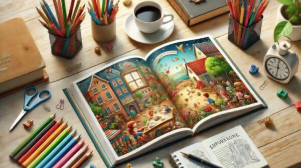
- Children’s books: Century Gothic or a rounded humanist sans serif for body text, with playful display fonts used sparingly on covers
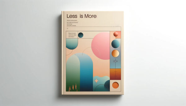
- Design forward and visual nonfiction: Futura or Avenir throughout
The safest approach is to match the reading speed a genre expects. Fast, plot driven genres do well with clean, low friction serif fonts, while slower, interpretive genres can support a font with a little more personality.
Display Fonts for Titles and Covers
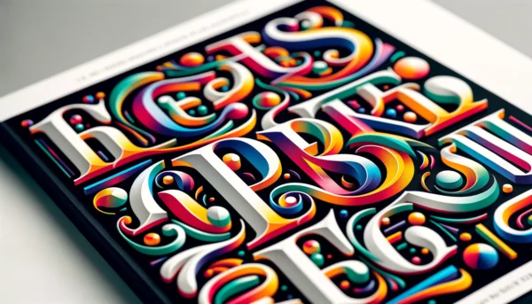
Display fonts belong in exactly three places in a book: the cover, the title page, and chapter headings, never the body text. These faces are drawn to be looked at rather than read continuously, which makes them the wrong tool the moment a reader needs to get through more than a line or two.
The safest pairing formula is to pick one display font for the cover and titles, then pair it with a plain, high readability serif or sans serif for everything else, a core rule of typography for covers. A cover built on three different decorative fonts reads as amateur before a potential reader ever opens the book, which is exactly why font choice is one of the biggest drivers of first impressions on a cover.
Free Fonts vs. Paid Fonts for Book Publishing
Free fonts, including the full Google Fonts library, are a legitimate choice for most self published books, and licensing is rarely the issue people assume it is. The real tradeoff is distinctiveness: a free, heavily used font makes a book blend into thousands of others set in the same typeface.
Paid fonts typically cost between twenty and a few hundred dollars for a full commercial license, and usually include more weights, better kerning, and broader language support. For a debut author on a tight budget, a well chosen free font (Garamond and its open source variant EB Garamond are both excellent and free) will not cost a single sale. For an author building a series or a distinct visual brand across a catalog, one paid display font for the covers is usually worth the investment.
Common Font Mistakes to Avoid
The most common mistake is using more than two fonts in a single book: one serif for body text, one sans serif for headings, and nothing else past that. Every additional typeface makes the book look more assembled and less intentional.
Other frequent mistakes:
- Pairing two serif fonts or two sans serif fonts together, which creates visual competition rather than intentional contrast
- Using Comic Sans or another informal display font anywhere in the body text
- Finalizing a font before checking a print proof, since a face that looks fine on a screen can read very differently on paper
- Ignoring how a font performs at a specific trim size, since a face that works well at 6 by 9 inches can feel cramped at 5 by 8
Consistency wins over cleverness almost every time. Whatever font gets chosen for chapter one should still be the font in chapter thirty.
FAQ: Fonts for Books
Q: What is the best font for a book?
Garamond is the best all around font for most books, because it was designed for readability across long stretches of text rather than for visual impact. It works well for fiction, memoir, and most nonfiction. The main exceptions are children’s books, which read better in a simple sans serif, and heavily illustrated nonfiction, which can support a more modern typeface throughout.
Q: What font are books written in?
Books are written in a serif font for body text, most commonly Garamond, Caslon, Baskerville, or Georgia. Sans serif fonts appear in books too, but almost always in headings, chapter titles, and covers rather than the main text, since the added strokes on a serif font make long paragraphs easier to read.
Q: What font size are books written in?
Book body text is typically set between 10 and 12 point, with 11 point the most common size for a standard trade paperback. Smaller trim sizes, like mass market paperbacks, often use 9 or 10 point to control page count, while larger formats can comfortably support slightly bigger type.
Q: What font do publishers prefer?
Traditional publishers most often use Garamond, Caslon, or another old style serif for body text, chosen for consistency and readability rather than personality. Many publishing houses also maintain a preferred house font for interiors across their catalog, so the exact choice varies slightly by imprint. For self published authors, sticking with the same handful of trusted serif fonts signals professionalism to readers and reviewers alike.
Q: What font does Harry Potter use?
The US editions of the Harry Potter books use Adobe Garamond for the body text, typically set around 11.5 to 12 point. Chapter titles use a separate display face, and the cover lettering is hand drawn artwork rather than a licensed typeface, which is why no single downloadable font matches the books exactly.
Q: Does it matter what font you use in a book?
Yes, font choice affects how long a reader can comfortably stay in your book, which directly affects whether they finish it. A poor font choice can make prose feel slower or heavier than it actually is, while a well matched font disappears entirely and lets the story carry the reading experience. For most books, a proven serif font for body text is the safest decision.
Q: What is the most common font for fantasy books?
Fantasy books most commonly use the same serif fonts as literary fiction, typically Garamond or Baskerville, since long chapters and dense worldbuilding both benefit from a font built for extended reading. Some fantasy titles use a decorative display font for chapter openers or drop caps to reinforce the tone and world of the fantasy genre, but body text almost always stays in a plain, readable seriff.
Q: What line spacing should I use for a book?
Book line spacing, or leading, typically runs between 120 and 145 percent of the font size, so an 11 point font usually sits well with about 13 to 16 points of leading. Genre fiction with tight page count targets often uses the lower end of that range, while literary fiction and nonfiction use more generous spacing to slow the reading pace and improve comprehension.