

You’re scrolling through a screen barely wider than your thumb, and one cover manages to stop you anyway. You don’t know the author. You haven’t read a single line of the blurb. Somehow the cover has already told you what you need to feel before you decide to tap it.
The best book covers work because they answer a question before the reader consciously asks it: what kind of experience is this, and is it for me? They answer it through three tools working together: color that signals mood, typography that signals tone, and a layout that tells the eye exactly where to look first.
Most cover advice stops there. What it skips is the detail that decides whether a self-published cover actually sells: almost every reader meets your cover first at postage-stamp size, in a thumbnail grid on Amazon or a retailer app, next to a dozen competitors. A cover that looks stunning full screen and disappears at 150 pixels wide has already lost that reader. Design for the thumbnail first, and the full-size version takes care of itself, which is exactly why beta testing a cover before launch catches problems a full-screen mockup hides.
The Science of First Impressions: Covers That Capture in 0.5 Seconds
A reader’s brain decides whether a cover is worth a second look in about half a second, long before it consciously reads a single word of the title. That snap judgment runs on contrast, pattern, and how quickly the eye finds a focal point. Covers that pass this test share one habit: a clear hierarchy, where the title lands first, a focal image lands second, and every other detail waits its turn.
From there, visual flow does the heavy lifting, moving the eye from title to image to supporting text without friction or confusion. Because here’s the truth: your cover has the attention span of a toddler on espresso. Use it wisely. Great cover design means choosing the few details that speak first, loudest, and cleanest, and cutting everything else. When every element knows its place, the brain clicks, curiosity sparks, and the reader leans in for more.
Color Palettes That Pop: How the Best Book Covers Use Color to Sell
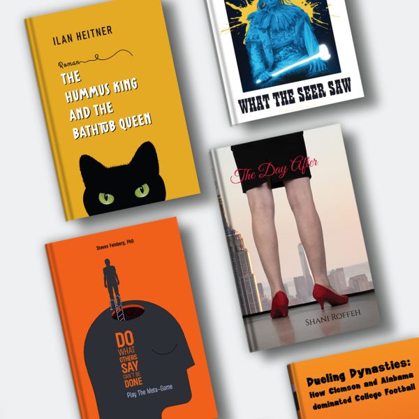
Color is the first signal a cover sends, and it sends it before the reader processes anything else on the page. Romance leans on blush, cream, and warm pastel to read as intimacy. Literary fiction leans on muted, desaturated tone to read as restraint and depth. Thrillers lean on black paired with red or acid yellow to read as danger, and that instinct runs deeper than genre convention, it’s rooted in the color psychology in book covers that shapes how fast a reader assigns mood to a page. Readers absorb genre through palette alone, often before they notice the title.
Here’s where most cover guides stop at the palette and skip the failure mode. Every genre palette has a pitfall that pushes it into the wrong category entirely:
| Genre | Typical Palette | Emotional Signal | Common Pitfall |
|---|---|---|---|
| Thriller / Suspense | Black, red, acid yellow, high contrast | Danger, urgency | Too much contrast reads as horror instead of suspense |
| Romance | Blush, cream, warm pastel | Intimacy, comfort | Tones that skew too bright read as young adult instead of adult romance |
| Fantasy / Epic | Deep jewel tones, metallics, atmospheric gradients | Wonder, scale | A palette copied from the current top three bestsellers reads as generic instead of original |
| Literary Fiction | Muted, desaturated, single dominant hue | Restraint, depth | A palette that’s too plain reads as memoir instead of fiction |
| Nonfiction / Self-Help | White space, one bold accent color | Clarity, authority | An accent color that’s too cold reads as academic instead of accessible |
When choosing a palette, think beyond what looks pretty. Ask what your color choices promise. Consider contrast for readability, cultural associations, and whether your palette fits your genre’s unwritten rules without blending into a sea of lookalikes. Steer clear of fleeting trends that age fast. Great color is timeless: your palette should help your story stand out today and still make sense five years from now.
Typography With Personality: Fonts That Tell a Story Before the Story
Typography is the first full sentence a cover speaks, before the reader reads the actual title. Sans serif fonts signal modern and approachable, which is why contemporary fiction and nonfiction lean on them. Decorative fonts signal genre-specific personality only, and outside that genre, they read as amateur rather than playful. Serif fonts signal tradition and literary weight, and picking the right typeface for your specific genre matters as much for readability at small sizes as it does for tone.
Your font choice works like an outfit on a first date. It reads as confidence or as nerves within the first glance, so choose deliberately. Spacing, hierarchy, and pairing decide the rest: tight enough to feel intentional, loose enough to breathe, title first and author name second. Get those right, and the typography does narrative work before anyone opens the book.
Layout Magic: Composition Tricks Behind the Best Book Covers
A strong cover layout tells the eye where to look in a fixed order: title first, focal image second, author name third, with each part of a cover earning its place rather than competing for the same glance. When that order breaks, so does the moment of impression, no matter how good the color or font choices are underneath it. Composition is the layer readers never consciously notice and always feel.
Title placement is often the star of the show. Centered titles feel bold and intentional, while top-heavy layouts suggest authority and tradition. Author names can sit quietly beneath the title or claim top billing, depending on fame level or brand strength. Imagery should support the text. When imagery and text compete for the same attention, neither wins, which is exactly the old design proverb: “If your title is fighting your image for attention, nobody wins.”
Negative space is another unsung hero. Giving your elements room to breathe creates balance, clarity, and a sense of professionalism. Too many competing visuals, and your cover starts to feel like a crowded elevator of ideas. Even small layout shifts, moving the title up, enlarging the focal image, tightening the crop, have been shown through A/B testing to meaningfully lift conversion rates. Sometimes the smallest adjustment produces the biggest jump in clicks.
Genre Signals: Why Readers Need Visual Clues More Than They Admit
Readers claim they don’t judge a book by its cover, and then they absolutely do exactly that within seconds of seeing one. A cover’s job is to signal genre fast enough that the right reader recognizes “this is for me” before reading the blurb. Romance signals through warmth and softness. Fantasy signals through symbolic motifs and atmosphere. Literary fiction signals through minimalism. Thrillers signal through stark contrast and sharp lines, and building suspense into a mystery cover often comes down to how much the imagery withholds rather than what it shows.
The trick is signaling genre expectations while still feeling fresh. Readers want a cover that feels familiar enough to trust and fresh enough to remember. Give them a cover that nods to the tropes they love, adds a clever twist, and promises the story they came for before they read a single word.
Trends vs. Timeless: Designing a Cover That Won’t Expire in Six Months
Trend-driven book covers age fast, often within a single publishing cycle, because they borrow their appeal from a visual moment rather than the story itself. Timeless covers use principles that don’t expire: clear hierarchy, immediate emotional clarity, and a concept strong enough to carry the design without leaning on a current aesthetic.
That doesn’t mean all trends are taboo. Some can give your cover a fresh, contemporary feel when used with intention. The key is asking whether a trend enhances your story or simply decorates it. If it’s the latter, back away slowly. Chasing trends is like wearing last year’s TikTok fashion: fun until it isn’t. Covers with a crisp title, purposeful imagery, and confident spacing age far better than something designed to match this month’s bestseller carousel. Your book will live longer than any trend. Its cover should too.
Final Takeaway: The Cover Is a Promise. Make It a Good One.
A book cover succeeds when it does one job well: it delivers an accurate promise about the read waiting inside, fast enough for a scrolling reader to trust it. Every choice in color, font, and layout exists to make that promise land in under a second, and to make it land honestly enough that the story can deliver on it once the reader opens the page.
So experiment boldly, choose intentionally, and let your design choices reflect what makes your book worth picking up in the first place. Aim for clarity, emotion, and a touch of courage. Perfection can wait.
FAQ: Best Book Covers
Q: What makes a book cover one of the best book covers in its genre?
The best covers signal genre, mood, and quality within half a second, using color, typography, and layout together rather than any one element alone.
Q: How do I design a book cover that stands out on Amazon and other online stores?
Use bold, readable typography, high-contrast colors, and one simple focal point that still reads clearly at thumbnail size, since that’s how most shoppers see it first.
Q: Do I really need a professional designer to create the best book cover for my book?
Not required, but strongly recommended: weighing DIY against hiring a professional usually comes down to whether layout, typography, and genre convention are things you can judge objectively about your own cover.
Q: What colors work best for book covers in different genres?
Thrillers use dark tones and sharp contrast, romance leans warm and soft, fantasy leans on deep jewel tones and metallics, and literary fiction favors muted, sophisticated palettes.
Q: How important is typography in creating the best book covers?
Extremely important: fonts communicate genre, tone, and professionalism, and bad typography can undercut even a strong illustration or photo.
Q: Should I follow current design trends when creating my book cover?
Use trends carefully. Let timeless principles, clear hierarchy, emotional clarity, and a strong concept, lead the design, with trends applied on top rather than driving it.
Q: Does my book cover need to work as a small thumbnail, not just full size?
Yes: most readers see your cover first as a thumbnail on a retailer page or social feed, so test it at roughly 300 pixels wide before finalizing the design.