Did you know that it takes just 7 seconds for a potential reader to decide if they’re interested in picking up your book? In those precious few moments, your cover has to make a lasting impression—and contrast is one of the secret weapons that can help your book stand out. Whether your book is fighting for attention on a crowded bookshelf or popping up in an endless online scroll, a well-designed cover with strong contrast can be the difference between grabbing a reader’s attention or being overlooked entirely. Let’s find out more on how to use contrast in book cover design.
From the colors you choose to the way you highlight your title and author name, contrast plays a massive role in making your book cover visually striking. Think of it as creating that “pop” factor—a balance between boldness and subtlety that instantly tells a potential reader, that this is the book you’ve been waiting for. Whether you’re designing for romance, mystery, or nonfiction, learning how to use contrast effectively will not only make your cover stand out but also give your book the best chance of being noticed.

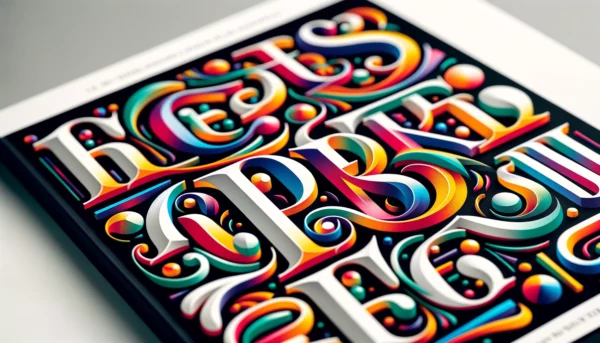
What Is Contrast in Book Cover Design?
The contrast in book covers and cover design is all about creating visual interest by placing opposing elements together—whether it’s bold colors, different fonts, or striking imagery. Essentially, contrast helps certain parts of your cover stand out, guiding the reader’s eyes to the most important details, like the book’s title or key imagery. Without contrast, even the most beautiful cover can fall flat, blending into the background rather than demanding attention.
One of the most common ways to use contrast is through color. For example, a deep, dark background with bright white or vibrant yellow text immediately draws attention to the title. But contrast can also be created through typography, by pairing a bold, modern font with a more delicate or cursive style. This helps to emphasize the title while adding layers of interest.
Beyond colors and fonts, the contrast in imagery also plays a major role. A dramatic, high-contrast image—such as a silhouette or bold graphic—can evoke strong emotions and set the tone for the book’s genre. In short, contrast isn’t just about making your cover “look good”—it’s about telling your story visually and grabbing the reader’s attention in an instant.
Understanding Color Psychology: Choosing the Right Contrasting Colors
Color isn’t just about aesthetics—it’s about evoking emotions and setting the mood for your book. In fact, research shows that 85% of consumers base their purchasing decisions on color alone, which means choosing the right contrasting colors for your book cover is crucial. This is where color psychology comes into play.
Colors have the power to trigger feelings. For example, purple is often associated with creativity and mystery, making it a popular choice for romance or fantasy covers. Pair it with a contrasting color like yellow, which conveys optimism and warmth, and you’ve instantly created a dynamic cover that grabs attention. Using complementary colors—those opposite each other on the color wheel—like blue, pink, and orange, can create striking contrasts that make your cover pop.
But it’s not just about what looks good. You want your colors to reflect your book’s genre and tone. A romance novel might use soft pinks and warm reds to evoke love and passion, while a thriller might lean toward darker colors with sharp, contrasting whites or reds to create tension. Understanding how colors affect human emotions, will help you choose the perfect contrasting palette that not only looks great but also resonates with your readers.
Your Publishing Journey Awaits – Start NowUsing Contrast to Highlight Key Elements on Your Book Cover
Contrast is your best friend when it comes to making sure important elements on the front cover of your book—like the title, subtitle, and author name—stand out. With a well-placed contrast, you can guide the reader’s eyes to exactly where you want them to look, ensuring nothing gets lost in the design.
One of the most effective ways to use contrast is with typography. Imagine a bold, blocky title paired with a more delicate subtitle—this not only makes the title jump out but also creates a visual hierarchy, helping the reader understand the flow of information at a glance. Similarly, using different font sizes and weights can highlight your name or a tagline, making these elements easy to spot.
But it’s not just about fonts—color plays a role here, too. A dark background with a light, bright title creates immediate contrast and makes the text pop. On the flip side, a light background with a bold, dark font can work wonders in genres like nonfiction or business, where clarity and professionalism are key.
By using contrast effectively, you ensure that no part of your design gets overlooked, making it easy for potential readers to pick out the title and key details at first glance.
Contrasting Imagery: Making Your Book’s Genre Shine
Imagery is one of the most powerful tools on your book cover, and contrast can make it even more impactful. The right contrast between imagery and background can immediately signal to potential readers what genre your book belongs to, whether it’s a dreamy romance or a thrilling mystery.
For romance novels, think of soft, pastel backgrounds with bold, contrasting imagery—a couple in a passionate embrace or a single symbolic object like a rose. This contrast not only captures attention but also sets the mood for the love story inside. On the other hand, thrillers or mysteries often use darker, moodier backgrounds with sharp, high-contrast imagery—silhouettes, shadows, or bold, red text that immediately gives off an air of suspense.
Even in nonfiction or self-help genres, contrast in imagery plays a significant role. A bright, clean background paired with secondary colors and a bold, central image—like a person overcoming a challenge or a strong graphic—can create a sense of clarity and focus, resonating with readers looking for personal growth or solutions.
By effectively contrasting imagery with the background and typography of the front cover, you can instantly communicate your book’s tone, genre, and message, ensuring it resonates with the right audience while standing out visually.

Balancing Contrast and Harmony: Avoiding Overwhelming Designs
While contrast is crucial for making your book cover pop, too much of it can create chaos. Like any good design, balance is key. You want to create a visually striking book cover design with colors that grab attention without overwhelming or confusing the viewer. Achieving the right balance between contrast and harmony is what turns a good design into a great one.
One common pitfall is overusing bold colors or fonts to the point where nothing stands out. If everything is competing for attention, nothing wins. To avoid this, focus on creating one or two areas of contrast—perhaps a bold title against a muted background or a striking image paired with understated text. This allows the eye to settle on key elements while still appreciating the overall design.
Harmony comes from ensuring the different elements of your cover—colors, fonts, imagery—work together cohesively. If your background is busy or textured, opt for simpler fonts and imagery to create a sense of balance. On the other hand, if your typography and title are bold, the background should be more subdued to let those elements shine.
By using design principles carefully balancing contrast with harmony, you can create a cover that draws readers in, communicates your story’s essence, and feels visually pleasing.
Contrast in Different Genres: Tailoring Your Design for Your Audience
Every book genre has its own design language, and contrast plays a huge role in ensuring your cover resonates with the right audience. Romance novels, thrillers, fantasy epics, and nonfiction books each use contrast in different ways to create contrast and appeal to their specific readers.
In romance novels, soft contrasts like pastel pinks against light blues or soft yellows against muted purples create a warm, inviting feel. The use of flowing script fonts paired with a subtle background image often works well to evoke emotions of love and tenderness. For these purple book covers though, the contrast is often more about subtlety—creating a sense of harmony while still allowing key elements to stand out, like the title or a symbolic image.
Thrillers and mysteries, however, rely on bolder contrasts to evoke suspense. Dark backgrounds paired with sharp, bright text in red, white, green, or yellow create an immediate sense of tension. This kind of high contrast visually communicates that the book is intense and full of intrigue.
Nonfiction books often go for clarity and professionalism. A light background with a dominant color and a strong, contrasting title in a clean, bold font is a classic approach. For self-help or business books, contrast is used to convey authority, reliability, and the promise of clear guidance.
By tailoring contrast to fit the tone and expectations of more readers of your genre, you ensure your book cover aligns with what your audience is looking for, making it easier to attract the right readers and stand out in the crowded market.
Your Publishing Journey Awaits – Start NowConclusion: How Contrast Helps Your Book Cover Pop
At its core, contrast is about making your book cover visually engaging and memorable. Whether it’s through color, typography, or imagery, using contrast effectively helps your cover stand out and clearly communicates the essence of your story. It guides potential readers to the most important elements of your book design—whether it’s the title, author name, or a powerful image—while setting the mood for your book.
When a book cover design is done right, contrast isn’t just about making your book look good; it’s about creating a cover that captures attention, speaks to your target audience, and gives your book the best chance of success. By balancing boldness with harmony and tailoring your design to your genre, you can create a cover that pops off the shelf, invites readers in, and compels them to pick up your book.
Mastering contrast is a crucial step in any book cover or design project. So, whether you’re working with a designer or trying your hand at it yourself, don’t be afraid to experiment with contrast—it could be the difference between blending in and standing out.
Ready to turn your manuscript into a masterpiece? With Spines, you get the tools, support, and community you need to publish like a pro. Join Spines today and take the first step toward bringing your story to life—your audience is waiting!