Think of your book cover as the opening scene of a great mystery film—it needs to captivate, intrigue, and leave the audience asking questions, all without giving away too much. For a suspense novel, the cover isn’t just decoration; it’s the first puzzle piece your readers encounter. In fact, studies show that 56% of readers admit the cover is the biggest influence on their decision to buy a book, second to the twists, secrets, and looming danger, your cover must hint at the unknown while pulling readers closer.
Whether it’s through haunting visuals, sharp typography, or the perfect color scheme, designing a mystery book cover is all about teasing the suspense without spoiling the story. Let’s dive into how you can craft a cover that makes readers turn the book over and say, “I have to know what happens next!”
Unraveling the Heart of Suspense: What Makes a Mystery Cover Effective
A successful mystery or suspense novel thrives on secrecy, tension, and unanswered questions—and your book cover should do the same. Before readers even open the book, they should feel the pull of hidden truths waiting to be discovered. The key elements that drive a suspenseful story—twists, clues, and high stakes—must be mirrored in the cover’s design. Whether it’s through a shadowy figure, a desolate landscape, or a single object that raises questions, your suspense book cover should reflect the heart of the mystery within.
Your Publishing Journey Awaits – Start NowCreating a sense of a cozy mystery covers isn’t about overwhelming the reader with details. Instead, it’s about teasing just enough information to spark curiosity. A cover can be a puzzle in itself, hinting at the plot without giving too much away. Think of it as the first clue in a long trail that your readers will eagerly follow. By understanding the core of your story, you can create a cover that feels like an invitation to uncover the secrets it holds.
Choosing the Right Imagery: Evoking Suspense with Visuals
When designing a suspenseful mystery book cover, imagery is your most powerful tool. The right visual can instantly evoke curiosity and build anticipation. Readers should feel a sense of mystery just by glancing at the cover, and this starts with carefully chosen images that suggest the unknown without revealing too much.
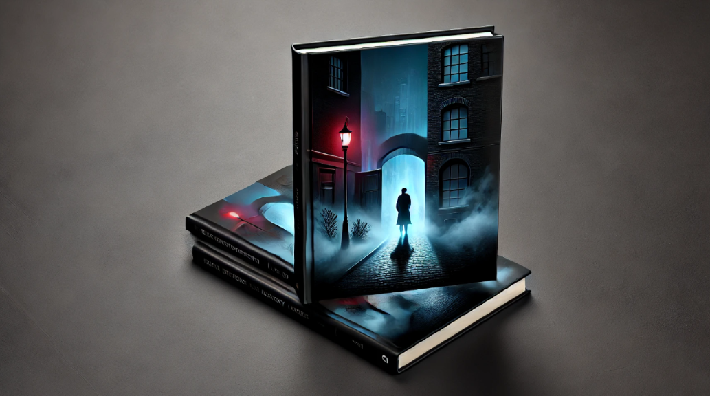
Consider using symbolic imagery—a dark alley, a foggy street, or a single, abandoned object. These visuals hint at hidden danger and unanswered questions. Think of a shadowy figure lurking in the background or subtle details like bloodstains or torn fabric. The goal is to invite the reader to ask, “What’s happening here? What’s the secret?”
It’s also important to build tension with your design. Shadows, contrasts, and silhouettes can create a feeling of unease and mystery. Avoid cluttering the cover with too many elements; instead, focus on a few striking details and ideas that leave room for the reader’s imagination to fill in the blanks.
For a truly interesting and captivating cover, let the imagery spark the reader’s curiosity, allowing them to feel like they’re uncovering the first clue in your suspenseful tale.
The Role of Color in Building Suspense
Color plays a huge role in setting the mood for a suspenseful mystery book cover. Dark tones like deep blues, blacks, and grays often dominate suspense and mystery covers because they instantly evoke feelings of tension, unease, and the unknown. A single pop of color—like a splash of red or a hint of gold—can symbolize danger, urgency, or even a hidden clue waiting to be uncovered.
A well-thought-out color palette can add layers to your cover design. Muted or desaturated colors can create a sense of mystery, while sharp contrasts, such as light against shadow, can heighten the feeling of suspense. The key is to ensure that the colors you choose reflect the tone of your book. A cozy mystery might lean toward softer, warmer hues, while a psychological thriller could dive into more sinister, dramatic shades.
Ultimately, color can communicate as much as the writing and visuals themselves. It’s a subtle yet effective way to give your readers a feel for the story before they even read the first word. Experiment with bold choices, and don’t be afraid to let the colors do some of the storytelling.
Typography: The Silent Communicator of Suspense
When it comes to designing a suspenseful mystery book cover, typography is often the unsung hero. The fonts you choose can subtly—or dramatically—set the tone for your suspense book covers and communicate the underlying tension in the story. A bold, sharp font might signal danger or urgency, while an elegant, serif typeface could hint at a more classic, slow-burning mystery.
Font size and spacing also matter. Tight, condensed lettering can create a sense of pressure and unease, while larger, spaced-out fonts give the reader room to breathe—often used to build suspense. For a psychological thriller, you might experiment with distorted or uneven fonts to mirror the unraveling of the protagonist’s mind. On the other hand, for a cozy mystery, softer, rounder fonts give off a more approachable vibe while still keeping a hint of curiosity.
Another crucial factor is the process of blending typography with the overall design. The font should complement the visuals without overpowering them, guiding the reader’s eye to important elements on the cover. In essence, typography should feel like an extension of the story—contributing to the suspense, not distracting from it.
Balancing Space and Details: Leaving Room for Imagination
In suspenseful mystery book covers, less is often more. When it comes to design, the balance between space and details is crucial. Too much clutter on the cover can overwhelm the viewer, but leaving just enough space for imagination to roam can be incredibly effective. Mystery thrives on what’s hidden and what’s hinted at, and your mystery book cover design should reflect this.
Your Publishing Journey Awaits – Start NowMinimalist designs, with strategically placed elements, can create a sense of intrigue. A single object, a shadowy figure, or an isolated symbol can be more powerful than a crowded scene. The empty spaces on your cover are not just blank—they are opportunities for suspense, drawing the viewer’s eye to what’s left unsaid and allowing them to imagine the rest of the story.
This approach creates a feeling of anticipation. The absence of obvious details makes readers curious to uncover what’s missing, subtly encouraging them to dive into the book for answers. By giving just a hint of the world and mystery within, you’re allowing the cover to act as the first puzzle piece in their journey through your story.
The Power of a Unique Concept: Standing Out in the Market
In a sea of mystery and suspense books, your cover needs to do more than just look good—it has to stand out. A unique, custom book cover can make all the difference, drawing in readers who are looking for something fresh and intriguing. Originality is key when designing a suspenseful mystery or suspense book cover yourself, especially in a genre that thrives on creativity and unexpected twists.
Collaborating with a designer who understands the nuances of the mystery genre is essential. They can help you explore bold, outside-the-box concepts that capture the essence of your story while still keeping it within the framework of a suspenseful narrative. Whether it’s experimenting with unusual imagery, playing with unexpected color combinations, or incorporating subtle yet powerful elements, a custom cover allows the designers and you to leave a lasting impression.
Remember, readers are often drawn to what feels different and intriguing. By investing in the other design elements for a unique design, you not only catch their attention but also give them a reason to pick up your book instead of the one next to it. Let your cover be a reflection of the unexpected twists and turns inside, making it impossible to resist.
Wrapping the Mystery in Style
Designing a suspenseful mystery book cover is a bit like plotting a thriller book with the perfect twist—keep them guessing, give just enough clues, and leave them wanting more. Your cover is the first clue readers encounter, so make sure it’s one they can’t ignore. With the right mix of imagery, color, typography, and a touch of mystery, you’ll have them hooked before they even crack open the book.
And remember, much like a detective at a crime or murder scene, a good cover leaves no detail unchecked—but always keeps a few secrets up its sleeve.
Spines Book Cover Design: Where AI Meets Creativity
At Spines, we understand that first impressions matter, and your book cover is often the first thing that captures a reader’s attention. That’s why we’ve combined advanced AI technology with human expertise to create stunning, professional covers that not only reflect your story but also stand out in the crowded marketplace. Our AI-driven cover design tool analyzes your manuscript and generates multiple cover options inspired by bestsellers in your genre—whether it’s a suspenseful mystery or a cozy thriller. From the front to the spine, every detail is crafted to perfection, ensuring your book cover resonates with your target audience.
But it’s not just about the visuals. With Spines, you have the freedom to experiment with different design elements, customize your cover, and make sure it truly represents the essence of your story. And the best part? It’s all included in our affordable publishing plans.
Ready to see your story come to life with a captivating cover? Sign up for free today and take the first step toward publishing your masterpiece with Spines!
Your Publishing Journey Awaits – Start Now


