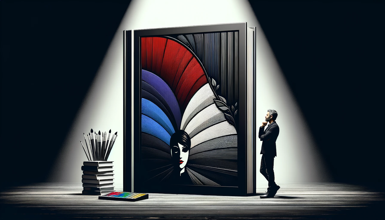
In the realm of literature, a book cover acts as the gateway to the world contained within its pages, offering the first crucial impression to potential readers. This visual introduction not only communicates the essence of the book’s content but also plays a pivotal role in capturing interest and inviting exploration. Amidst this visual communication, color psychology emerges as a foundational element, wielding the power to subtly influence emotions and perceptions. The strategic application of color psychology in book cover design transcends mere aesthetics, tapping into the depths of human psychology to evoke specific feelings and expectations.
By understanding and harnessing the nuanced language of colors, authors and designers can craft book covers that resonate and attract readers on an emotional level, aligning with the narrative’s tone and theme, and ultimately guiding the reader’s decision to delve into the book’s journey.
The Basics of Color Psychology in Book Covers
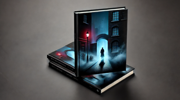
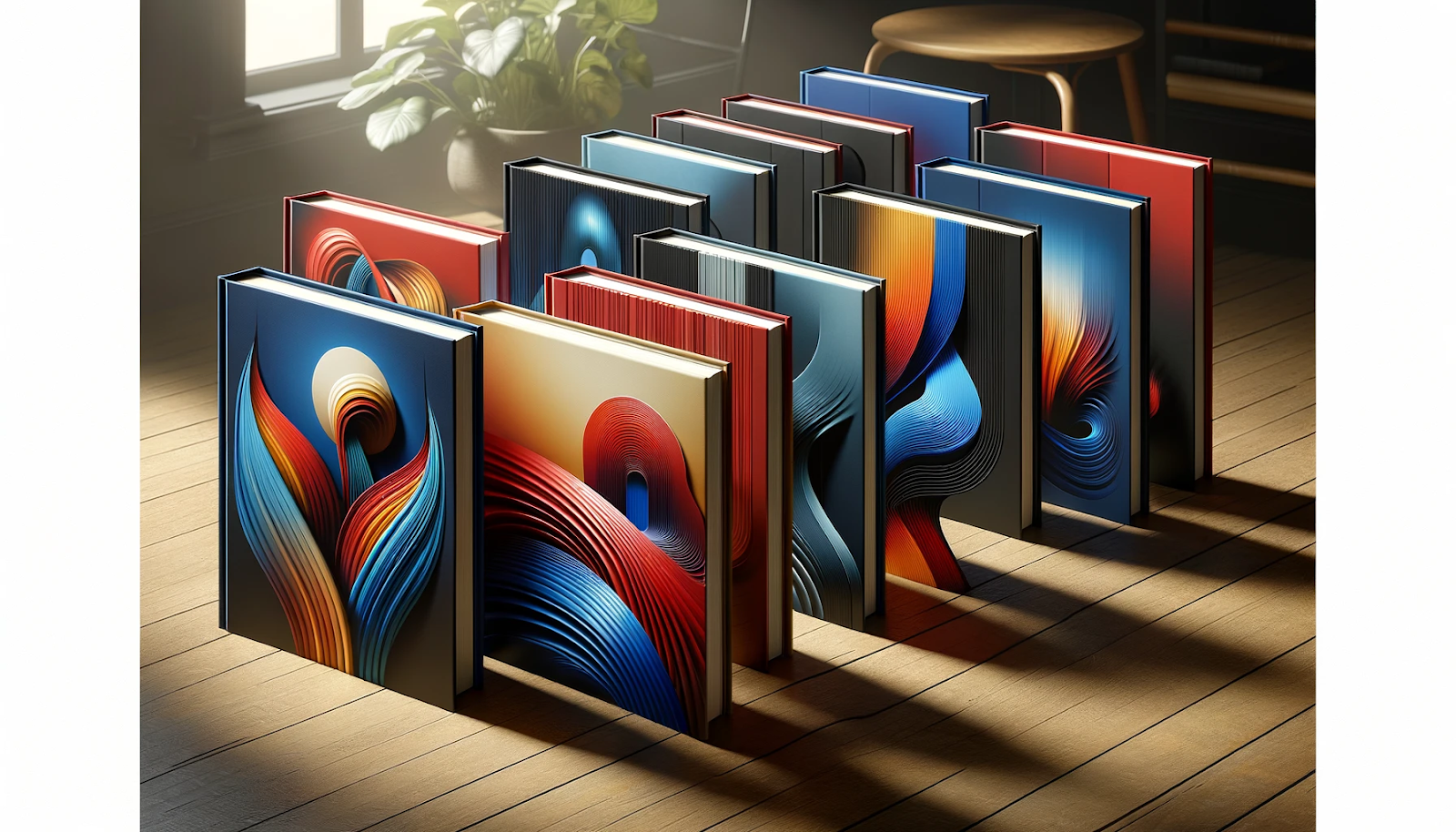
Color psychology delves into the profound impact that hues have on human emotions and behaviors, serving as a silent yet powerful communicator. Each color carries its psychological weight, triggering an array of responses that can sway perceptions and moods. For instance, red can evoke feelings of passion and urgency, while blue may instill a sense of calm and trustworthiness. This intricate dance of color and emotion is especially critical in the design of book covers, where the primary goal is to make a compelling first impression. The chosen palette not only reflects the content and mood of the book but also possesses the unique ability to attract or repel potential readers at a glance.
Your Publishing Journey Awaits – Start NowA well-considered color scheme can pique curiosity, convey the genre, and hint at the narrative’s underlying themes, all within the brief moment it takes for a viewer’s eye to settle on the book cover. Thus, the strategic use of color psychology in book covers is not merely an artistic choice but a crucial marketing decision that can significantly influence a book’s appeal and, ultimately, its success in the marketplace.
Understanding the Emotional Impact of Colors
Warm Hues: Yellow and Orange’s Vibrant Energies
Warm bold yellow is a beacon of ambition and optimism, its radiant energy fostering creativity and inspiration. Ideal for book covers that seek to motivate, warm bold yellow ambition captures the essence of innovation and forward-thinking. Orange, equally vibrant and energetic as warm bold yellow-orange symbolizes ambition, and embodies positivity and enthusiasm. It’s a color that promises adventure and wisdom, often used to denote prestige and success in a narrative, making these hues perfect for books that aim to uplift and energize their audience.
Passionate Depths: The Power of Dark Red and Brown
Dark red, with its passionate and powerful presence, evokes deep emotions and a sense of intensity. It’s the color of choice for covers that house dramatic and intense stories, symbolizing strength and vitality. Brown, in its earthy and stable nature, brings forth feelings of suspense and a connection to the natural world. It offers a sense of rugged reliability, making it suitable for adventure tales and narratives deeply rooted in nature.
Cool Serenity: Light Purple, Green, and Blue’s Tranquil Influence
Light purple offers a soft, ethereal touch, suggesting themes of truth, prosperity, and spiritual growth. It lends a serene and noble aura, ideal for books exploring personal enlightenment. Green, the emblem of nature, signifies growth and innovation, perfect for narratives that push the envelope or delve into environmental themes. Blue, mirroring the calm of the sky and sea, stands for dependability and health, making it a go-to for those book covers that aim to convey trust and tranquility, such as in self-help or medical narratives.
Neutral Tones: Grey and Pale Yellow’s Subtle Balance
Grey and blue, balancing neutrality with sophistication, introduces a hint of mystery and complexity to a fascinating world, fitting for intricate fantasy worlds or sophisticated narratives. Pale blue and yellow, with its subdued and gentle nature, evokes approachability and comfort, ideal for light-hearted novels or guides meant to soothe and assist, demonstrating how neutral blue tones can subtly but effectively set the tone for a diverse range of literary works.
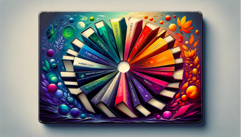
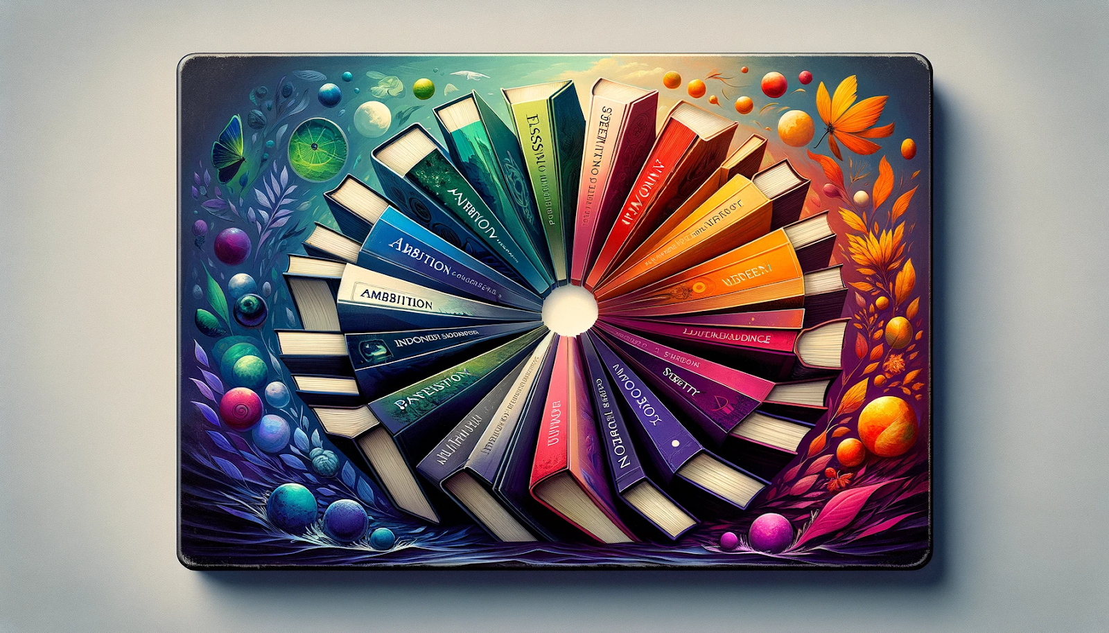
Color Combinations and Their Effects on Book Covers
The interplay of color combinations on book covers can evoke a spectrum of different emotions, and create associations throughout, far beyond what single colors can achieve. By strategically pairing hues, designers can create a visual harmony that narrates the book’s essence before the first page is turned. Complementary colors, sitting opposite each other on the color wheel, create a dynamic contrast that is visually striking and can emphasize the other color in the book cover’s central themes or emotions. For instance, the juxtaposition of blue and orange can balance feelings of trust with bursts of energy, ideal for a narrative that intertwines excitement with reliability.
Your Publishing Journey Awaits – Start NowColor schemes
Whether analogous, monochromatic, or triadic, contributes to the mood and tone of the cover. An analogous color scheme, using colors next to each other on the wheel, offers a serene and cohesive look, suitable for narratives requiring a subtle emotional depth. Monochromatic schemes, varying in lightness harmony dark purple depth, and saturation of a single dominant color throughout, can convey a range of emotions while maintaining a sophisticated simplicity, perfect for highlighting a book’s central theme without overwhelming potential readers.
Color palettes
Color palettes carefully curated for the book’s cover design, can be a powerful communication tool to elicit specific responses and set the stage for the reader’s journey. A palette combining warm and cool tones can suggest a balance of action and calm, suitable for a story that weaves through tumultuous events towards a tranquil resolution. Through these strategic combinations, colors hold immense power in shaping the reader’s perception and emotional response, making the color in the book cover a pivotal factor in the book’s allure and overall impact.
Implementing Color Psychology in Your Own Cover Design
For authors and designers eager to harness color psychology in their cover designs, a few practical tips can make a significant difference. Firstly, aligning color choices with the book’s mood and content is paramount. Reflect on the emotions and messages you wish to convey all the warning signs and select colors that embody these feelings. For a thriller, dark and intense colors like black or dark red can set a foreboding tone, while a light-hearted romance might benefit from soft pinks or lavender, suggesting tenderness and love.
Conducting proper research into color trends within your book’s genre can provide valuable insights. Trends can offer a glimpse into what readers currently find appealing, ensuring your book cover feels relevant and engaging. However, it’s also important to choose consciously how to differentiate your book covers from others, using unique color combinations to stand out on the shelves.
Utilizing tools like the color wheel can aid in understanding color relationships and selecting a harmonious palette. Complementary colors can create vibrant contrasts for a dynamic effect, while analogous colors offer a more subtle and cohesive look. Remember, the cover art’s ultimate goal is to evoke the desired emotional response from potential readers, guiding them to choose your book. Balancing trend insights with timeless principles of both color theory and psychology will ensure your cover is both eye-catching and emotionally resonant.
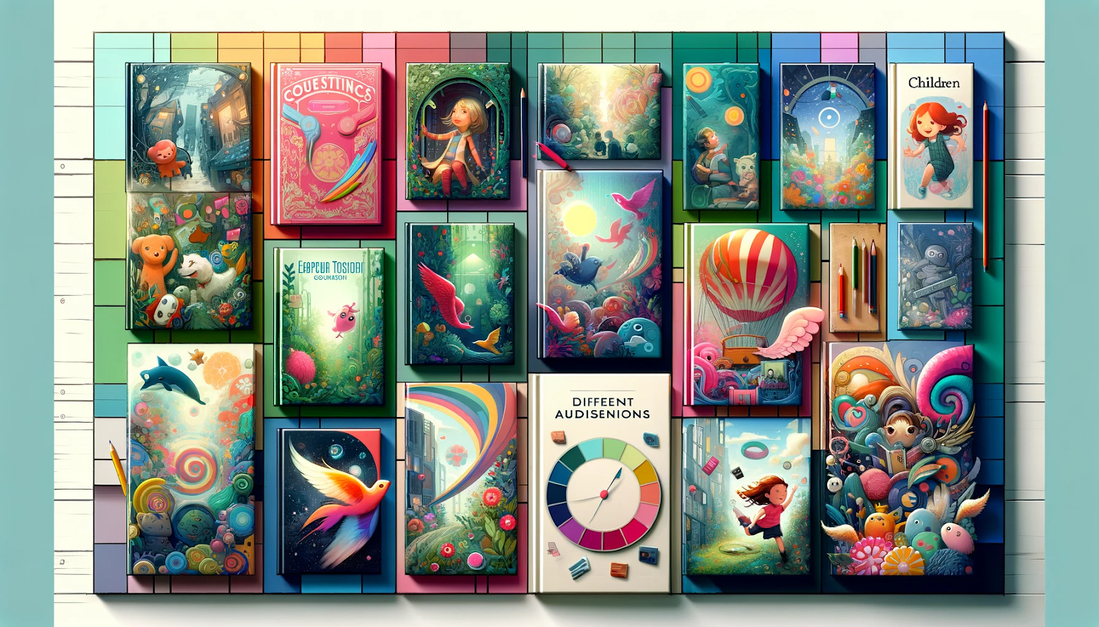
Designing for Your Target Audience
Designing book covers with the target audience in mind is crucial for resonating with potential readers and conveying the appropriate message. For children’s books, bright colors and playful combinations can captivate young minds, with shades of bright green pale yellow, or pink signaling fun and adventure, inviting curiosity and exploration. Romance novels often lean towards soft pastels or rich, deep hues like purple and red, evoking feelings of love, passion, and intimacy, drawing in readers seeking emotional and romantic narratives.
Self-help books benefit from calm, reassuring colors like blue, pink covers, or pale yellow, which can convey a sense of tranquility, optimism, and approachability, appealing to individuals seeking guidance and personal growth. Business books, on the other hand, often employ strong, solid colors such as navy blue or dark green, which denote professionalism, stability, and growth, attracting professionals and entrepreneurs looking for insights and strategies to succeed in their careers.
Understanding the psychological impact of these colors and their associations allows designers to create book covers that not only attract attention but also speak directly to the desires and needs of the intended audience. This tailored approach ensures that whatever color represents an essential element of the book stands out and immediately attracts the attention of those most likely to be interested in its content, significantly increasing its appeal and potential impact.
Revolutionizing Book Cover Design with Spines
Spines is a groundbreaking platform designed to revolutionize the process of self-publishing and book cover design by leveraging the power of artificial intelligence. This innovative tool offers a seamless and efficient alternative to the traditional challenges faced by authors in creating compelling covers for their books.
Your Publishing Journey Awaits – Start NowTraditionally, authors had two main paths for cover design: undertaking the arduous journey of learning the intricacies of design, using color theory, psychology, and illustration themselves—often with mediocre results—or investing a significant amount of money to hire professional designers, which isn’t a viable option for many. Spines present a third, more efficient solution.
The cover design feature on the Spines platform is a game-changer. It simplifies the book cover design and creation process by analyzing an author’s entire manuscript, summarizing its essence, and then generating a range of professional and visually appealing book cover design options. This AI-driven approach draws on a vast database of successful books across various genres to ensure that each book cover design is not only stunning but also genre-appropriate.
What sets Spines apart is its comprehensive coverage; the tool designs not just the front cover but also the back cover and spine, providing a complete package that’s currently an unparalleled marketing tool in the market. By simply signing up and uploading their manuscript to Spines’ platform, authors can embark on a hassle-free journey to obtaining a captivating book cover that stands out in the crowded literary landscape.
In conclusion, the strategic use of color psychology in book covers is a potent tool in the arsenal of authors and designers, capable of evoking specific emotions and drawing in the intended audience. The careful selection of colors and their combinations can significantly influence a reader’s perception and interest in a book. As we’ve explored, colors hold the power to communicate themes, evoke emotions, draw attention, set the mood, and make a memorable first impression. Authors and designers are encouraged to harness this knowledge consciously, choosing hues dominant colors that not only complement the content but also resonate with potential readers, thereby enhancing the book’s appeal and its success in the literary marketplace.

FAQ’s
1. How does color psychology impact a reader’s perception of a book cover?
Color psychology plays a crucial role in shaping a reader’s emotional response to a book cover. Specific colors on book covers can evoke certain emotions and create an immediate impression, influencing the reader’s decision to explore the book further.
2. Can the color scheme of a children’s book cover affect its sales?
Absolutely. The color scheme can significantly impact a book’s attractiveness to potential buyers. A well-chosen color palette can draw attention, convey the book’s mood, and resonate with the target audience, potentially boosting sales.
3. How do I choose the right color combination for my book cover?
Consider the emotions and themes you wish to convey through your book. Use the color wheel to explore complementary and analogous color schemes that align with your book’s genre and content. Experiment with different combinations to see what feels right for your story.
4. Is it necessary to follow color trends in book cover design?
While being aware of color trends can be beneficial, it’s more important to focus on what best represents your book and appeals to your target audience. Trends can inspire, but authenticity should guide your final choice.
5. How can Spines’ cover design feature help in creating my book cover?
Spines’ cover design uses AI to analyze your manuscript and generate cover designs based on successful books in your genre. It offers a range of professional, genre-appropriate options, making the design process more accessible and tailored to your book’s specific needs.
Your Publishing Journey Awaits – Start Now