In the realm of literary arts, the adage “don’t judge a book by its cover” often falls by the wayside, as the cover stands as the silent herald of the tales nestled within its pages. Among the myriad of styles gracing bookshelves, the concept of minimalist book cover design has surged in popularity, championing the ethos of simplicity and clarity. This design philosophy strips away the obvious and superfluous, allowing fundamental elements such as typography, color, and space to narrate the story’s essence with understated elegance.
The minimalist approach to both literature and book covers is not merely an inspired aesthetic choice but a strategic one, designed to capture the wandering eye of a reader in a sea of visual noise. A well-crafted book cover also serves as a beacon, inviting readers into a new world while setting the tone and expectation for the journey ahead. In an age where the visual often precedes the verbal, the importance of a book’s cover cannot be overstated, making minimalist design a potent tool in the arsenal of authors and designers alike.
Start Your Publishing Journey FOR FREE
The Essence of Minimalist Book Cover Design
Minimalism in graphic design is an aesthetic that hinges on the ‘less is more’ philosophy, emphasizing the idea that simplicity and clarity lead to good design. This design approach is characterized by its uncluttered layouts, clean lines, limited color palettes, and an overall focus on the essentials rather than embellishments. The core principles of minimalism include simplicity, functionality, and emphasis on the content itself, often resulting in designs that are striking in their apparent ease and understated elegance. Book cover trends are always changing, but some elements will always stand the test of time.
Cover Design
When applied to book cover design, these minimalist principles transform the cover into a canvas where every element serves a purpose. Simplicity in book cover design means stripping away unnecessary graphics, images, or text that do not contribute to conveying the book’s essence. This deliberate reduction not only focuses the potential reader’s attention on the most important elements but also creates a visually calming entry point into the narrative world of the book.
The use of space, or negative space, is another hallmark of the minimalist style of design that plays a pivotal role in the minimalist style of book covers. This space is not merely empty; it’s a powerful tool that helps to frame and highlight the elements that are present, often leading to a more impactful and memorable design. The strategic use of space can evoke emotions or themes related to the book’s content, making the cover not just a protective layer but a part of the storytelling process.
Typography in minimalist book cover design is not just a means of conveying the title and author’s name but an integral part of the visual appeal and thematic expression. The choice of font family, size, color, and placement can all contribute to the mood and message of the book cover designed throughout, with minimalist designs often opting for strong, readable typefaces that make a statement without overwhelming the senses.
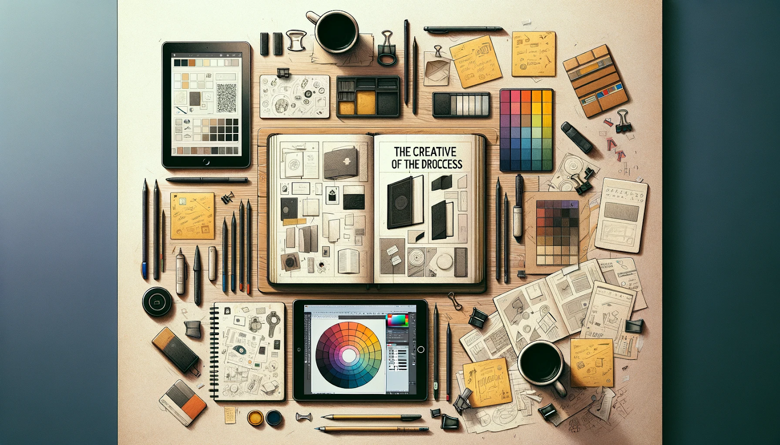
The Creative Process of a Minimalist Book Cover
The creation of a minimalist book cover is a journey that melds creativity with strategic design, where each step is pivotal in translating a book’s essence into a singular, compelling visual. This process often unfolds as follows:
Start Your Publishing Journey FOR FREE1. Understanding the Book’s Essence:
The first step involves immersing oneself in the book’s world—its themes, characters, tone, and the emotions it seeks to evoke. This deep understanding forms the foundation of the rest of the design process, guiding the designer in capturing the narrative’s soul.
2. Initial Conceptualization:
Armed with insights and inspiration from the book, the designer embarks on generating initial ideas. This stage is characterized by brainstorming sessions where various concepts are explored, often through sketches or digital mockups. The aim is to find a creative angle or idea that resonates with the book’s essence while adhering to minimalist principles.
3. Refinement of Ideas:
From the plethora of initial concepts, a select few are chosen for further development. This refinement process involves critiquing each idea’s ability to communicate the book’s title, whole idea, or essence effectively and its visual impact. Feedback from the author or publishing team can be invaluable during this phase.
4. Focusing on Key Elements:
With a clear direction in mind, the designer zeroes in on the key elements of the design—typography, word used, color, and imagery. In minimalist design, each of these elements must carry significant weight, conveying meaning and emotion. The choice of a font, the color palette, and any imagery or symbols used are all meticulously considered and tested in various compositions.
5. Experimentation with Layout and Space:
A hallmark of minimalist design is the effective use of space. The designer experiments with different layouts, adjusting the balance between the visual elements and the negative space. This step is crucial in achieving a design that feels both unified and dynamic, inviting the viewer’s eye to engage with the cover.
6. Finalization and Refinement:
With the layout and key elements in place, the design undergoes a series of refinements. This includes adjusting the scale, contrast, and alignment of elements to ensure the cover is visually harmonious and effectively communicates the book’s essence. Attention to detail is paramount, as even minor adjustments can significantly impact the design’s overall feel.
7. Mockups and Feedback:
Before finalizing the cover design, mockups are often created to see how the cover looks in various formats, such as in print, as an ebook, or displayed online. Feedback from the author, publishers, and potential readers can provide valuable insights, leading to final adjustments.
8. Delivery of Final Design:
Once all elements are perfected, the final design is prepared for production. This involves ensuring the cover meets all technical requirements for printing or digital display, marking the culmination of a thoughtful creative process that transforms a simple concept into a powerful visual narrative.
Throughout this creative journey, the designer’s role is not just as a creator but as a storyteller, distilling the complex world of a book into a minimalist cover that speaks volumes with its simplicity and elegance.
Why Minimalist Covers Work: Psychology and Impact
Minimalist illustrations on book covers wield a subtle yet profound psychological influence, captivating attention and setting expectations through their understated elegance. The effectiveness of minimalist books and art design in engaging readers can be attributed to several psychological underpinnings:
Cognitive Clarity: In a world brimming with information and visual stimuli, the simplicity of a minimalist book cover offers a visual respite, making it a beacon for attention. The human brain is wired to appreciate clarity and ease of processing. A minimalist design, free from clutter, allows readers to quickly grasp the book cover’s message or mood, making the book more memorable and appealing.
Emotional Resonance: Minimalist covers often use a single powerful image or a bold typographic treatment to evoke emotions or themes. This focused approach can resonate more deeply with viewers, as it leaves room for personal interpretation and emotional connection. The space and simplicity in the design invite readers to fill in the gaps with their imagination, creating a more personalized and impactful experience.
Perceived Value and Quality: Minimalism in design is frequently associated with sophistication and high quality. A minimalist book cover can convey a sense of confidence in the content, suggesting that the story or information within is compelling enough to stand on its own without the need for elaborate embellishments. This perception can elevate the reader’s expectations and interest in the book.
Setting the Tone: The minimalist approach to book cover design can effectively set the tone for the rest of the book’s content, guiding readers’ expectations. Whether it’s a serene and spacious layout indicating a reflective narrative or a bold, stark typography hinting at a powerful drama, the design cues help prime readers for the experience that awaits them.
In essence, minimalist book covers leverage psychological principles to create a visual and emotional impact, drawing readers in with their simplicity and clarity. By distilling a book’s essence into a singular, compelling design, these covers not only capture attention but also shape the reader’s journey from the very first moment of first glance.
Case Studies: Iconic Minimalist Book Covers
Minimalist book covers, with their powerful simplicity, have made indelible marks on the literary landscape. These case studies showcase iconic minimalist cover designs, unraveling how each element contributes to creating their lasting impact.
Start Your Publishing Journey FOR FREEGeorge Orwell’s “1984”: A seminal example of minimalist cover design, “1984” has been reimagined multiple times, but its most striking editions often employ stark minimalism to evoke the book’s dystopian themes. One notable version features a stark black background with the title and author’s name in crisp, bold white typography, interrupted by a single, ominous eye. This eye serves as the central imagery, symbolizing the oppressive surveillance state Orwell depicted. The use of negative space around the eye amplifies its impact, making the cover a compelling visual metaphor for the book’s exploration of privacy invasion and totalitarianism.
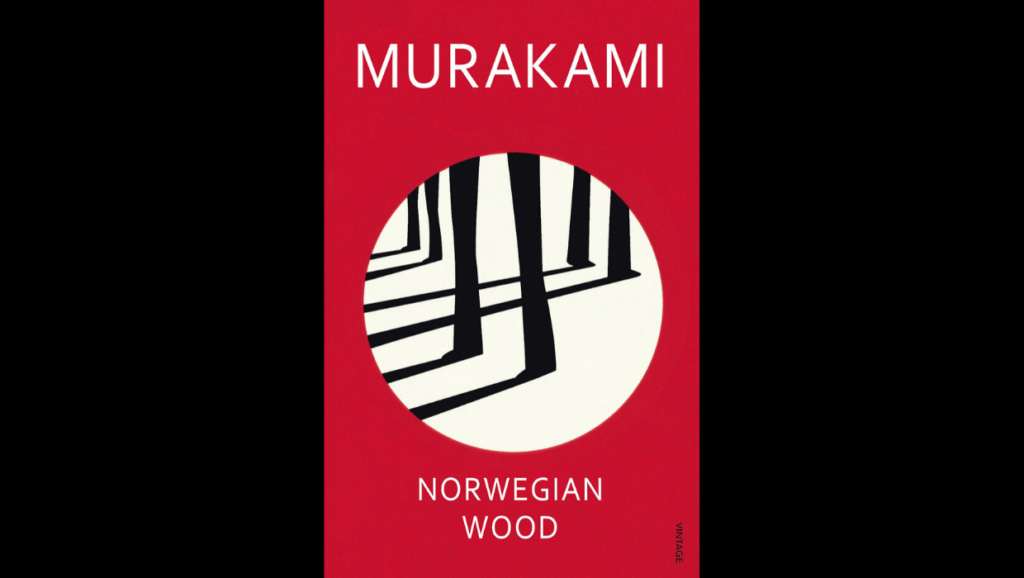
Haruki Murakami’s “Norwegian Wood”: This cover employs minimalism through a serene, almost Zen-like aesthetic, mirroring the novel’s introspective and melancholic tone. A simple, solitary tree against a vast, empty background evokes a sense of isolation and introspection, themes central to the narrative. The title and author’s name are presented in subtle, clean typography, ensuring the imagery’s emotional resonance takes center stage. The limited color palette, often in muted tones, complements the cover’s tranquil, minimalist vibe, inviting readers into Murakami’s contemplative world.
“The Girl with the Dragon Tattoo” by Stieg Larsson: The cover of this modern thriller exemplifies minimalism’s power to intrigue and allure. Often featuring nothing more than a girl against a stark background with the title’s typography intertwined with a simple, yet striking dragon tattoo design, the cover captures the essence of the story’s mystery and intensity. The contrast between the background and the tattoo design emphasizes the novel’s themes of contrast and conflict, drawing readers into the enigmatic world Larsson created.
“To Kill a Mockingbird” by Harper Lee: Some minimalist editions of this classic novel showcase its thematic richness with deceptive simplicity. A memorable version features the silhouette of a mockingbird, poised as if in mid-flight, against a clean, white backdrop. The simplicity of the imagery, coupled with classic, understated typography, speaks volumes, symbolizing the innocence and fragility central to the novel’s narrative. The use of negative space around the mockingbird not only focuses the viewer’s attention but also reflects the novel’s exploration of moral and ethical vacuums in a racially divided society.
Each of these covers demonstrates how minimalist design, through careful choice of color, typography, and imagery, can distill a book or subject’s essence into a single, compelling visual. These covers do not just decorate the book but deepen the reader’s engagement with the title, its themes, and stories, proving that in the realm of book cover design, less can indeed be more.

Tips for Creating Your Minimalist Book Cover
Creating a minimalist book cover that captivates and conveys your book’s essence requires careful consideration and a strategic approach. Here are some practical tips for authors and designers embarking on this creative journey:
Start Your Publishing Journey FOR FREE1. Focus on the Core Message: Start by identifying the central theme or message of your book. Consider what emotion or idea you want the cover to suggest or evoke and use this as the guiding principle for your design.
2. Choose Typography Wisely: Typography is a powerful tool in minimalist design. Opt for clean, strong typefaces that align with your book’s tone. For fiction, a serif font might add a touch of elegance, while sans-serif fonts can suit non-fiction for their clarity and modernity. Ensure the typography is legible and stands out, even in thumbnail size for digital displays.
3. Limit Your Color Palette: A limited color scheme can enhance your cover’s minimalist appeal. Choose colors that reflect the book’s mood—cool tones for a serene or suspenseful story, warm tones for romance or adventure. Consider also the psychological impact of colors and how they can influence a potential reader’s perception of the new book.
4. Use Imagery Sparingly: In minimalist design, less is more when it comes to imagery. A single, powerful image or graphic element can be more effective than a busy composition. This image should encapsulate your book’s essence and be open to interpretation, allowing the viewer’s imagination to engage with the title and cover.
5. Leverage Negative Space: Negative space is not empty space; it’s an active design element. Use it to frame and emphasize your typography or imagery, creating a focal point that draws the eye.
6. Iterate and Test: Design is an iterative process. Create multiple versions of your cover and seek feedback from a diverse audience. Testing how your cover looks in different sizes and formats can ensure its effectiveness across various platforms.
Tools and Resources:
Design Software: Adobe InDesign and Photoshop are industry standards, offering extensive features for typography, color management, and image editing. For those seeking simpler, more accessible tools, Canva and Adobe Spark provide user-friendly interfaces and templates tailored for book covers.
Typography Resources: Websites like Google Fonts and Adobe Fonts offer a wide range of examples of free and premium fonts suitable for book cover design.
Color Scheme Generators: Tools like Coolors and Adobe Color can help you explore and select harmonious color palettes for your cover.
By adhering to these tips and utilizing available resources, you can craft and create a minimalist book cover that stands out for its simplicity, clarity, and emotional resonance, effectively drawing readers to discover your story.

Spines: Revolutionizing Book Cover Design with AI
Spines, an AI-powered publishing platform, introduces a revolutionary approach to book cover design, offering a seamless and efficient alternative to traditional methods. Traditionally, crafting a book cover involves a steep learning curve, where one must master various aspects such as color psychology, illustration, and design principles. This DIY route often leads to mediocre outcomes due to the complex skill set required. On the other hand, hiring a top professional designer or graphic designer guarantees quality but comes with a hefty price tag, making it an impractical choice for many aspiring authors.
At Spines we offer a cover design tool that is a game-changer for authors seeking high-quality, professional book covers without the exorbitant costs or the steep learning curve. This innovative tool harnesses the power of AI technology to transform the book cover design process. By analyzing your entire manuscript, Spines’ tool summarizes the core themes and narratives to generate stunning cover options. It draws from a vast database of successful books in your specific genre, ensuring that the designs are not only beautiful but also genre-appropriate and market-relevant.
The magic doesn’t stop at the front cover; Spines’ tool extends to crafting the back cover and spine, offering a comprehensive package that’s often overlooked in other design solutions.
Getting started with Spines is straightforward and cost-effective. The platform allows free initial use, inviting authors to explore the possibilities without financial commitment. Simply sign up, upload your manuscript, and witness the transformation of your narrative into captivating cover designs that promise to engage readers at first glance. Spines embody the most efficient path to achieving professional, eye-catching book covers, redefining the design process for authors everywhere.
Start Your Publishing Journey FOR FREEConclusion
In the art of book cover design, minimalism emerges as a compelling testament to the power of simplicity. By distilling a book’s essence into its fundamental elements—selective typography, a restrained color palette, and purposeful imagery—minimalist covers captivate and communicate with understated elegance. This article has underscored the psychological allure and strategic craftsmanship behind minimalist design, offering insights and practical tips for creating impactful covers. Authors and designers are encouraged to embrace minimalism, not as a constraint, but as a creative catalyst that can convey the heart of a story with clarity and intrigue. In the realm of book covers, indeed, less can be infinitely more, inviting readers to explore the depths within from the very first glance.