A great horror book cover does more than just catch the eye—it sends a shiver down your spine before you even open the first page. Dark imagery plays a crucial role in setting the tone, hinting at the terror that awaits inside. Whether it’s a haunting figure lurking in the shadows or a color palette that screams danger, these covers give readers a taste of the fear, suspense, and thrill to come. In this article, we’ll explore how the right visuals can transform a cover into an unforgettable invitation to your darkest nightmares.
The Psychology of Dark Imagery in Horror Covers
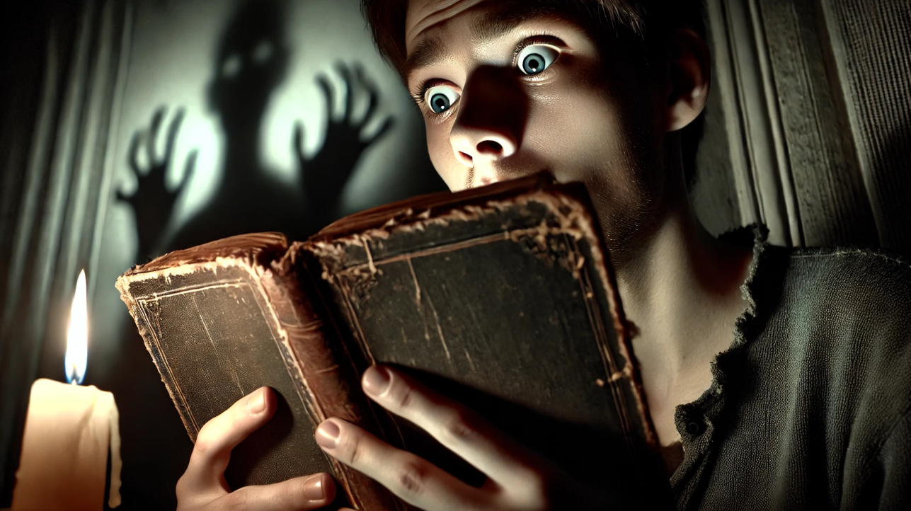
Dark imagery taps into our most primal fears, and that’s what makes it so effective on horror book covers. The human brain is wired to respond to visual cues that suggest danger or uncertainty, like shadows, eerie figures, or unsettling landscapes. These elements trigger feelings of unease and curiosity, urging readers to pick up the book and explore what lies beneath the surface.
A well-designed horror cover uses surreal depictions, such as distorted faces or looming structures, to evoke fear and mystery. It teases the terror that awaits without revealing too much, leaving the mind to fill in the blanks. For example, covers featuring haunted houses, stormy skies, or lurking monsters immediately communicate a sense of dread, setting the stage for psychological twists within the story.
Studies on color psychology also show that dark, muted tones—like deep blacks, grays, and reds—intensify feelings of foreboding, while stark contrasts, such as blood-red on a black background, draw attention and suggest violence or danger. Thus, dark imagery on a horror cover isn’t just about aesthetics—it plays directly into the psychological experience of fear, making the book irresistible to potential readers.
By combining these elements, horror covers don’t just hint at a story—they invite readers to confront their deepest fears head-on.
Essential Elements of an Effective Horror Book Cover
An effective horror book cover does more than just look creepy—it combines several visual and design elements that work together to create a powerful and chilling first impression. The most successful covers masterfully blend typography, imagery, color palettes, and composition to strike the perfect balance between intrigue and terror.
Typography is one of the first things readers notice as fonts can tell a lot about the tone of the book. Jagged, dripping fonts might suggest a supernatural tale, while clean, minimalist text paired with eerie imagery hints at psychological horror. The choice of font must complement the story’s tone and style, helping to establish the book’s genre from the moment a reader glances at the cover.
Color palettes play a huge role in setting the mood. Dark, muted colors like black, gray, and deep reds are often used to evoke a sense of danger, mystery, and fear. The contrast between light and dark—like a splash of red on an otherwise black background—can symbolize violence, blood, or danger, immediately grabbing the reader’s attention. For instance, classic horror novels like The Exorcist and Pet Sematary use stark contrasts to amplify their unsettling themes.
The imagery itself must be carefully chosen to communicate the core elements and ideas of the story. Haunted houses, ominous figures, or grotesque creatures are common motifs that instantly tell potential readers what kind of horror awaits inside. However, subtlety can also be a powerful tool. Sometimes, a seemingly innocent image, like a cracked porcelain doll or an empty swing, can evoke an even deeper sense of unease by allowing the reader’s imagination to fill in the horrifying blanks.
Composition ties everything together. The arrangement of these visual elements creates the overall feel of the cover. Whether the imagery dominates the space or the typography is bold and takes center stage, the composition needs to draw the eye and build anticipation for the terror lurking within the pages.
By carefully weaving together these key elements, a horror book cover becomes a window into the story, setting the tone and capturing the essence of the terrifying tale while sending shivers down the spine of potential readers.
The Influence of Gothic Horror on Modern Book Covers
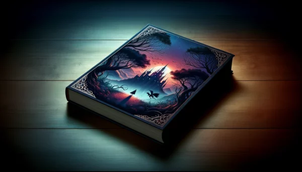
Gothic horror, with its dark castles, shadowy figures, and eerie landscapes, has left an indelible mark on modern horror book covers. Even today, many covers borrow heavily from the visual language of classic gothic literature to evoke the same feelings of dread and unease that have haunted readers for centuries.
In classic gothic novels like Dracula or Frankenstein, the cover imagery often featured crumbling mansions, stormy skies, or mysterious figures cloaked in darkness. These elements have become synonymous with the horror genre, representing themes of isolation, madness, and the unknown. Modern horror covers continue to draw inspiration from these gothic motifs, updating them for contemporary audiences while retaining their haunting charm.
For instance, contemporary horror novels may showcase shadowy, crumbling houses or fog-filled landscapes but with a more minimalist approach. The focus may shift to a single stark image, like an ominous doorway or a lone figure standing in the distance, hinting at the haunted house and the horrors within. This blending of gothic aesthetics with modern design principles helps create covers that feel both timeless and fresh.
Gothic horror also introduced the use of contrast between light and dark, a technique still prevalent in modern covers. The looming shadows against the pale moonlight or the flickering candle in a darkened hallway set an eerie atmosphere that draws readers into the world of the supernatural. Today’s designers often incorporate these visual cues to pay homage to the gothic tradition while keeping the look contemporary and engaging for mdoern audiences.
By infusing modern covers with elements from gothic horror, designers tap into a well of fear that has been effective for generations, ensuring that even in the digital age, these chilling tales continue to captivate readers with their haunting visuals and terrifying tales.
Creating Fear with Color: The Role of Color Palettes
Color plays a crucial role in evoking fear and setting the mood on horror book covers. The right color palette can stir emotions, spark curiosity, and give a subtle yet effective preview of the terror within the pages. Dark tones, eerie contrasts, and muted hues are often the go-to choices for horror designers, but how these colors are combined can make all the difference in a book’s appeal.
Dark, muted colors like black, deep gray, and blood red are staples in horror book covers for a reason—they immediately create a sense of danger and foreboding. Black often symbolizes the unknown, death, or evil, while red hints at violence, blood, and danger. Combined, these colors stir primal fears, drawing potential readers closer while sending shivers down their spines.
However, effective horror covers often go beyond just black and red. Designers use color contrasts to make certain elements pop and to guide the viewer’s eye to key parts of the cover. For example, a bright splash of red on a predominantly dark background can create an unsettling sense of urgency, as if something horrifying is about to happen. This technique is often seen in horror classics like The Exorcist, where contrasting elements amplify the sense of unease.
Another powerful tool is the use of muted, washed-out tones to create a sense of dread. Instead of relying on bold, garish colors, some of the most effective horror book covers use desaturated palettes—pale grays, faded yellows, or sickly greens—to evoke feelings of decay, illness, and the supernatural. These colors suggest that something is off, without screaming it, allowing the reader’s imagination to fill in the gaps.
Ultimately, the use of color in horror book cover design is about balance. Too much darkness can overwhelm the cover, making it difficult to differentiate the elements, while too much brightness takes away from the eerie atmosphere. Designers carefully craft palettes that stir fear while leaving just enough to the imagination, creating a lingering sense of unease that pulls readers into the story.
In horror, color is more than just a visual choice—it’s a psychological tool that helps create an atmosphere of fear and mystery, giving potential readers a taste of the terrifying journey that awaits.
The Art of Minimalism in Horror Covers
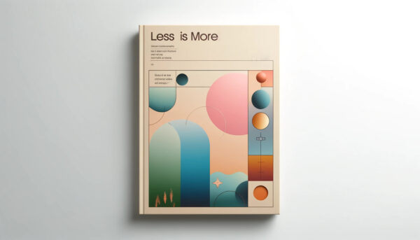
Sometimes, what you don’t show can be scarier than what you do. Minimalism in horror book cover art and design is a powerful approach that relies on subtlety to create fear and intrigue. Instead of overwhelming readers with graphic images or busy designs, minimalist covers let the imagination anticipate the horrors within.
Minimalist horror covers often use stark imagery—a single unsettling object or a shadowy figure—to convey a sense of dread. This approach invites readers to wonder about the story’s darker themes. For example, a lone silhouette standing in the distance or a barely visible face emerging from the shadows can be more terrifying than a gruesome depiction. The absence of detail fuels curiosity and stirs fear, as the mind fills in the blanks with its own worst nightmares.
The use of negative space is another hallmark of minimalist horror covers. Large areas of empty, dark space create a sense of isolation and vulnerability, heightening the reader’s tension. It’s a technique seen in books like The Silence of the Lambs, where the sparse design puts emphasis on a singular, haunting image—a moth over a face—suggesting something sinister without being overly explicit.
Minimalist covers also lean on symbolism, using simple, evocative visuals to represent deeper themes. A cracked mirror, a bloodstained object, or an empty chair can hint at violence, psychological breakdown, or the supernatural without directly showing it. These subtle hints leave readers uneasy, encouraging them to pick up the book and discover what lies beneath the surface.
By focusing on minimalism, horror book covers can create a quiet, creeping fear that lingers long after the initial glance. The key is in restraint—less is more when it comes to unsettling potential readers and letting their imagination run wild with terror.
Typography: How Fonts Set the Mood for Horror
While often overlooked, typography plays a significant role in horror book cover design. The choice of font can set the tone for the entire reading experience before a single word of the story is read. Fonts are not just functional; they are emotional cues that can convey fear, suspense, and tension. When done right, typography can elevate a few horror book cover designs from simply spooky to utterly terrifying.
Jagged, uneven fonts are a common feature on horror book covers, especially for supernatural or slasher-themed stories. These fonts often look like they’ve been scratched or torn, evoking a sense of chaos and violence. A prime example of this is the cover of The Shining by Stephen King, where the title’s cracked and shattered lettering mirrors the psychological breakdown that occurs within the story. The typography itself becomes a visual representation of the horror.
On the other hand, cleaner, more minimalist fonts are often used for psychological thrillers, where the horror is more subtle and cerebral. These fonts are typically sleek and modern, contrasting sharply with the disturbing imagery or dark color palette of the cover. The juxtaposition between the eerie nature of the calm, orderly typography and the creepy imagery creates a sense of unease, as seen in the cover for Gone Girl, which hints at hidden layers of tension beneath the surface.
Distorted or off-kilter text can also be used to signal that something is “off” in the story. Fonts that appear slightly askew or faded evoke a sense of instability, reinforcing the psychological horror or supernatural elements of a book. This technique is particularly effective in covers for books with unreliable narrators or surreal plot twists, where the typography mirrors the unraveling of the protagonist’s mind.
The placement and size of the text also contribute to the overall mood. Titles that loom large and dominate the cover can feel oppressive and inescapable, while smaller, almost hidden titles create a sense of mystery and leave room for the imagery to take center stage. In both cases, the typography must work in harmony with the other design elements to craft a cover that not only draws in readers but gives them a chilling preview of the fear awaiting within.
Typography is more than just a design choice—it’s a storytelling tool that hints at the book’s mood and themes. In horror, the right font can amplify the tension, suggest psychological twists, and draw readers into the dark, thrilling world that awaits.
Horror Book Covers in a New Era: The Influence of Psychological Thrillers
As psychological thrillers have surged in popularity, their influence on modern horror book cover design has become undeniable. These books, which delve into the complexities of the human mind, often use subtler, more cerebral forms of horror, and their covers reflect this shift from overt terror to a more insidious, creeping dread.
Unlike traditional horror covers that rely heavily on graphic imagery—monsters, blood, or haunted houses—**psychological thriller covers** tend to focus on minimalism and suggestion. Rather than showing the horror directly, they hint at the disturbing themes that lie beneath the surface. A cover might feature something as simple as an empty chair in a shadowy room, a single eye peering through a crack, or a distorted reflection in a mirror. These subtle touches engage the reader’s imagination, drawing them in to uncover the psychological twists and turns the book promises.
Color schemes for psychological thrillers also stray from the traditional dark reds and blacks of horror. Instead, these covers often use muted tones—soft grays, faded blues, and pale yellows—that, at first glance, seem innocuous. However, when paired with unsettling imagery or off-kilter typography, these colors evoke a quiet tension, suggesting that something is wrong beneath the calm surface. A cover might feature a serene landscape with a single ominous element, like a shadowy figure in the distance or a dark storm cloud, hinting at the unraveling narrative within.
Fonts in psychological thriller covers are typically clean, sleek, and modern, often placed against stark imagery. This contrast between the orderly typography and the disturbing visuals heightens the sense of psychological imbalance, much like in the story itself. In books like The Girl on the Train or Sharp Objects, the fonts are straightforward, but the imagery surrounding them—whether it’s a blurry face or a fractured reflection—implies a deeper, more sinister undercurrent.
This new generation of horror covers is designed to appeal to readers who seek stories that challenge their minds as much as their fears. The influence of psychological thrillers has broadened the scope of what a horror cover can be, allowing designers to explore more subtle and nuanced forms of terror. It’s not about showing the monster anymore—it’s about suggesting that the real monster might be inside your mind.
As psychological thrillers continue to shape modern horror, their covers will keep pushing the boundaries of fear, relying on subtle visual cues and understated designs to draw readers into stories that haunt them long after the final page.
The Crucial Role of Dark Imagery in Horror Book Success
Dark imagery is more than just a stylistic choice—it’s a fundamental tool that sets the stage for the terrifying journey inside a horror novel. A well-designed horror book cover taps into primal fears, using shadows, eerie figures, and unsettling color palettes to create a first impression that sticks with readers long after they’ve set the book down.
Whether through minimalism, psychological twists, or gothic inspiration, horror covers act as the bridge between the reader and the story’s dark heart. They hint at the fears awaiting within, drawing in potential readers who are eager for a chilling experience. From typography to color combinations, every design choice works together to create a sense of dread, making the book irresistible.
In today’s market, where a book’s cover often determines whether it gets picked up or passed over, dark imagery plays a crucial role in drawing readers toward horror literature. It stirs curiosity, evokes emotion, and promises a spine-tingling journey—inviting readers to step into the shadows and confront the unknown.
Ready to create a cover that captivates your readers and brings your horror story to life? At Spines, we specialize in designing covers that evoke fear, spark curiosity, and drive success. Through the use of advanced technology and creativity, we can make your book as terrifyingly successful as you’d like, together. Let’s make your book unforgettable.
