
A great book cover works before you’ve read a single sentence. It tells you, in under a second, what a story will do to you: unsettle you, seduce you, break your heart a little. The covers that get remembered decades after publication, the ones people can picture with their eyes closed, share a specific set of decisions about color, type, and symbolism, and most of those decisions were made under deadline pressure by someone with far less budget than you’d guess.
This piece walks through eight famous book covers and the exact choices that made them iconic, plus the underlying design psychology so you can apply the same logic to a cover of your own.
What Makes a Book Cover Iconic?
A book cover becomes iconic when a single visual idea, one symbol, one color choice, one typographic decision, does the emotional work an entire paragraph of copy would otherwise need to do. It is recognition compressed into an image: you see the silhouette and you already know the mood, the genre, and roughly how the story will make you feel.
Designers build that recognition through a small set of repeatable tools. Color sets the emotional temperature before anything else registers; blue reads as calm or cold, red reads as urgent or dangerous, yellow reads as a tap on the shoulder. Visual hierarchy decides what your eye hits first, second, and last, the same way a first line decides what a reader takes in before anything else. And restraint almost always outperforms accumulation. A cover crowded with detail is a cover with no argument. The ones that last tend to say exactly one thing, and say it with total confidence.
8 Famous Book Covers, Explained
Here are eight covers that became more recognizable than most of the sentences inside them, and the specific design decision responsible for it.
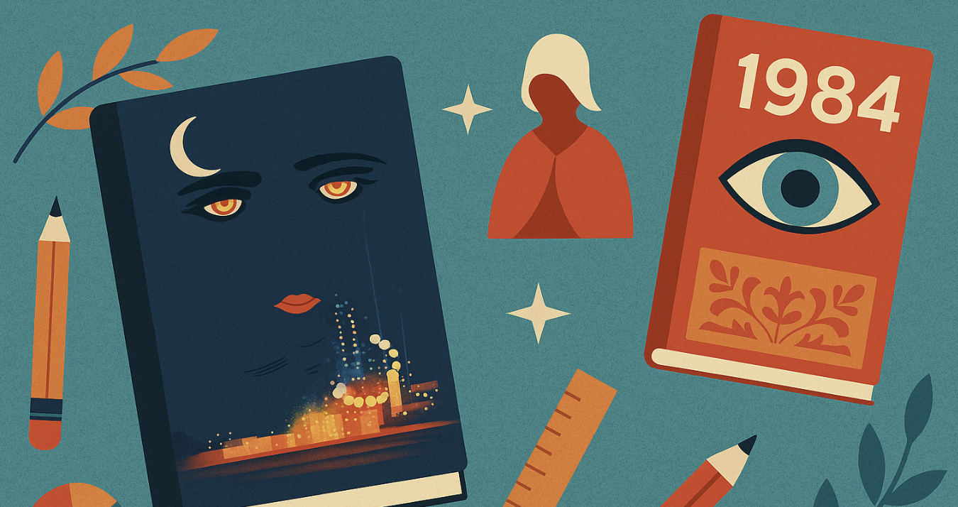
The Great Gatsby. Francis Cugat’s 1925 cover, showing disembodied eyes and painted lips floating over a carnival of city lights, carried enough narrative weight that F. Scott Fitzgerald reportedly reworked passages of the manuscript to match it after seeing the finished art. The eyes read as surveillance and longing at once, which is the entire novel in one frame.
1984. Modern editions strip George Orwell’s dystopia down to a single unblinking eye or a censored title, using visual metaphor instead of illustration. The cover turns the reader into a subject of surveillance, watching you the way the Party watches Winston, which lands harder than any illustration of Big Brother ever could.
The Handmaid’s Tale. A faceless woman in a blood-red cloak carries the entire premise in silhouette. The color functions as warning and identity simultaneously, and the blank face argues for the book’s real subject: what happens to a person once her name is taken from her.
Jurassic Park. Chip Kidd built the T. rex skeleton from a public-domain scientific illustration because there wasn’t budget for anything more ambitious. The constraint produced one of publishing’s most licensed silhouettes, proof that a strong idea beats a big budget almost every time.
Harry Potter and the Sorcerer’s Stone. The looping, hand-inked lettering told a six-year-old browsing a shelf that this book was going to feel like magic before they read the jacket copy. Typography did the genre signaling that illustration usually handles.
The Girl with the Dragon Tattoo. A stark black background, a single tattoo motif, and almost no other visual noise. The restraint delivers the genre promise on its own: expect something colder and sharper than a typical mystery, and the cover never softens that.
The Fault in Our Stars. Plain stamped type on a solid color field, with almost nothing else on the jacket. The minimalism reads as sincerity, which matters enormously for a book that lives or dies on whether readers trust its emotional honesty.
The Catcher in the Rye. Bold, slightly erratic lettering with no illustration at all. The type itself looks restless, which mirrors Holden Caulfield’s voice more accurately than any drawing of him ever could.
The pattern across all eight: none of them try to summarize the plot. Each one picks a single psychological truth about the book and commits to it completely.
The Hidden Psychology Behind Cover Symbolism
Cover symbolism works the same way a strong opening line works: it withholds almost everything and trusts the reader to lean in anyway. A cover plants one image that keeps surfacing in the reader’s mind for the first fifty pages, until the meaning arrives on its own without any explanation from the jacket.
We see this pattern constantly with Spines authors choosing their first cover. The instinct is almost always to include too much: a character, a setting, a subplot detail, all fighting for space on the same jacket. The covers that actually sell are the ones where an author picks the single image the book is really about and has the discipline to leave everything else off. That restraint is uncomfortable for a first-time author, because it feels like leaving information on the table. It is usually the difference between a cover readers scroll past and one they stop for.
Minimalism vs. Maximalism: Why Opposite Styles Both Sell
Minimalism and maximalism succeed for the same reason, they each commit fully to a single tone instead of hedging between two. A minimalist cover, like the stark black jacket of The Girl with the Dragon Tattoo, works because it leaves room for curiosity; it tells you almost nothing and dares you to find out more. A maximalist cover, dense with pattern and detail, works because it signals abundance, the promise of a world large enough to get lost in, which is exactly what draws readers to sprawling fantasy epics and lush historical fiction.
The failure mode is choosing both styles at once, landing on a cover too busy to whisper and too timid to shout.
Typography That Became as Famous as the Story
Typography sets a book’s mood before the artwork gets a chance to. A sharp, angular serif reads as tension or danger; a soft, rounded script reads as warmth or nostalgia. Swap the font on a thriller for the font on a wedding invitation and the story underneath hasn’t changed, but the promise the cover makes to a stranger walking past a shelf has changed completely.
Harry Potter’s looping lettering, The Fault in Our Stars’ stamped title treatment, and The Catcher in the Rye’s restless hand lettering all became recognizable independent of the artwork around them. That’s the tell of typography doing real work: readers remember the letters as vividly as the image.
From Shelf to Thumbnail: Designing for a Half-Second Decision
A modern cover has to survive being shrunk to the size of a postage stamp, because that’s how most readers meet it first: as an Amazon thumbnail, not a physical object on a shelf. The details that once impressed a browser standing three feet away now have to register in a mobile-sized square in under a second, or the cover has already lost.
That shift rewards the same instincts that made the classics iconic in the first place: bold contrast, one legible focal point, and nothing decorative competing for attention. Modern reissues of 1984 lean into flat, high-contrast graphics for exactly this reason, and Dracula’s ornate Victorian borders have largely given way to a single bold bat silhouette that reads clearly even at thumbnail scale. Some designers now build covers deliberately without any title text at all, betting that a strong enough image will be recognized on sight, the same logic Chip Kidd used on Jurassic Park decades before thumbnails existed.
A Brief History of How Book Cover Design Got Here
Book covers weren’t always selling tools; for most of publishing history they were closer to protective packaging. Cloth bindings in the 1800s existed to keep the pages intact, not to move product off a shelf. That changed with the pulp paperback boom of the 1930s and 40s, when covers became the entire pitch: garish, illustrated, built to win a glance from three feet away in a crowded drugstore rack. Offset lithography in the mid-20th century made full-color, photographic covers affordable for the first time, which is how a single haunting illustration like Cugat’s Gatsby became possible. The digital shelf changed the brief again: a cover no longer has three feet and full color to work with, it has a thumbnail and half a second, which is why the boldest, simplest covers in this piece are also often the most modern.
What Today’s Authors Can Learn From the Greats
A book cover is the fastest piece of communication your book will ever send. Every cover in this piece succeeds for the same underlying reason: it commits to one idea completely instead of hedging across several.
Treat your own cover as your book’s handshake. It should be confident, specific to your story, and willing to leave things out. People will judge your book by its cover. Give them one clear reason to pick it up.
FAQ: Famous Book Covers
Q: What are the most iconic book covers of all time?
The Great Gatsby, 1984, The Handmaid’s Tale, Jurassic Park, and Harry Potter and the Sorcerer’s Stone are among the most frequently cited iconic book covers, largely because each one reduces its story to a single unmistakable image or typographic choice rather than illustrating the plot.
Q: What are the top 10 best book covers of all time?
There’s no single agreed-upon top 10, since “best” depends heavily on genre and personal taste, but the famous book covers people cite most consistently include The Great Gatsby, 1984, The Handmaid’s Tale, Jurassic Park, Harry Potter, The Girl with the Dragon Tattoo, The Fault in Our Stars, and The Catcher in the Rye. Each earns its spot by committing to one idea instead of illustrating the whole plot.
Q: What is the most beautiful book cover?
Beauty in book cover design usually comes down to color and composition rather than fine detail, which is why Francis Cugat’s original Great Gatsby jacket, glowing city lights beneath a pair of painted eyes, is one of the covers most consistently called the most beautiful in publishing. Beauty and recognizability often overlap, though a cover can be striking without becoming instantly memorable.
Q: What are some classic book covers?
Classic book covers tend to trace back to the mid-20th century, when offset lithography first made full-color illustration affordable and produced covers like the original Great Gatsby jacket and the early Penguin paperbacks with their color-coded genre spines. Those covers favored one striking image or bold color block over intricate detail, the same restraint that shapes minimalist covers today.
Q: What makes famous book covers so effective?
Famous book covers work because they commit to one clear visual idea (a color, a symbol, a typographic choice) instead of trying to represent everything in the story at once, which lets a reader absorb the mood and genre in under a second.
Q: How can I design a book cover that stands out like the famous ones?
Start by choosing the single image or feeling your book is really about, then build the entire cover around that one idea instead of adding more. Strong contrast, readable typography, and a clear focal point matter more than detail or polish.
Q: How should book covers be adapted for Amazon thumbnails and ebooks?
Prioritize one legible focal point and strong contrast, since a cover now has to work at the size of a postage stamp before it ever gets seen at full scale. Remove any detail that disappears when the image shrinks to a thumbnail.