
Book formatting is the set of decisions that turn a manuscript into something a reader can hold without noticing the mechanics behind it: margins, fonts, spacing, chapter breaks, and the small typographic choices that either disappear into the reading experience or announce themselves as mistakes. Readers rarely praise good formatting. They only notice bad formatting, usually right before they put the book down. Poor formatting is one of the more common reasons readers abandon a book altogether, and it often gets blamed on the writing instead.
We see this constantly in manuscripts that come through Spines for formatting. The writing is frequently fine. The formatting is what makes it look unfinished.
This guide covers the exact specs professional formatters use, how to format a book by applying them in Google Docs and Word, the dialogue rules that trip up most self-published books, and how to adapt a file for KDP, IngramSpark, and the platforms beyond them.
What Book Formatting Actually Involves
Book formatting involves four core decisions: font and size, line spacing and margins, consistent styling from chapter to chapter, and page layout choices like where headers, footers, and page numbers sit. Skip any one of them and the book still reads. It just reads like it wasn’t finished by someone who knew what they were doing.
Font Choice and Size
- Stick to clean, professional fonts like Times New Roman, Georgia, or Arial. A 12-point font works best for body text, while chapter titles can range from 14 to 18 points depending on style.
- Avoid decorative fonts. They distract readers and read as unprofessional, whether the manuscript lives in Word or Google Docs.
Line Spacing and Margins
- Double spacing is standard for manuscripts, especially when submitting to publishers or editors.
- For print books, use 1-inch margins on all sides, with a slightly wider inside margin to account for binding.
- For eBooks, keep margins simple. Text needs to adjust to different screen sizes without breaking.
Consistency Is Key
Every part of a book, from chapter titles to subheadings to footnotes, should follow one format. Pre-built styles in Word, Google Docs, or Kindle Create make that uniformity automatic instead of something to track by hand.
Page Layout Matters
Page numbers typically sit at the bottom center or bottom corners for print books. For eBooks, every chapter should start on a new page using an actual page break, never a string of blank lines, since blank lines shift unpredictably across devices.
Manuscript Format: What Publishers Actually Expect
Standard manuscript format is 12-point Times New Roman or Garamond, double-spaced, with 1-inch margins on all sides and a 0.5-inch first-line indent on every paragraph. These are close to the same specs outlined in the Chicago Manual of Style, and most agents and editors stop reading a submission that ignores them well before page two.
Standard Manuscript Format
- Font: Times New Roman, Georgia, or a similarly readable font, 12-point size.
- Line Spacing: Double-spaced, to leave room for edits and comments.
- Margins: 1 inch on all sides.
- Indentation: 0.5-inch first-line indent on every paragraph, set through paragraph settings rather than the tab key.
- Page Numbers: Top-right or bottom-right corner. Professional submissions also include a header with the author’s last name and the manuscript title.
Key Elements to Include
- Title Page: Book title, subtitle, and author name. Submissions to publishers should also include contact information.
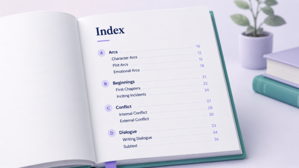
- Table of Contents (Optional): Expected for nonfiction and most eBooks.
- Page Breaks: Real page breaks between chapters, not blank space.
Consistency Is Everything
One consistent format across fonts, spacing, and headers is what makes a manuscript read as professional rather than assembled. Style templates in Word or Google Docs hold that consistency automatically once they’re set up correctly. Formatting makes a manuscript look ready to submit. Editing your book is what makes sure the writing underneath actually is.
How to Format Dialogue in a Book
Dialogue in a book follows a small, strict rule set: every new speaker starts a new paragraph, spoken words sit inside quotation marks, and any punctuation that belongs to the dialogue goes inside the closing quotation mark rather than after it.
The Core Rules
- New paragraph per speaker. Even a one-word reply gets its own paragraph. Two characters speaking inside the same paragraph is the single most common dialogue mistake we catch in manuscripts at Spines, and it forces a reader to stop and work out who said what.
- Punctuation inside the quotes. “I’m leaving,” she said. The comma sits inside the closing quotation mark, not after it.
- Dialogue tags stay lowercase. “Are you leaving?” she asked. The word after the tag stays lowercase even though a question mark comes right before it, because the question mark here is doing dialogue punctuation, not sentence punctuation.
- Action beats take their own sentence. “I’m leaving.” She grabbed her coat. An action beat is not a dialogue tag, so it ends the dialogue with a period and starts fresh as its own sentence.
- Interrupted dialogue conventionally cuts off mid-word or mid-thought using an em dash placed right before the closing quotation mark. Trailing-off dialogue ends in ellipses instead. The two signal different things: a dash means something or someone cut the line short, ellipses mean the character’s own thought drifted.
Getting these five rules right is what makes dialogue disappear into the story instead of pulling a reader out of it to reread a confusing line.
Crafting a Professional Title Page
A professional title page contains the book title, the author’s name, and nothing else unless the genre specifically calls for more, centered both vertically and horizontally on its own page.
What to Include
- Book Title: Bold and prominent, taking center stage.
- Author Name: Included in a slightly smaller font than the title, alongside co-authors if applicable.
- Optional Elements: A subtitle, tagline, or credentials for nonfiction. Children’s books often list the illustrator’s name here as well.
Formatting Tips
- Alignment: Center all text both vertically and horizontally for a clean, balanced look.
- Font Choice: One or two professional fonts, kept simple. Decorative fonts distract from the content they’re meant to introduce.
- Print vs. Digital: For print books, the title page appears on the right-hand side after the cover page. For eBooks, it’s the first page a reader sees when the book opens.
Tailor to the Platform
Preview the title page on different devices or in a print proof before finalizing it, whether the destination is Amazon KDP, IngramSpark, or another platform. A layout that looks balanced on a laptop screen can shift out of alignment on a 6-inch eReader.
Structuring Chapter Titles and Headings
Chapter titles should sit centered near the top of a new page in a larger font than the body text, generally 16 to 18 points, with enough white space above and below to separate them visually from the story.
Formatting Chapter Titles
- Placement: Centered at the top of a new page, with ample space above and below.
- Font Style: Larger size than body text, often bolded or capitalized.
- Numbered Chapters: Place the chapter number above the title, usually in all caps.
Subheadings
Subheadings work best in nonfiction, where they break up dense text and improve readability. Align them left, in a size between the chapter title and the body text, and set them as a reusable style rather than manually formatting each one.
Decorative Touches
Drop caps, an enlarged first letter at the start of a chapter, add a polished feel when used sparingly and consistently. Overuse turns a nice detail into a distraction.
Starting Each Chapter on a New Page
Always insert a real page break at the end of a chapter. This is essential for platforms like Amazon KDP or IngramSpark, where a missing page break can shift an entire book’s layout during conversion.
How to Format a Book in Google Docs
Formatting a book in Google Docs comes down to five settings: page size under File then Page setup, margins in that same menu, a 12-point body font with Google’s built-in Heading styles for chapter titles, real page breaks inserted through Insert then Break instead of blank lines, and an automatic table of contents built from those heading styles.
The heading styles matter more than they look like they should. KDP’s file converter reads heading tags to build a clickable table of contents automatically. Text that’s just bold and resized to look like a heading doesn’t carry that tag, so the converter skips it, and the table of contents comes out blank or broken.
Step by Step
- Page setup: File then Page setup, then choose a trim size (5×8, 6×9, or 8.5×11 inches) or set custom margins.
- Font: Select the body text and change it from Google’s 11-point Arial default to 12-point Times New Roman or Georgia before exporting anything.
- Chapter titles: Format then Paragraph styles, then apply Heading 1 to every chapter title instead of manually bolding text.
- Page breaks: Insert then Break then Page break, placed at the end of every chapter.
- Table of contents: Insert then Table of contents, with page numbers for print or blue links for an eBook-only file.
Google Docs won’t match Word’s advanced styling options, but it handles every one of these steps well, autosaves as it goes, and lets a co-author or editor leave comments directly on the manuscript.
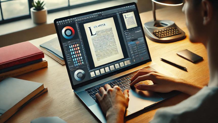
Tools of the Trade: Word, Vellum, Atticus, and Kindle Create
Microsoft Word, Vellum, Atticus, and Kindle Create are the four most common tools for book formatting outside Google Docs, and each one is built for a different kind of author.
Vellum
Vellum is a book formatting tool built specifically for Mac. It applies drop caps, scene breaks, and chapter headings automatically, and its real-time preview shows exactly how a book will look on Kindle, Apple Books, and other eReaders before export. Vellum is free to download and format in; a license is only required to export, at $199.99 for eBook formatting or $249.99 for eBook plus print.
Atticus
Atticus is a cloud-based writing and formatting tool that runs on Windows, Mac, Linux, and Chromebooks, which makes it the more accessible option next to Mac-only Vellum. It combines drafting, formatting, and export in one platform, with customizable themes and real-time previews for both print and digital. Atticus is a one-time purchase at $147, with lifetime updates.
Microsoft Word
Word remains a default for many authors because of how deep its formatting controls go: margins, line spacing, font styles, page numbers, headers, and footers are all handled natively. Pre-built book templates save time by shipping with title pages, chapter headings, and body text styles already set up.
Kindle Create
Kindle Create is built specifically for Amazon KDP. It imports a finished Word document and fine-tunes the layout for Kindle, including an automatic table of contents and chapter navigation, so the eBook version looks intentional rather than converted. For a full side-by-side comparison, see our breakdown of the top tools for formatting your book.
Formatting for Different Publishing Platforms
KDP, print-on-demand, and platforms like Apple Books and Kobo each expect different formatting choices, and uploading one platform’s file to another is one of the fastest ways to get a manuscript rejected or visibly broken after conversion.
Kindle Direct Publishing (KDP)
KDP books need to adapt to a wide range of screen sizes, so fixed layouts and heavy decorative formatting cause more problems than they solve. Stick to standard fonts, build a clickable table of contents through heading styles, and use real page breaks between chapters rather than blank space.
Print Books
Print formatting depends on physical constraints digital formatting doesn’t have. For a standard 6×9-inch book, set inside margins to at least 0.75 inches to accommodate the binding, keep body text at 11 or 12 points, and include page numbers along with a header carrying the book title, author name, or chapter title.
Platforms Beyond KDP
Apple Books, Kobo, and Smashwords generally require EPUB files, convertible through tools like Calibre. Each platform runs its own validation: Smashwords runs manuscripts through a tool it calls the Meatgrinder, and Apple Books places extra weight on accessibility formatting. Testing the converted file across a few devices before publishing catches most of what a platform’s checklist would otherwise catch later.
Before You Publish
The fastest way to catch a formatting mistake is to preview the file on the actual device or platform it’s headed to, not just scroll through it inside Word or Google Docs. A layout that looks clean on a laptop screen can break entirely on a 6-inch Kindle.
Spines handles this part directly. Choose eBook or print formatting, pick from ready-made formatting styles, customize chapter pages and disclaimers, and select print options down to paper type and finish. The formatting gets handled so the only thing left to focus on is the book itself.
FAQ: How To Format a Book
Q: What is the most common book format?
The most common print trim sizes are 5×8 inches for fiction, 6×9 inches for nonfiction and trade paperback, and 8.5×11 inches for workbooks and textbooks. For eBooks, EPUB is the standard format across Kindle, Apple Books, and Kobo, while PDF works best for fixed-layout eBooks and print-on-demand files.
Q: What is the standard format for a book manuscript?
A submission-ready manuscript uses 12-point Times New Roman or Garamond, double spacing, 1-inch margins, and a 0.5-inch first-line paragraph indent, saved as a Word document or PDF. Self-published authors can adjust these specs once the manuscript moves from submission to the actual formatting stage for a chosen platform.
Q: Is there a template for writing a book?
Yes. Word, Google Docs, Scrivener, and tools like Atticus all offer built-in book templates with margins, chapter styles, and title pages already set up. Starting from a template saves the setup work and keeps formatting consistent from chapter one, though most authors still need to adjust margins or fonts to match their chosen publishing platform’s requirements.
Q: Can I use Word to format a book?
Yes, Word is one of the most reliable tools for formatting a book, with built-in support for margins, line spacing, page numbers, headers, and pre-designed book templates. It handles both manuscript formatting for submissions and final formatting for platforms like KDP, though exporting a polished eBook file usually takes a few extra steps compared to dedicated tools like Vellum or Atticus.
Q: Can you format a book in Google Docs?
Yes, Google Docs can format a full manuscript for print or eBook, using File then Page setup for margins and trim size, Heading styles for chapter titles, and Insert then Break for page breaks. It lacks some of Word’s advanced styling options, but it autosaves automatically and makes it easy for an editor or co-author to comment directly on the file.
Q: How do you format dialogue in a book?
Every new speaker starts a new paragraph, spoken words go inside quotation marks, and punctuation that belongs to the dialogue sits inside the closing quotation mark. Dialogue tags like “she said” stay lowercase even after a question mark or exclamation point inside the quote, and action beats end with their own period rather than a comma.
Q: How many chapters should a book have?
Most novels run between 20 and 30 chapters, though there’s no fixed rule since chapter count depends on pacing more than any target number. An 80,000-word novel with 3,000-word chapters lands around 27 chapters, while thrillers with short, fast-moving chapters can easily double that count without changing the overall word count.
Q: What font size are books written in?
Print books use 10 to 12-point body text, most often in Garamond, Times New Roman, or Baskerville. eBooks default to 12-point since readers can resize text on their own device, and children’s books typically size up to 14 to 18 points for early readers.