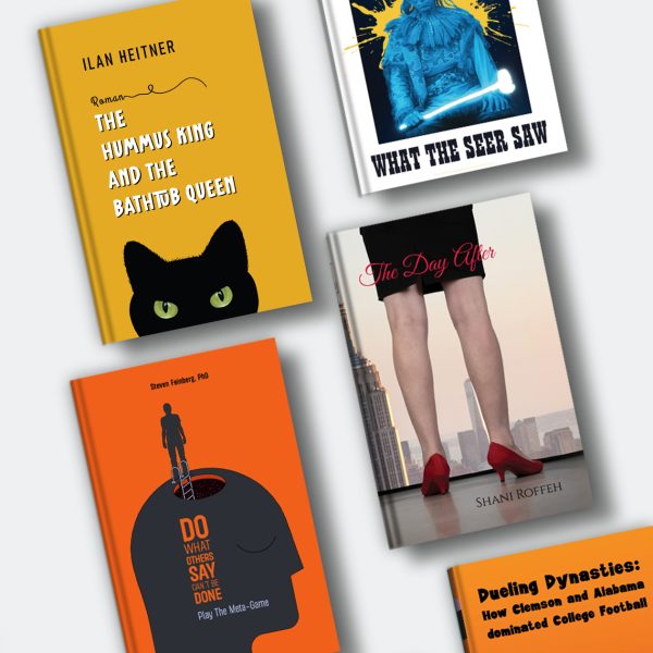
The most useful book cover design tip is to design for the reader who will buy your book, at the size they will first see it. But what does that mean?
In practice, that means matching your genre’s conventions, building the cover around one clear idea, setting a title that still reads as a thumbnail, and testing the result with readers before you publish.
What most guides leave out is how unreliable praise is: authors who split test covers with strangers can find that the version friends and fellow writers loved is the one the market ignores.
| Book cover design tip | What to do | Why it matters |
| Signal the genre | Study the current bestsellers in your exact category before you sketch anything | Readers scan covers for genre cues in seconds and skip what doesn’t match |
| Build on one idea | Choose a single image, object or typographic gesture that carries the book | Covers that try to summarise the plot turn into clutter |
| Make the title the structure | Set the title large, in a typeface that fits the genre, with strong contrast | The title is often the only element that survives at thumbnail size |
| Limit the palette | Use one dominant colour and one accent | Contrast creates a focal point and survives screen compression |
| Leave space | Give the title and the main image room around them | Empty space directs the eye and keeps the cover from looking crowded |
| Design for two sizes | Get the structure right for the thumbnail, then add texture and detail for print | Most readers meet the cover on a phone before they ever hold the book |
| Use licensed, high resolution assets | Confirm rights to every image and font, and use print-quality images | An unlicensed or low resolution asset can stop a book at upload or later |
| Check the image isn’t already taken | Run a reverse image search on any stock photo before you license it | Standard stock licences are non-exclusive, so the same photo can sit on other books |
| Plan the whole wrap | Treat the spine and back cover as part of the design from the start | The print cover is one file, and the spine depends on the final page count |
| Test before you publish | Show two or three versions to readers of your genre | Authors are too close to their own book to judge the cover cold |
Famous Book Covers and the Design Lesson in Each
The quickest way to understand these tips is to see them working on real covers. Each of the covers below is credited to its designer, and each one shows a single principle carried out with unusual clarity.
| Cover | Designer | Edition | The lesson |
| Nineteen Eighty-Four by George Orwell | David Pearson | Penguin, Great Orwell series, 2013 | Typography can carry the whole idea: the debossed title and author name are covered in black foil, so the cover itself looks censored |
| The Girl with the Dragon Tattoo by Stieg Larsson | Peter Mendelsund | Alfred A. Knopf, US edition | Restraint can stand out in a loud genre; Mendelsund has said he made 50 to 70 versions over three months |
| Jurassic Park by Michael Crichton | Chip Kidd | Alfred A. Knopf, first edition, 1990 | One bold drawing in a limited palette of black, white and red can become an icon |
| The Great Gatsby by F. Scott Fitzgerald | Francis Cugat | Charles Scribner’s Sons, first edition, 1925 | A cover concept can start before the book is finished and shape how it is presented |
| I Remember by Joe Brainard | David Pearson | Daunt Books, 2025 | The first place cover in Literary Hub’s 2025 survey of 52 cover designers |
None of these covers tries to tell the story. Each picks one idea and commits to it, which is the same discipline an independent author needs when the cover has to work on a crowded results page.
For more examples, our gallery of minimalist book covers and our list of the best book covers 2025 and 2026 add designer credits and the reasoning behind each.
How to Make a Book Cover, Step by Step
Every professional cover moves through the same sequence, whether you design it yourself or brief a designer. Skipping a step usually shows up later as a revision, a rejection or a cover that sells the wrong book.
- Write a brief. Note the genre, the target reader, the tone, the title and subtitle, and two or three images, objects or symbols that matter to the book.
- Research the shelf. Pull up the current bestsellers in your exact category and note what they share: typefaces, palettes, image types and where the title sits.
- Choose the one idea. Decide what the cover is about. A character, an object, a setting or a typographic treatment can all work, provided there is one focal point.
- Sketch concepts. Rough out several directions in small thumbnails. This is the cheapest stage at which to change course.
- Set the typography. Choose a title face that fits the genre and give it enough size and contrast to read when the cover is shrunk. Our guide to typography for book covers covers pairing and hierarchy.
- Build the palette and layout. Commit to a dominant colour and an accent, then arrange the elements so the eye moves from title to image to author name.
- Prepare the files. An ebook needs a single front cover image; KDP’s ideal size is 2,560 by 1,600 pixels in RGB. A paperback needs a single PDF wrap with back cover, spine and bleed, built once the page count is final. Our guide to Kindle book cover size has the full specifications.
- Test and refine. Show the cover to readers in your genre, compare versions and adjust before you upload.
Art and Function on a Book Cover
Every cover negotiates between two jobs. It has to be a good piece of design, and it has to sell a specific book to a specific reader.
The tension shows up most often when an author wants the cover to capture everything the book means. Cover designer Damonza put the counterargument plainly in its 2026 trends report: “Covers are not summaries.
They are signals.” A cover’s first job is to tell the right reader, in a second or two, that this book is for them. Artistic ambition works when it serves that signal, as Pearson’s censored Nineteen Eighty-Four does, and it fails when it obscures it.
Function also covers the practical layer readers never think about. KDP requires cover text of at least 7 points and print images of at least 300 dpi, and the title has to stay legible on a phone screen.
A cover can be beautiful at full size and still fail if those basics are missing. When an illustrated approach fits the genre, our guide to book cover illustration explains how to brief and license the artwork.
Testing Your Book Cover Before You Publish
Authors are rarely the best judges of their own covers, because they already know what the book is about. Testing with readers fills that gap.
A useful approach runs in two rounds. The first, sometimes called alpha testing, is an internal review with critique partners or a designer: does the concept fit the genre, are the type and colour working, is the file technically sound?
The second, beta testing, puts two or three finished versions in front of readers of your genre and asks specific questions. Would you click this? What genre do you think it is? What kind of story do you expect?
A few habits make the results more reliable. Keep the title and subtitle identical across versions and change only the visual elements, so you know what made the difference. Show the covers at thumbnail size as well as full size.
Recruit readers who actually buy books in your category, and treat feedback from friends and family with caution, because they are likely to be kind. Look for patterns across many responses and don’t redesign around a single strong opinion.
Authors with an ad budget can go a step further and test in the marketplace itself. Running the same small ad with each cover image, and nothing else changed, shows which version strangers actually click, which is the closest available measure of how the cover will perform on a retailer page.
Where Authors Say a Cover Everyone Loved Didn’t Sell
The most expensive cover mistake in author discussions is a cover that looked right to everyone close to the book. It shows up in interviews, surveys and author essays again and again, and each account ends the same way: the cover only got fixed once the author stopped asking for opinions and started measuring behaviour.
In a March 2026 Author Media interview, a thriller author described paying a professional designer for covers that were gorgeous and universally praised, then losing money on ads for a year.
Split testing showed the covers attracted the wrong readers as thumbnails, partly because the books looked dystopian when they read as thrillers. He tested image-only Facebook ads for 11 cover options, spending around $50 to $70 per round, and the ads turned profitable once the new covers and genre positioning were in place.
Two of his practical lessons travel well: pay designers for every concept you test, and ask for entirely separate concepts, because three colour variations of one idea tell you nothing.
Written Word Media’s 2025 survey of 1,346 indie authors points the same way. Authors ranked the cover as the single biggest factor in selling a book, and the survey’s own advice was to be ruthless about changing a cover that isn’t working, naming emotional attachment to a DIY cover as one of the biggest blockers it sees.
An earlier SFWA essay on indie covers recorded authors changing covers several times, with sales usually rising when the new cover matched the genre and story, and flagged a useful warning sign: a cover that gets more clicks than sales is promising something the book doesn’t deliver.
The pattern is consistent across all three. A cover is a hypothesis until strangers in your genre respond to it, and the response that matters is a click, not a compliment.
Common Book Cover Design Mistakes
Most covers that look amateur fail in predictable ways. Each of these mistakes is easy to spot once you know to look for it.
| Mistake | What it looks like | The fix |
| Telling the whole plot | Several characters, a setting, an object and a symbol all competing | Pick one focal point and move the rest into the blurb |
| Illegible title | Thin, decorative or low contrast type that vanishes when small | Increase size, weight and contrast, then test at thumbnail size |
| Too many fonts | Three or four typefaces fighting each other | Use one display face for the title and a simple companion |
| Wrong genre signal | A thriller that looks like romance, or nonfiction that looks like a novel | Compare against current bestsellers in the exact category |
| Low resolution or unlicensed images | Blurry artwork, or a stock image used without the right license | Use print-quality assets and confirm rights before design starts |
| Ignoring the spine and back | A strong front attached to an afterthought wrap | Plan the wrap from the beginning, after the page count is final |
| Designing for print only | Fine detail that turns into noise on a phone | Build strong structure first, then add detail |
| A popular stock photo | The same image already fronting other books in your genre | Reverse image search before licensing, then customise the image or commission original art |
Designing It Yourself or Hiring a Designer
Whether to design your own cover depends on your skills, your genre and your budget. Many authors can produce a competent cover with good software and these principles, and many genres reward the polish only an experienced designer brings.
Design it yourself if you have a clear concept, a feel for typography and a genre whose covers are relatively simple, and use tools that export to retailer specifications.
Hire a designer if your genre relies on illustration, photo compositing or highly polished type, or if you have tried and the cover still doesn’t match the bestsellers beside it. Spending is not a guarantee either way.
In Written Word Media’s 2025 survey, most authors earning over $5,000 a month spent at least $250 per cover, often $250 to $1,000, while the survey found no clear link between spending $2,000 or more and higher income. For a wider range of starting points, our collection of creative book cover design ideas shows different directions in practice.
How Spines Approaches Cover Design
Spines brings design into the same workflow as the rest of the publishing process. The aim is a cover that fits the book’s genre and is ready for every format it will appear in.
Spines’ cover design tool analyses a manuscript and generates genre-specific designs drawn from a database of successful covers, so the starting point reflects what works in the author’s category.
Authors who want a designer to take the concept through to final files can work through Book Cover Design Services, with the cover produced alongside editing, formatting and distribution.
FAQ – Book Cover Design Tips
Q: How do I make a book cover?
Start with a brief that names your genre, reader and tone, then study current bestsellers in your category. Choose one central idea, set a large and legible title, build a simple palette and layout, prepare files to your retailer’s specifications, and test the cover with readers before publishing.
Q: What are the most common book cover design mistakes?
The most common mistakes are trying to show the whole plot, using a title that disappears when small, mixing too many fonts, sending the wrong genre signal and using low resolution, unlicensed or overused stock images.
Q: Should I test more than one cover design?
Yes. Show two or three genuinely different concepts to readers of your genre, keep the title and subtitle identical so only the visuals change, and look for patterns across responses. Authors with an ad budget can test image-only ads to see which version strangers click.
Q: How do I know if my book cover is working?
Watch what strangers do. A cover that gets few clicks in ads or on retailer pages is not attracting your readers, and a cover that gets clicks without sales is likely promising a different kind of book than the one inside.
Q: Can another author use the same image on their book cover?
Yes, if the image comes from a standard stock library. Stock licences are non-exclusive, so the same photo can appear on other books. A reverse image search before you license it shows where it has already been used, and commissioning original art is the way to get an image that is yours alone.