Let’s be honest, when it comes to book design, we’ve all been in this situation. You’ve got your manuscript all set, your story’s golden, and then you hit the layout stage. Suddenly, the pages look like a jumbled mess of words and white space, and you start wondering if you’ve accidentally created a “book of chaos” instead of a literary masterpiece. Fear not, friend. This is where book layout becomes your secret weapon.
A good book layout can make the difference between a reader getting lost in the story or tossing your book aside in frustration. Whether you’re printing or going digital, the layout is the silent force behind that seamless reading experience. It’s like the stage crew in a theater production: without it, the show doesn’t quite go on.
But don’t panic. This guide will help you master book layout, no sweat. We’ll cover everything from the essentials of layout design to how book layout templates can save your sanity. Ready to make your book look as good as it reads?
What is Book Layout and Why Does it Matter?
Book layout is the blueprint that takes your manuscript from a simple collection of words to a polished, readable masterpiece. It’s everything from the margins and gutters to the fonts and chapter breaks. A well-executed layout ensures that your text flows smoothly, guiding the reader’s eye from one page to the next without any distractions. It’s the unsung hero of the design world, working quietly behind the scenes to create a seamless experience.
Why does it matter? Because the layout can make or break your book. A cluttered, disorganized layout is like trying to read a novel on a foggy day: nothing’s clear. But a clean, thoughtful design enhances readability, making it easier for your readers to get lost in your story. Think of it like this: a bad layout can send readers running faster than a surprise plot twist, but a great layout? That’s what keeps them turning the pages long into the night. So, when you’re laying out your book, think of your readers as your guide, keep it clean, keep it clear, and keep them hooked!
Your Publishing Journey Awaits – Start NowHow to Layout a Book: The Basic Blueprint
Alright, let’s dive into the nitty-gritty of how to lay out a book. Think of this as your design adventure, where every step brings you closer to that final, beautiful product!
Page Size
First up, page size: this is the foundation. Most books use a standard size like 6×9 inches, but it depends on your genre and the look you’re going for. Now that you’ve got your page size, you’ll need margins. These are the blank spaces around your text, and they help create breathing room. The standard margin is typically 1 inch, but feel free to adjust for aesthetic or practical reasons.
Interior
Next, don’t forget the gutter, the inner margin where the pages are bound. It’s essential to allow a bit more space here to prevent text from disappearing into the book’s spine. Headers and footers? These little guys help keep things tidy. Headers can contain your book title or chapter name, while footers are great for page numbers. Speaking of which, page numbers are non-negotiable. They keep readers from getting lost and are often placed in the header or footer, depending on your style.
Chapter Breaks
Now, chapter breaks; these are like mini celebrations in your book, giving readers a visual cue that it’s time to dive into something new. Be sure to make them stand out with extra space or a fresh, bold font.
As you put all these pieces together, consistency is key. A grid system will help you maintain order and ensure that everything aligns perfectly. With a little attention to detail, you’ll see how easy it is to layout a book that looks professional and polished. So, take your time, and remember: every design choice is an opportunity to elevate your story!
How to Layout a Book for Printing: The Final Touches That Matter
When it’s time to prepare your book for printing, the fun’s not over yet. In fact, this is where the magic (and potential chaos) happens. Let’s walk through the technical aspects of how to layout a book for printing because trust us, it’s worth getting these details right.
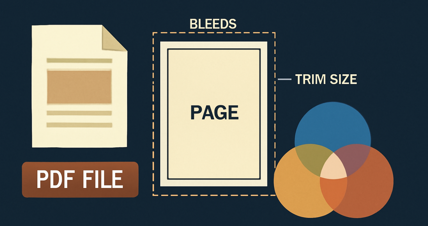
- Start with file types. The two most common formats for print are PDF and InDesign files. PDFs are ideal because they preserve the design exactly as you intended, while InDesign gives you flexibility for future edits. Either way, make sure your file is high resolution: 300 DPI is the sweet spot for crisp, clear prints.
- Next, bleeds. They’re not as dramatic as they sound. Bleed refers to the space around the edges of the page that’s trimmed off during printing. This ensures that your design goes all the way to the edge without any awkward white space. A standard bleed is 0.125 inches (or 3mm), so don’t forget to extend any backgrounds or images beyond the page edge.
- Trim size is also crucial. This is the final size of your book after it’s cut. Make sure your design fits within the trim size, and always account for the bleed. A mismatch here can lead to text being accidentally chopped off; trust us, nothing says “oops” like opening a chapter only to find half the words missing!
- And then, there are color profiles: use CMYK (cyan, magenta, yellow, and black) for printing. RGB (red, green, blue) is for screens, and using it for print can lead to some nasty color surprises.
Choosing the right book layout template for printing can save you loads of time and hassle. Templates are set up with all the correct margins, bleed, and trim allowances, ensuring your book’s ready for print.
One last tip: make sure your margins are not too close to the edge. Picture this: You’ve spent months perfecting your book, and then you open the printed version to find the chapter title is partially cut off because the margin was too tight. Total disaster. Avoid it by double-checking your layout before you hit “print.”
So, take a deep breath, check your files, and give yourself the best chance for a flawless print job. With these final touches, your book will be ready to shine in the real world!
Book Layout Templates: The Secret Weapon for Designers
Let’s face it: book layout design can be a bit overwhelming. From choosing the right font to deciding where to place that perfect chapter break, the details are endless. But what if I told you there’s a secret weapon to save time and frustration? Enter: book layout templates.
A book layout template is like a pre-made blueprint for your book’s design. It’s structured with all the essential elements: margins, page numbers, headers, and chapter breaks already in place. All you have to do is plug in your content, and voila, the hard work is done! These templates take the guesswork out of the equation, so you can focus on what really matters: your story.
But don’t think templates are one-size-fits-all. The beauty of book layout templates is their flexibility. You can easily adjust fonts, colors, and spacing to match the vibe of your book, whether it’s a sleek, professional thriller or a whimsical children’s tale. Want to make your chapter titles pop? No problem. Feel like adding a quirky margin design? Go for it! Templates provide the framework, but you’re still in the driver’s seat.
Now, let’s talk options. There are plenty of free and paid templates out there. Free options, like those on Canva or DIY Book Covers, are perfect for authors on a budget. If you’re willing to invest a bit, platforms like Adobe InDesign offer premium templates with even more customization and design options.
The best part? By using a book layout template, you avoid the chaos of starting from scratch. Templates streamline the process, leaving you with more time to focus on your content rather than fiddling with design details. So why reinvent the wheel when the perfect template is just a click away?
Common Book Layout Mistakes and How to Avoid Them
Even seasoned designers can stumble when it comes to book layout. But don’t worry, by knowing the most common pitfalls, you can dodge them like a pro!
- Inconsistent spacing is a biggie. When your text feels cramped on one page and overly spaced on the next, it throws off the entire reading flow. To fix this, use consistent line spacing and alignment throughout your book. A grid system can be a lifesaver here, helping keep everything neat and organized.
- Next up: improper font choices. A fancy font may look great for a title, but using it for the entire book can be like trying to read a novel in Comic Sans, just, no. Stick to easy-to-read fonts for the body text (think Times New Roman or Garamond) and save the decorative ones for titles or headings. Keep it clean, and your readers will thank you.
- And don’t get us started on poor page flow. Imagine reading a chapter where every page has a different layout: one page with a huge header, the next with giant margins, and suddenly, the text is running off the edge. It’s like a circus for your eyes. To avoid this, make sure your text flows logically from page to page. Consistency is key!
In a worst-case scenario, you might end up with a chapter that has all the text cut off because you forgot to check the margins. Picture opening your book and reading a chapter with half the words missing. Yikes! Double-check your trim size and margins to avoid this disastrous “Oops!” moment.
With a little attention to detail, your page layout will be a polished masterpiece, free of the typical pitfalls that cause chaos!
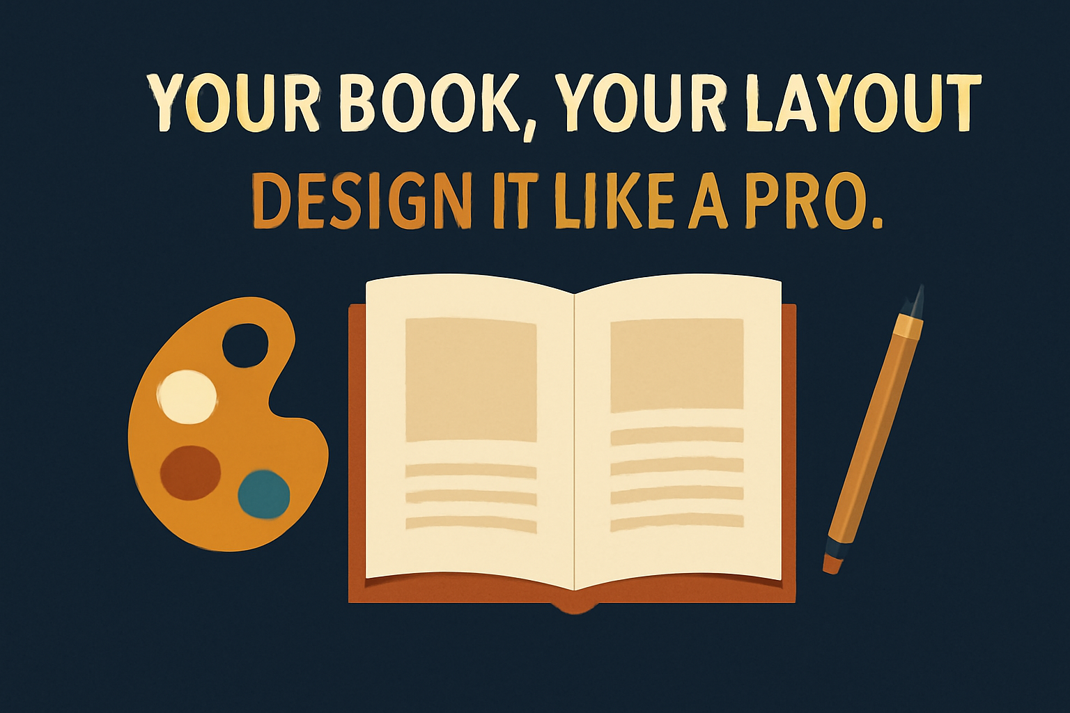
Final Thoughts: Your Book, Your Layout – Design it Like a Pro!
Mastering the book layout process isn’t just about looking professional; it’s about creating an experience for your readers. A well-designed layout enhances readability, improves flow, and makes your book feel like a polished work of art. Whether you’re using a template or designing from scratch, remember: it’s your book, and the layout is your creative canvas.
So, embrace the challenge! Get creative, have fun, and trust the process. This is your opportunity to bring your story to life visually, making sure every page matches the brilliance of your words.
Now, go ahead and design your book like a pro because in the end, it’s your story, your vision, and your layout! Let’s get those pages looking as good as they read!
FAQs: Book Layout
Q1: What is the best line spacing for a book?
The best line spacing for a book typically falls between 1.15 and 1.5. For most genres, 1.5 line spacing works well for readability, especially for novels and nonfiction. However, it’s important to consider your font size type, larger fonts may benefit from tighter spacing, while smaller fonts could require more breathing room.
Q2: What is the recto format?
In book publishing, recto refers to the right-hand page of an open book, usually the odd-numbered page. It’s the first page of a new chapter or section and often contains important text or chapter titles. The verso is the left-hand page (even-numbered), which follows the recto.
Q3: Does Google Docs have a book template?
Google Docs doesn’t offer a pre-set book template by default, but you can find free templates online or create your own. Simply adjust the page size, margins, and formatting to fit your needs. You can also find downloadable book templates in Google Docs’ template gallery or from third-party sites to get you started.
Q4: Why don’t books start on page one?
Books typically don’t start on page one because the first few pages (title page, copyright, acknowledgments, etc.) are part of the front matter. These pages are numbered in lowercase Roman numerals (i, ii, iii) and set up the structure before the story or content begins. The first page of the actual content, like the first chapter, usually starts on page 1.
Q5: What are the basic types of layout?
The two main types of layout are single-page layout and spread layout. Single-page layout is used for text-heavy content and is ideal for novels and non-fiction books, where each page contains one column of text. Spread layout is used for designs with images or more complex structures, like children’s books or graphic novels, where pages are designed to be viewed side-by-side.
Q6: How do I choose the right book layout template for my book?
Choosing the right book layout template depends on the genre, style, and format of your book. For example, a children’s book may require a template with larger images and generous margins, while a novel will focus more on text-heavy templates with appropriate fonts and spacing. When selecting a template, ensure it supports your trim size, desired margins, and includes features like headers, footers, and page numbers that suit your content. Remember, templates are starting points; feel free to tweak and customize them to match your vision!