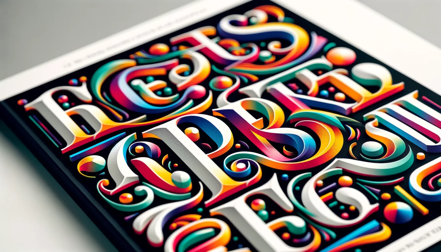
Typography plays a pivotal role in book cover design, serving as a silent yet powerful communicator. The fonts chosen for a book cover can convey the genre, mood, and style of the content within, making it a crucial aspect of marketing and reader engagement. By understanding the significance of typography and its impact on visual appeal and reader interest, authors, designers, and self-publishers can make informed font choices that elevate their book covers to new heights.
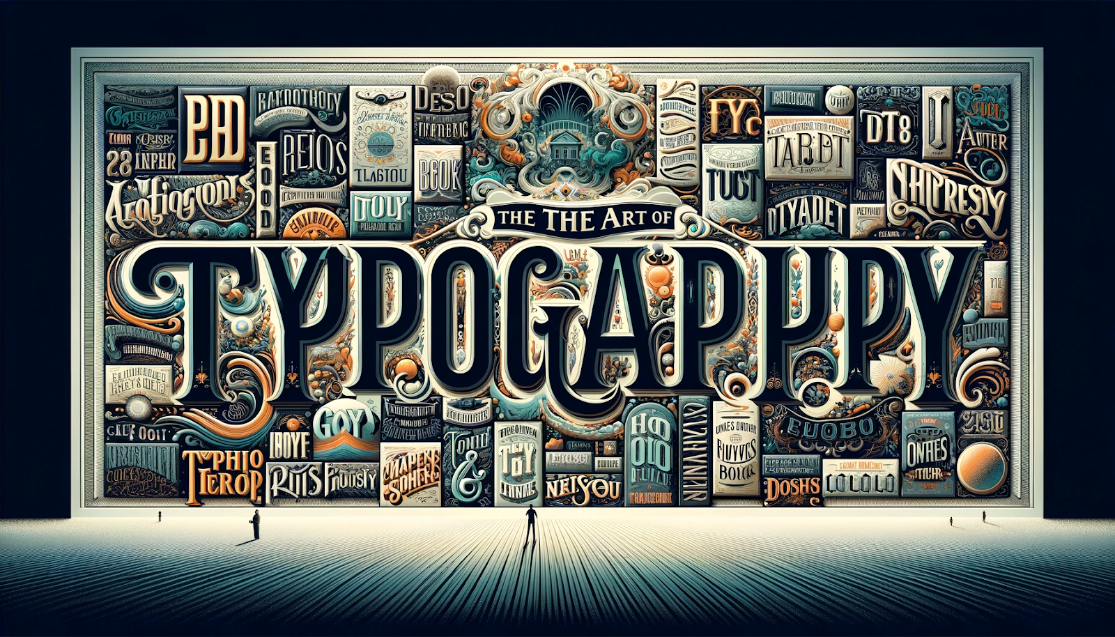
This article aims to delve into the art of typography for book covers, offering insights into serif and sans-serif fonts, free and commercial options, and font styles tailored to specific genres.
Typography for Book Covers
Understanding the Role of Typography in Book Covers
Typography isn’t merely a selection of fonts; it’s the language that speaks to potential readers before they even open the book. The typography on a book cover conveys a multitude of information, from the genre and tone to the intended audience. It sets the stage for the reading experience and influences a reader’s first impression. Carefully chosen typography can entice, captivate, and invite readers into the world of the book.
Establishing Visual Hierarchy with Fonts
In the realm of book covers, not all text is created equal. Fonts are essential tools for creating a visual hierarchy, guiding the viewer’s eye, and emphasizing key elements. Titles, author names, and taglines must stand out prominently, drawing immediate attention. Subtitles, series names, and additional text should complement the primary information without overshadowing it. Typography achieves this hierarchy through variations in font size, weight, color, and placement. A well-structured visual hierarchy ensures that the most critical information takes center stage, enhancing the overall impact of the cover.
The Impact of Font Style on Book Cover Design
Font style is the personality of your book cover. The choice between serif and sans-serif fonts, decorative or minimalist typefaces, and the subtle nuances of individual font families all contribute to the cover’s message. Serif fonts often evoke tradition, classicism, and formality, making them suitable for historical novels or literary works. In contrast, sans-serif fonts convey modernity, making them ideal for contemporary fiction or non-fiction titles. The font style should align with the book’s content, setting the appropriate tone and resonance with the target audience. The synergy between font style and cover design can either make a book stand out on the shelf or blend into the background.
Serif vs Sans Serif Typeface
Serif fonts
Serif fonts are the classic workhorses of typography, known for their timeless elegance and readability. They are characterized by the small decorative strokes or “serifs” that extend from the ends of each letter’s main strokes. These subtle embellishments give serif fonts a sense of tradition and formality, making them a popular choice for various printed materials, including book covers.
Characteristics of Serif Typefaces
- Serifs: As mentioned, the small decorative strokes at the ends of letters.
- Legibility: Serif fonts are known for their excellent readability, particularly in long-form text. The serifs help guide the reader’s eye along the lines of text.
- Classic Elegance: Serif fonts often convey a sense of history and tradition, making them well-suited for conveying a sense of timelessness or literary significance.
- Variability: Serif fonts come in various styles, from the more formal and ornate to the clean and modern, offering versatility for different design needs.
When to Use Serif Fonts on Book Covers
Serif fonts are particularly advantageous for literary and historical works, such as novels, biographies, and historical texts, as they establish a connection to the past and convey a sense of seriousness. They are also ideal for books with classic and traditional themes, reinforcing the message through their time-honored appearance. Additionally, when aiming to evoke an air of elegance and sophistication, serif fonts emerge as a natural selection, adding a layer of refinement to the text.
Examples of Classic and Contemporary Serif Fonts
Classic Serif Fonts:
- Times New Roman: A widely recognized and timeless serif font known for its legibility and versatility.
- Garamond: An elegant and understated serif font with a long history, often associated with classic literature.
- Baskerville: Known for its clarity and readability, Baskerville is a classic choice for book covers, especially in the realm of non-fiction.
Contemporary Serif Fonts:
- Georgia: Designed for on-screen readability, Georgia is a modern serif font with a clean and friendly appearance.
- Playfair Display: This high-contrast serif font exudes sophistication and is often used for titles and headings.
- Lora: A versatile serif font with a touch of modernity, making it suitable for many other book cover fonts and designs.
Sans serif fonts
Sans serif fonts, as the name suggests, lack the decorative “serifs” found on the ends of letters in serif fonts. These typefaces are characterized by their clean, straightforward lines and modern appearance. Sans serif fonts have gained popularity for their simplicity, versatility, and ability to convey a sense of contemporary design.
Characteristics of Sans Serif Typefaces
- Clarity: Sans serif fonts are known for their straightforward and legible design, making them ideal for conveying information with clarity.
- Modernity: They exude a sense of modernity, which can be particularly appealing for contemporary genres and non-fiction works.
- Simplicity: Sans serif fonts are often minimalist in their design, focusing on the essentials and eliminating decorative elements.
- Versatility: Their clean lines and neutral appearance make sans serif fonts adaptable to various design contexts.
When to Use Sans Serif Fonts on Book Covers
For books delving into contemporary themes, modern topics, technology, or futuristic settings, sans serif fonts effectively reinforce the sense of currency and relevance. They are particularly well-suited for non-fiction and informational works, such as textbooks, manuals, and informational books, due to their clarity in delivering information. Moreover, sans serif fonts are the go-to choice for book covers designed with a clean and minimalist aesthetic, aligning perfectly with the simplicity and sleekness of the design.
Examples of Clean and Modern Sans Serif Fonts
Contemporary Sans Serif Fonts:
- Helvetica: A timeless and widely used sans serif font known for its neutrality and versatility.
- Arial: A popular alternative to Helvetica, Arial offers a clean and modern appearance, ideal for various design applications.
- Roboto: A friendly and readable sans serif font designed for digital media and print, making it a more versatile font choice for book covers.
Modern Sans Serif Fonts:
- Futura: With its geometric shapes and clean lines, Futura exudes a sense of modernity and is often used in design-forward book covers.
- Avenir: Known for its elegance and readability, Avenir is a contemporary sans serif font suitable for a range of genres.
- Montserrat: A modern and highly legible sans serif font, Montserrat is a great choice for minimalist and information-driven book covers.
Fonts for Book Covers
Selecting the right font for a book cover is crucial, as it sets the tone and influences reader perception. Different genres call for different typography styles, and the right font can make a book stand out on shelves or digital platforms. Below are some of the best fonts categorized by type and genre.
Best Serif Fonts for Book Covers
Serif fonts are ideal for literary, historical, and non-fiction works, offering a sense of tradition, elegance, and credibility.
- Garamond – A timeless and elegant serif font, perfect for classic literature and historical fiction.
- Baskerville – A refined and highly readable font, often used in non-fiction and biographies.
- Playfair Display – A modern serif with high contrast, great for romance and literary fiction.
- Lora – A contemporary serif with a soft, friendly feel, suitable for novels and personal essays.
Best Sans-Serif Fonts for Book Covers
Sans-serif fonts work well for modern, minimalist, and technology-driven books due to their clean and simple appearance.
- Helvetica – A versatile and neutral font, widely used in contemporary fiction and non-fiction.
- Avenir – A modern and sleek typeface, ideal for business and self-help books.
- Montserrat – A geometric sans-serif font that adds a bold and structured look, great for thrillers and sci-fi.
- Roboto – A well-balanced sans-serif font, often used in tech and informational books.
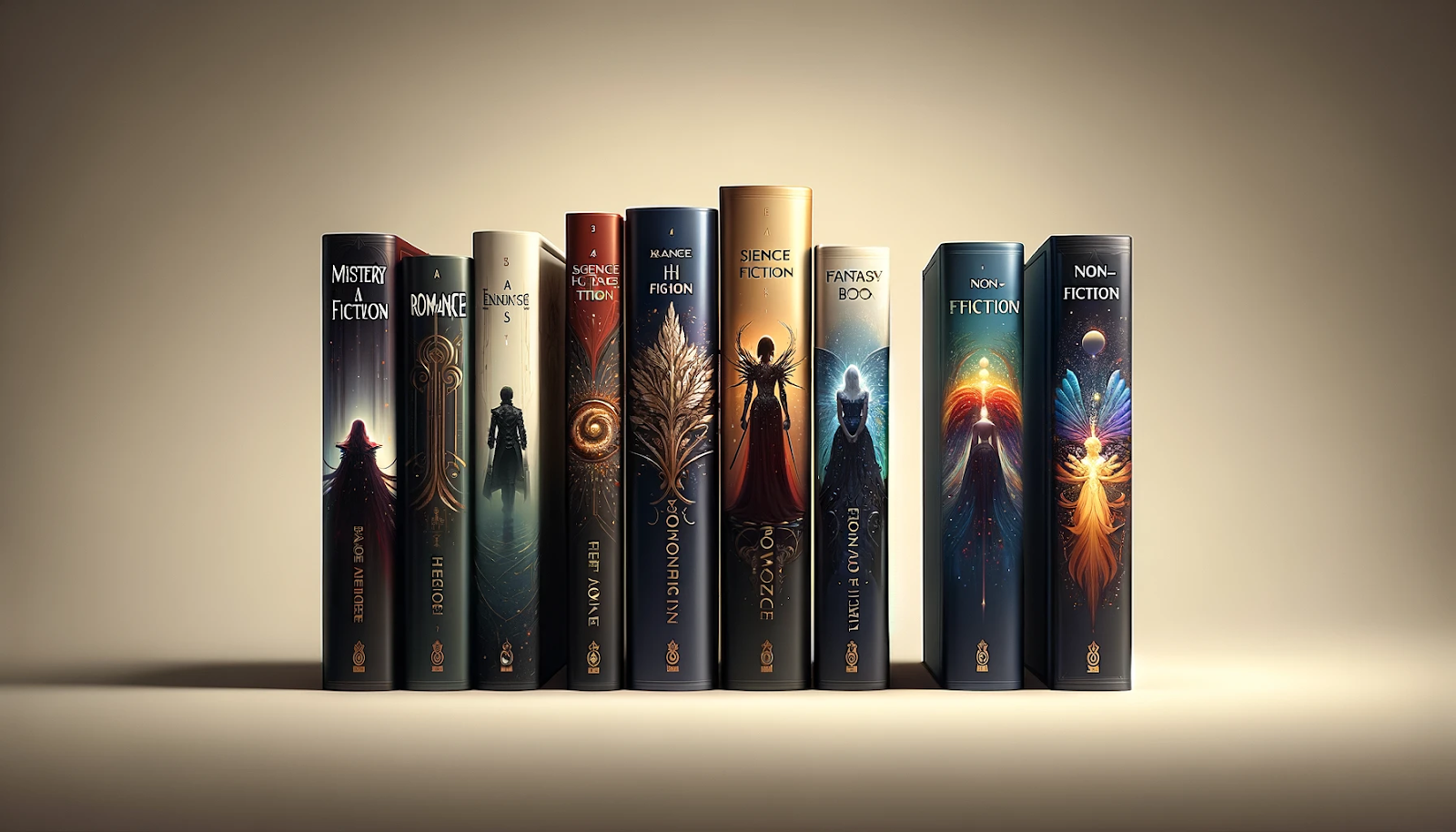
Best Fonts for Specific Genres
Fantasy & Sci-Fi
Fantasy and science fiction books benefit from decorative and unique fonts that evoke a sense of wonder and adventure.
- Cinzel – A sophisticated, ancient-inspired font perfect for epic fantasy.
- Uncial Antiqua – A medieval-style font that works well for historical fantasy.
- Orbitron – A futuristic sans-serif font great for sci-fi novels.
- Exo – A sleek, tech-inspired font that enhances modern sci-fi covers.
Thrillers & Mystery
Thrillers and mystery novels need bold, sharp, and high-impact fonts to create suspense.
- Oswald – A condensed sans-serif that adds intensity and drama.
- Bebas Neue – A modern, all-caps font great for high-stakes stories.
- Archivo Black – A strong, bold sans-serif that commands attention.
- Cormorant Garamond – A sophisticated serif with an air of mystery and elegance.
Romance & Drama
Romance novels often use soft, elegant, and flowing fonts that evoke warmth and emotion.
- Dancing Script – A handwritten script font that feels intimate and charming.
- Great Vibes – A flowing, romantic script perfect for love stories.
- Playfair Display – A high-contrast serif that adds sophistication.
- Parisienne – A delicate cursive font ideal for lighthearted romance.
Non-Fiction & Self-Help
Non-fiction books require clean, professional fonts that prioritize readability.
- Lato – A modern, easy-to-read sans-serif for business and self-improvement books.
- Merriweather – A highly legible serif that conveys authority and credibility.
- Raleway – A stylish sans-serif that works well for lifestyle and motivational books.
- PT Sans – A friendly, professional sans-serif great for guides and instructional books.
Free vs. Commercial Fonts for Book Covers
- Free Fonts – Many high-quality free fonts can be found on Google Fonts, Font Squirrel, and Adobe Fonts. However, free fonts are often widely used, which may affect originality.
- Commercial Fonts – Paid fonts offer unique designs, professional refinement, and flexible licensing for commercial use, making them a worthwhile investment for authors seeking a standout cover.
When choosing a font for your book cover, ensure it aligns with your genre, resonates with your audience, and maintains high readability. A well-chosen font not only enhances the cover’s visual appeal but also strengthens the book’s branding and marketing impact.
Your Publishing Journey Awaits – Start NowChoosing the Right Font for Your Book Cover
Selecting the perfect font for your book cover is a critical decision that can significantly impact how your work is perceived. Several factors should be taken into account during the book cover font selection process:
Tone and Genre: Consider the mood and genre of your book. Different fonts convey different emotions and themes. For example, a bold, decorative font may suit a fantasy novel, while a clean, modern sans-serif font could be ideal for a technical manual.
Target Audience: Think about your readership. Your font should resonate with the preferences and expectations of your intended audience.
Book Title and Content: The title font should align with the essence of your content. It should reflect the central message or theme of your work.
Visual Appeal: Your font choice should be visually appealing and engaging. Avoid fonts that look outdated or overly generic.
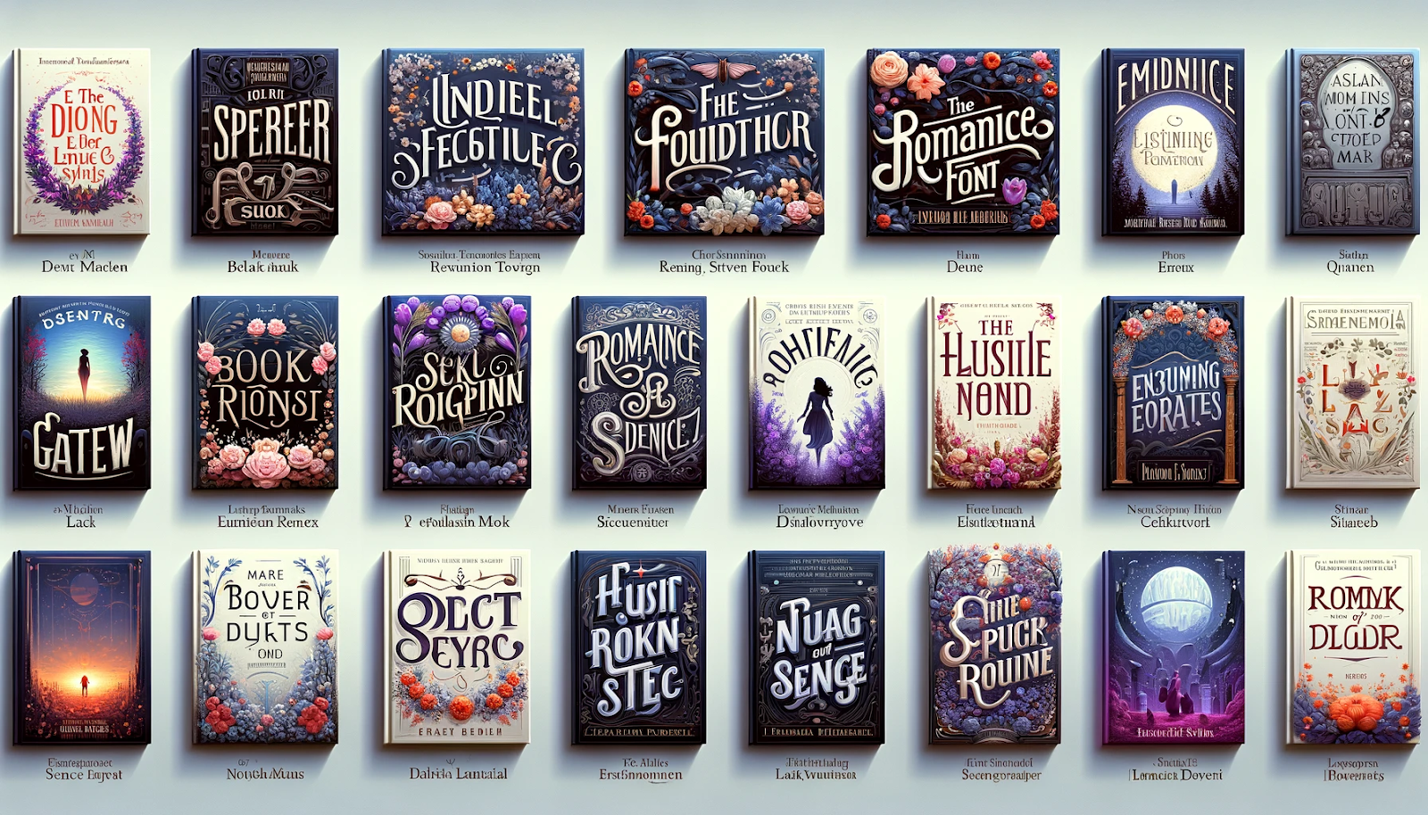
Matching the Font to the Book’s Genre
Matching the font to your book’s genre is a pivotal aspect of font selection, as different genres come with their own typographic conventions. For instance, romance and drama books often benefit from the use of cursive or script fonts, which can evoke a sense of romance and intimacy. In contrast, thriller and mystery genres may be better served by bold, sharp sans-serif fonts that create a sense of tension and intrigue. Fantasy and science fiction titles tend to favor decorative or unique fonts, helping to transport readers to otherworldly realms. Meanwhile, non-fiction and technical works require clean and highly readable fonts, ensuring that information is conveyed accurately and effectively.
Creating a Visual Identity Through Font Choice
Your font choice contributes to your book cover’s overall visual identity. Consistency is key. Use the chosen font for the title, author name, and other essential elements throughout your book’s marketing materials, including promotional banners and author websites. This consistent use of typography reinforces your book’s branding and creates a cohesive and memorable image for your readers.
Ensuring Readability and Legibility
No matter how visually stunning a font may be, readability and legibility should always be a top priority. The text on your book cover must be clear and easy to read from a distance. Test your chosen font in various sizes and colors to ensure it remains legible in different contexts. Avoid overly ornate or overly condensed fonts that may compromise readability.
Selecting the right font for your book cover is a crucial aspect of design that requires careful consideration. It’s an art that involves aligning the font with your book’s genre, audience, and message while ensuring it remains visually appealing and legible. The perfect font can make your book cover stand out and entice potential readers, setting the stage for a successful literary journey.
Free Fonts vs. Commercial Fonts
Free Fonts
Free fonts offer several advantages, such as cost-efficiency, making them an attractive option for self-publishing authors or those on a tight budget. The variety of free fonts available provides a broad spectrum of styles and designs, and their easy online accessibility ensures that everyone can find something suitable for their needs. However, these benefits come with drawbacks. The licensing for free fonts often includes restrictions on commercial use or modification, potentially limiting design options. Another concern is the overuse of popular free fonts, which could result in a book cover that fails to stand out in a crowded market if a widely used font is chosen.
Commercial Fonts
Commercial fonts are usually crafted by professional designers and undergo extensive testing to ensure they meet high standards of readability and aesthetic appeal. Additionally, commercial fonts often come with more flexible licensing options, permitting their use across various platforms, including commercial endeavors. Investing in a commercial font can also imbue your book cover with a unique and professional appearance, setting it apart in a competitive marketplace. However, investing in commercial fonts for book covers can strain budgets, especially for independent authors or small publishers. Additionally, navigating complex licensing agreements for commercial fonts may pose legal challenges and limit usage flexibility.
Finding Quality Free Fonts
If you opt for free fonts, it’s crucial to find high-quality options suitable for both personal and commercial use. Some reputable sources for quality free fonts include Google Fonts, Font Squirrel, and Adobe Fonts (formerly Typekit). Always check the licensing terms and usage restrictions associated with each font to ensure compliance.
Tips for Using Free Fonts Effectively
When using free fonts on your book cover, keep these tips in mind:
- Limit Font Choices: Use no more than two or three fonts to maintain a clean and cohesive design.
- Pair Wisely: Combine fonts that complement each other, such as a serif font for the title and a sans-serif font for the author’s name.
- Test for Legibility: Ensure that your chosen free fonts remain readable in various sizes and colors.
- Customize Carefully: If you need to modify a free font, respect the font creator’s licensing terms and always maintain readability.
The choice between free and commercial fonts for your book cover design depends on your budget, licensing needs, and design goals. While free fonts can be a cost-effective solution, investing in quality commercial fonts often pays off by enhancing the professionalism and uniqueness of your book’s visual presentation.
Font Styles for Specific Book Genres
Fantasy Books
Fantasy book covers transport readers to magical worlds, and font choices play a crucial role in creating that sense of wonder. When designing a fantasy book cover, consider decorative fonts, script fonts, and handwritten fonts. Decorative fonts add enchantment and otherworldliness, script fonts evoke elegance, and handwritten fonts convey a personal and mystical touch.
Thrillers
Thriller book covers aim to create tension and intrigue. The right font sets the mood and keeps readers on the edge of their seats. For thriller covers, consider bold sans-serif fonts for urgency, gothic fonts for mystery and suspense, and serif fonts for depth and complexity.
Science Fiction
Science fiction book covers often explore futuristic landscapes and advanced technologies, and font choices should reflect innovation. Choose futuristic fonts with sleek lines, sans-serif fonts for modernity, and fonts with geometric elements for precision and technological advancement.
Technical Books
Technical books demand clarity and readability to convey complex information effectively. Opt for highly legible sans-serif fonts, maintain the same font and consistency for organization, and create a visual hierarchy using font size, weight, and style to guide readers through technical content.
Creating Visual Interest with Decorative Elements
Incorporating Decorative Fonts and Elements
Incorporating decorative fonts and design elements can infuse creativity and uniqueness into your book cover. To achieve this, consider using decorative fonts for titles and key highlights to ensure they grab the reader’s attention. Adding ornamental flourishes or accents can elegantly frame titles, author names, or essential text elements. If resources allow, collaborating with a typographer or designer to create custom typography tailored to your book’s theme and style can further enhance its uniqueness. Additionally, incorporating decorative borders can add an element of elegance and visual appeal to your cover design, making it stand out.
Balancing Creativity with Readability
Maintaining a balance between creativity and readability is crucial when incorporating decorative elements into your book cover design. To achieve this balance, prioritize readability by ensuring that decorative fonts, while visually appealing, remain legible in various sizes and formats. Consistency in the style and placement of decorative elements helps create a cohesive design. Emphasizing key information, such as the title and author name, with decorative elements prevents overwhelming the viewer. Finally, simplicity is key; avoiding excessive decorative elements ensures that your cover’s central message remains clear and unobstructed.
When considering decorative typefaces, explore both whimsical and elegant typeface options:
Whimsical Typefaces:
- Comic Sans MS: Playful and informal, suitable for light-hearted or humorous book covers.
- Lobster: A whimsical script font that conveys fun and creativity.
- Bangers: Bold and quirky, adding whimsy to children’s books or fantasy titles.
Elegant Typefaces:
- Didot: A classic, high-contrast serif font exuding sophistication, perfect for literary or historical fiction.
- Bodoni: Elegant serif font with a modern touch, favored for timeless beauty.
- Cursive Fonts: Various cursive or script fonts offer elegance and a handwritten feel, ideal for romance or personal memoirs.
Successfully incorporating decorative elements aligns with your book’s theme and tone. Whether opting for a whimsical font or elegant typefaces, they should enhance the overall aesthetic, captivating potential readers while maintaining readability and clarity.
AI in Typography Cover Design
AI is revolutionizing book cover typography, offering data-driven insights that help match fonts with genre trends and reader preferences. By analyzing market demands, AI tools can recommend typography that enhances a book’s visual appeal and marketability—without the need for expensive designers. Today’s technology provides a cost-effective and efficient way to craft professional-quality book covers.
Platforms like Spines empower authors with AI-driven tools to explore font styles, experiment with typography, and preview cover designs—all within minutes. Whether you’re a self-published author or a seasoned designer, leveraging AI can elevate your book cover’s impact.
Ultimately, typography is more than just selecting fonts; it’s an art form that shapes first impressions, strengthens branding, and connects with readers on an emotional level. As you embark on your book cover design journey, embrace typography as a creative tool. Explore, experiment, and let your book cover tell a compelling story—before a single page is even turned.
FAQs – Typography for Book Covers
Q: What is typography in publishing?
Typography in publishing refers to the art of arranging type—fonts, sizes, spacing, and layout—to enhance readability, aesthetics, and communication. In book covers, typography plays a crucial role in conveying the book’s genre, mood, and overall appeal.
Q: What fonts are best for book covers?
The best fonts for book covers depend on the genre and style of the book. Serif fonts like Garamond and Baskerville are great for classic and literary works, while sans-serif fonts like Helvetica and Avenir work well for modern and minimalist designs. Decorative and script fonts can add uniqueness but should be used carefully for readability.
Q: What is the best font for a fantasy novel?
Fantasy novels often benefit from decorative, ornate, or calligraphic fonts that evoke a sense of magic and adventure. Fonts like Cinzel, Uncial Antiqua, and Playfair Display are popular choices that align with the genre’s imaginative themes.
Q: How do you make text stand out on a book cover?
To make text stand out, use contrast, bold typography, and hierarchy. Larger, bold fonts for the title, proper color choices against the background, and spacing adjustments ensure readability. Adding subtle shadows or outlines can also enhance visibility.
Q: What makes a book cover stand out?
A book cover stands out when it has a clear focal point, a well-balanced composition, and a strong color scheme. Typography should complement the imagery, and the overall design should align with the book’s theme. A professional, polished look is key to capturing attention.
Q: What is the best format for a book cover?
The best format for a book cover depends on the publishing platform. Print book covers require high-resolution images (300 dpi), with standard dimensions like 6″ x 9″ for most novels. For ebooks, a 1.6:1 aspect ratio (e.g., 1600 x 2560 pixels) ensures good display across digital devices.
Q: How do I make my book cover look professional?
A professional book cover maintains visual balance, uses high-quality typography, and follows genre expectations. Proper font pairing, clean spacing, and an effective color palette contribute to a polished design. Hiring a designer or using AI-powered tools like Spines can also elevate the quality.
Q: How can AI help with book cover design?
AI tools can analyze book trends, suggest typography, and automate design elements to create professional-looking covers. Platforms like Spines offer font recommendations, layout adjustments, and real-time previews, making it easier for authors to create visually appealing covers without advanced design skills.