We’ve all done it. You’re wandering through a bookstore or scrolling online, fully intending to browse, and suddenly a cover grabs you by the collar. You don’t know the author, you haven’t read the blurb, and the algorithm isn’t whispering in your ear, yet there you are, falling headfirst for a rectangle of ink and pixels. That’s the quiet superpower behind the best book covers: they win your attention before your brain even remembers why you opened the app.
First impressions in publishing aren’t just helpful; they’re decisive. A cover has a fraction of a second to signal genre, mood, quality, and “yes, I belong on your nightstand.” When it fails, readers keep scrolling. When it succeeds, it feels like magic.
In this article, we’ll pull back the curtain on the elements that make a cover irresistible: color that sparks emotion, typography that sets the tone, and layouts that guide the eye exactly where it should go. Ready to see how great design works its quiet charm?
The Science of First Impressions: Covers That Capture in 0.5 Seconds
Blink. That’s all the time your brain needs to decide whether a book cover is worth a closer look. In those split seconds, we’re not analyzing, our brains are scanning for clarity, emotional cues, and visual promises. It’s why top-performing covers feel instantly “right,” even when we can’t explain why. There’s real psychology at play: humans are wired to respond to contrast, pattern, and simplicity long before we consciously process meaning.
That’s where hierarchy swoops in like a friendly design chaperone. A strong title should be the first thing your eye lands on, followed by a clear focal point: a symbol, an illustration, a bold typographic choice anchoring the story’s feel. From there, visual flow does the heavy lifting, guiding the viewer from one element to the next without chaos or confusion.
Because here’s the truth: your cover has the attention span of a toddler on espresso: use it wisely. Great cover design isn’t about piling on details; it’s about making the right details speak first, loudest, and cleanest. When every element knows its place, the brain clicks, curiosity sparks, and the reader leans in for more.
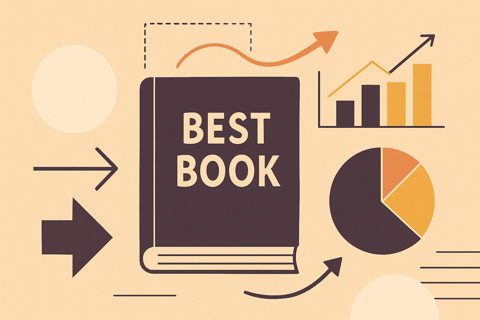
Your Publishing Journey Awaits – Start NowColor Palettes That Pop: How the Best Book Covers Use Color to Sell
Color is the first emotional handshake between a reader and a book. Before a title can charm or a font can flirt, color steps in and announces the mood. In the world of the best book covers, this isn’t accidental; it’s strategic color theory doing its quiet, powerful work. Different hues trigger different instincts: warm tones excite, cool tones soothe, and dark tones hint at mystery. And yes, “Red screams danger; blue whispers trust; neon green just screams.”
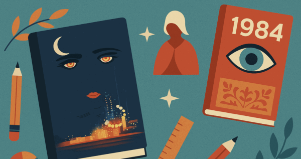
Genres lean heavily on these emotional cues. Thrillers often rely on high-contrast palettes, black paired with red or electric yellow, to signal tension and urgency. Romance tends to soften the edges, embracing blush tones, creams, and warm pastels that feel like a gentle sigh. Literary fiction lives somewhere in the artful middle, often using muted, sophisticated palettes that suggest depth, nuance, and a touch of existential longing.
When choosing a palette for your own cover, think beyond what looks pretty. Ask what your color choices promise. Consider contrast for readability, cultural associations, and whether your palette fits your genre’s unwritten rules without blending into a sea of lookalikes. And steer clear of fleeting trends that will age like milk. Great color is timeless; your palette should help your story stand out today and still make sense tomorrow.
Typography With Personality: Fonts That Tell a Story Before the Story
If color is the emotional handshake, typography is the first full sentence your cover speaks. Fonts do far more than spell out a title: they set the mood, signal genre, and shape expectations before a reader even glances at the blurb. A thriller with curly script? Confusing. A romance with a harsh geometric typeface? Also confusing. Fonts matter because they’re the voice of your cover, and readers hear that voice instantly.
Serif fonts bring a sense of tradition, authority, and literary weight: perfect for historical fiction or more contemplative reads. Sans serif fonts feel modern, clean, and approachable, making them a go-to for contemporary fiction and nonfiction. Decorative fonts? They’re the confetti cannons of typography: fun, attention-grabbing, and best used sparingly unless your genre truly embraces the drama.
And remember: Your font choice is like your outfit on a first date: bold statement or quiet panic? Choose wisely.
The best book covers treat typography as a character, not an afterthought. That means paying attention to spacing (tight enough to feel intentional, loose enough to breathe), hierarchy (title first, author second, extras later), and pairing fonts that complement rather than compete. Get these right, and your typography won’t just communicate your story, it’ll captivate before a single page is turned.
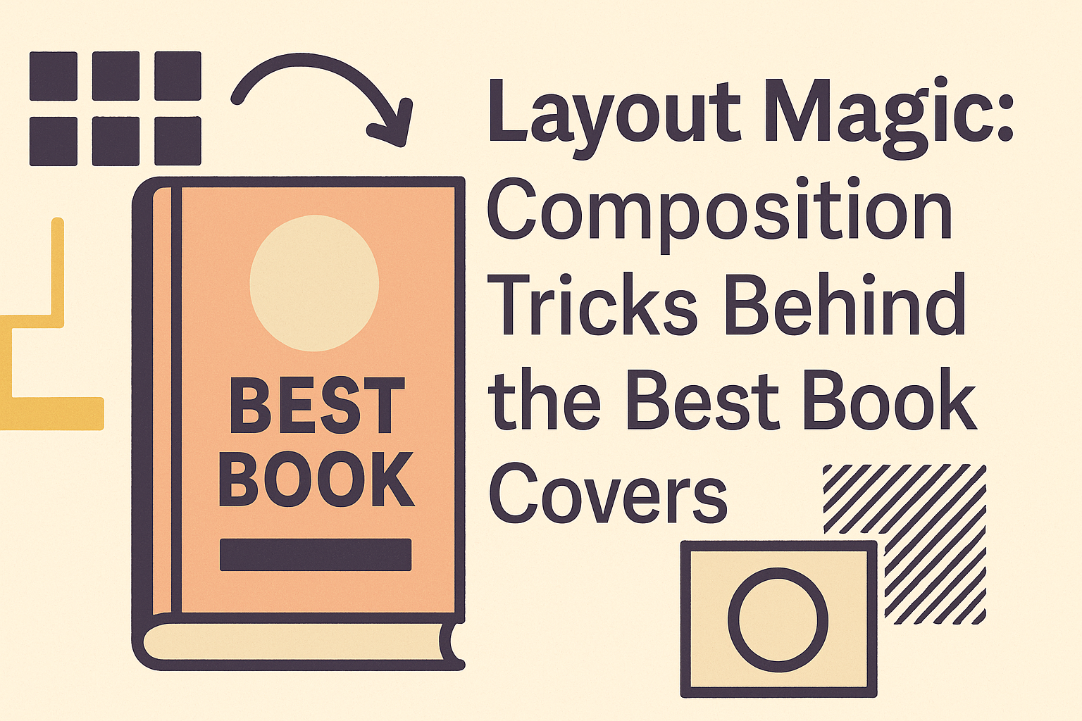
Layout Magic: Composition Tricks Behind the Best Book Covers
Even the most stunning colors and fonts fall flat without a layout that knows how to behave. Composition is the invisible architecture of the best book covers, the thing readers don’t consciously notice but immediately feel. A strong layout guides the eye effortlessly: title first, then author name, then imagery, all in a smooth visual rhythm that says, Ah yes, this makes sense.
Title placement is often the star of the show. Centered titles feel bold and intentional, while top-heavy layouts suggest authority and tradition. Author names can sit quietly beneath the title or claim top billing, depending on fame level or brand strength. Imagery should support, not overpower, the text and vice versa. As the old design proverb goes, “If your title is fighting your image for attention, nobody wins.”
Negative space is another unsung hero. Giving your elements room to breathe creates balance, clarity, and a sense of professionalism. Too many competing visuals, and your cover starts to feel like a crowded elevator of ideas.
Interestingly, even simple layout tweaks like shifting the title upward, enlarging the focal point, and reducing clutter have been shown through A/B testing to meaningfully increase conversions. Sometimes, the smallest adjustments unlock the biggest “Add to Cart” moments.
Genre Signals: Why Readers Need Visual Clues More Than They Admit
Readers may swear they don’t judge books by their covers, but they absolutely judge what kind of book they’re picking up. Genre signals are the silent guides that help readers understand the ride ahead, whether they’re in for a pulse-pounding thriller, a softhearted romance, or a sweeping fantasy epic. And these cues don’t need to be loud to be effective.
Thrillers tend to lean on stark contrasts, sharp lines, and imagery that hints at danger without spelling it out. Romance often favors warmth, softness, and emotional intimacy, but that doesn’t mean every cover needs to look like a pink confetti cannon. Fantasy covers can evoke rich worldbuilding through symbolic motifs or atmospheric landscapes, without defaulting to dragons perched on mountain cliffs every single time. Literary fiction usually opts for minimalism or conceptual imagery that whispers instead of shouts.
The trick is signaling genre expectations while still feeling fresh. Readers want familiarity, not formula. Give them a cover that nods to the tropes they love, adds a clever twist, and promises the story they came for before they even read a single word.
Trends vs. Timeless: Designing a Cover That Won’t Expire in Six Months
Trendy book covers are tempting. Who doesn’t want to ride the wave of whatever minimalist-abstract-squiggly-line aesthetic is currently dominating Instagram? But trends are fickle creatures. What looks cutting-edge today can look embarrassingly dated tomorrow. As the saying goes, “Chasing trends is like wearing last year’s TikTok fashion, fun until it isn’t.”
That doesn’t mean all trends are taboo. Some can give your cover a fresh, contemporary feel when used with intention. The key is asking whether a trend enhances your story or simply decorates it. If it’s the latter, back away slowly.
Timeless design, on the other hand, is built on principles that never go out of style: clear hierarchy that guides the eye, emotional clarity that immediately tells readers what they’ll feel, and a strong concept that ties everything together. Covers with a crisp title, purposeful imagery, and confident spacing will age far better than something designed to match this month’s bestseller carousel.
When in doubt, choose meaning over momentary flair. Your book will live longer than any trend, its cover should too.
Final Takeaway: The Cover Is a Promise. Make It a Good One.
At the end of the day, the best book covers do one thing beautifully: they respect the reader’s attention. A cover isn’t just decoration; it’s a promise of the story, tone, and experience inside. So experiment boldly, choose intentionally, and let your design choices reflect what makes your book worth picking up in the first place.
You don’t need perfection; you need clarity, emotion, and a touch of courage. Craft a cover that invites readers in and keeps its promise once they do.
FAQ: Best Book Covers
Q1: What makes a book cover one of the best book covers in its genre?
A great cover clearly signals genre, uses strong typography, and creates an instant emotional connection with the reader.
Q2: How do I design a book cover that stands out on Amazon and other online stores?
Focus on bold, readable typography, high-contrast colors, and a simple, eye-catching focal point that still looks good in thumbnail size.
Q3: Do I really need a professional designer to create the best book cover for my book?
Not always, but a professional can help with layout, typography, and genre expectations, which often leads to better clicks and conversions.
Q4: What colors work best for book covers in different genres?
Thrillers use dark tones and sharp contrasts, romance leans warm and soft, and literary fiction often prefers muted, sophisticated palettes.
Q5: How important is typography in creating the best book covers?
Extremely. Fonts communicate genre, tone, and professionalism, bad typography can ruin even the most beautiful illustration or photo.
Q6: Should I follow current design trends when creating my book cover?
Use trends carefully. Let timeless principles like clear hierarchy, emotional clarity, and a strong concept lead, and sprinkle trends on top, not the other way around.